OCIO、显示转换和误解
- OCIO, Display Transforms and Misconceptions - Chris Brejon - Chris Brejon
- https://chrisbrejon.com/articles/ocio-display-transforms-and-misconceptions/
- This article is mostly about OCIO configs and Display Transforms, which is a crtical part of the Image Formation Chain.
介绍 Introduction
I often think about this great question asked by Doug Walker at one of our OpenColorIO (OCIO) meetings : what are you trying to solve ? So in our case, what is this post about ?
我经常会想起 Doug Walker 在我们的一次OpenColorIO (OCIO) 会议上提出的这个好问题:你们想解决什么问题? 那么在我们的例子中,这篇文章是关于什么的?
In the past year (2021), I have given several talks online about OCIO and theAcademy Color Encoding System (ACES). I thought it would be useful to put those slides online for two reasons :
在过去的一年 (2021 年) 中,我在网上做了几次关于 OCIO 和学院色彩编码系统(ACES) 的演讲。我认为将这些幻灯片放到网上会很有用,原因有二:
- If there is any inaccurracy, anyone can correct me and I’ll be more than happy to update this page.
- 如果有任何不准确之处,任何人都可以纠正我,我会非常乐意更新此页面。
- With these slides online, I hope I can reach more people and raise awareness about certain topics.
- 通过在线发布这些幻灯片,我希望能够接触到更多的人并提高他们对某些主题的认识。
I do not consider myself an expert. I do not believe in this word anymore. We are only human beings, doing our best to understand things. We make mistakes, hopefully learn from them and keep going. So no, I'm not an expert on anything !
我不认为自己是专家。我不再相信这个词了。我们只是人类,尽最大努力去理解事物。我们会犯错,希望从中吸取教训,继续前进。所以不,我不是任何方面的专家!
The only thing I can offer is an artist’s point of view on Color Management. Quite often, I have been lost on where to begin when it comes to OCIO and ACES. So by writing this post, I hope I can share with you some useful information.
我唯一能提供的是艺术家对色彩管理的看法。 很多时候,当谈到 OCIO 和 ACES 时,我都不知道从哪里开始。所以通过写这篇文章,我希望可以和大家分享一些有用的信息。
There is a reason my book starts with two chapters about Color Management. It will give you the fundation to create beautiful images. So I thought it would be interesting to compare various OCIO configs, with a series of visual examples in order to study their strength and flaws.
我的书以两章关于色彩管理的内容开头是有原因的。它将为你提供创建精美图像的基础。 因此,我认为比较各种 OCIO 配置以及一系列视觉示例以研究它们的优点和缺点会很有趣。
Really the idea is to look back but NOT judge these historical OCIO configs. Not at all ! Huge respect to all the persons who more than ten years ago developed and shared these configs with the community.
真正的想法是回顾而不是评判这些历史 OCIO 配置。一点也不! 向十多年前开发并与社区分享这些配置的所有人致以崇高的敬意。
伟大的社区 A great community
Some people may find this post too obvious, boring or outdated. Probably ! But I was really interested to go back in time and write this historical analysis on OCIO and Display Transforms. This is post is primarly about my own misconceptions, but hopefully it will help others too !
有些人可能会觉得这篇文章太明显、太无聊或太过时了。可能吧!但我真的很想回到过去,写一篇关于 OCIO 和 Display Transforms 的历史分析。这篇文章主要讲的是我自己的误解,但希望它也能帮助到其他人!
Please note that I will only talk about OCIOv1 configs here.
请注意,我将在这里仅讨论 OCIOv1 配置。
First of all, I would like to thank the Academy of Motion Picture Arts and Sciences (AMPAS) because without them, I would have probably never discovered this crazy wonderful world of Color Management. ACES has been my entry point to Color Management and I will never be thankful enough for that.
首先,我要感谢美国电影艺术与科学学院(AMPAS),因为如果没有他们,我可能永远也不会发现色彩管理这个疯狂而美妙的世界。ACES 是我进入色彩管理的切入点,对此我永远心怀感激。
Thanks to them, I have discovered this amazing community of colour nerds and colour scientists, and I would like to personnally thank the following persons for their generosity, sharing and patience with my questions :
感谢他们,我发现了这个令人惊叹的色彩迷和色彩科学家社区,我还想亲自感谢以下人士的慷慨、分享和对我的问题的耐心:
It is really heart-warming to have this group of people passionate about colour and display transforms who are able to debate online at midnight over sRGB or scene-referred grading. It is a welcoming community, who does not agree on everything and who has still a lot to figure out… Which is really exciting !
看到这群对色彩和显示变换充满热情的人能够在午夜在线辩论 sRGB 或场景参考分级,真是令人欣慰。这是一个热情的社区,大家不会在所有事情上都意见一致,还有很多事情需要解决……这真的很令人兴奋!
Okay, enough with the name dropping, let’s start ! Yay !
好了,名字说得够多了,我们开始吧!耶!
术语的重要性 The importance of terminology
I’m writing these lines with great humility because I have been dead wrong in the past and I’m probably still inacurrate about many things… But I’m learning and I think my only vantage is to explain things simply enough so hopefully fellow CG artists can understand me.
我非常谦虚地写下这些话,因为我过去犯过很大的错误, 而且我可能在很多事情上仍然不准确......但我正在学习,我认为我唯一的优势就是足够简单地解释事情,以便希望 CG 艺术家同行能够理解我。
I’ll start here with a bit of OCIO vocabulary, so we’re all on the same page :
我将从一些 OCIO 词汇开始,以便我们都了解同一页面:
- Display : monitor with its characteristics (primaries, white point, EOTF, nits…).
- 显示器:监视器及其特性(原色、白点、EOTF、尼特……)。
- View : the way we see the images (ACES, Raw, Log, Un-tone-mapped…).
- 视图:我们看图像的方式(ACES、Raw、Log、Un-tone-mapped……)。
- Look : creative preference or grading (LMT in the ACES terminology).
- 看:创意偏好或分级(ACES 术语中的LMT )。
These three terms may sound really basic but they are out of the utmost importance for what comes next. As you probably know, I’m quite a practical person. I like to have visual and concrete examples to support my explanations. So we’ll start by having a look at these two OCIO Config repositories and study our different options :
这三个术语听起来可能非常基础,但对于接下来的内容来说,它们并非至关重要。你可能知道,我是一个很实际的人。我喜欢用视觉和具体的例子来支持我的解释。所以我们首先来看看这两个OCIO 配置 存储库,并研究我们的不同选项:
-
nuke-default
-
spi-anim / spi-vfx
-
Filmic Blender
-
ACES
-
核默认
-
spi-动画 / spi-视觉特效
-
电影混合器
-
王牌
OCIO 配置示例 OCIO Configs examples
nuke-默认 nuke-default
nuke-默认描述 nuke-default description
Why should we start with an OCIO config that was shipped with Nuke 6.3 in 2011 ? First of all, because I believe it is still used in some schools and small shops. Second of all, because it contains an option that has misled me for ages.
为什么我们要从 2011 年 Nuke 6.3 附带的 OCIO 配置开始?首先,因为我相信它仍在一些学校和小商店中使用。其次,因为它包含一个误导我多年的选项。
displays:
  default:
    - !<View> {name: None, colorspace: raw}
    - !<View> {name: sRGB, colorspace: sRGB}
    - !<View> {name: rec709, colorspace: rec709}
    - !<View> {name: rec1886, colorspace: Gamma2.4}

active_displays: [default]
active_views: [sRGB, rec709, rec1886, None]
I won’t mention here that the “Display” is default (what ?) and that the “Views” are actually Transfer Functions…
我不会在这里提到“显示”是默认的(什么?)并且“视图”实际上是传递函数……
Let’s focus on something else instead !
我们还是把注意力转移到别的事情上吧!
Revelation #1 : In this config it is important to notice that the Rec.709 Transfer Function is a camera encoding OETF ! It is NOT a display standard ! It took me a while to figure that one out ! So what everybody calls a “Rec.709 display” is actually a “BT.1886 EOTF with BT.709 primaries” display.
启示 #1 : 在此配置中,需要注意的是,Rec.709 传输函数是相机编码 OETF!它不是显示标准!我花了一段时间才弄清楚!因此,大家所说的“Rec.709 显示器”实际上是“带有 BT.709 原色的 BT.1886 EOTF ”显示器。
This camera encoding was designed to direct drive output on a CRT broadcast display, with an EOTF of approximately 2.4. It was designed to look appropriate on both what later became BT.1886 and sRGB 2.2.
该摄像机编码旨在直接驱动 CRT 广播显示器上的输出,EOTF 约为 2.4。它被设计为在后来成为 BT.1886 和 sRGB 2.2 的设备上看起来都合适。
From a fellow color nerd.
来自一位色彩迷。
BT.709 和 BT.1886
This was one of my first interrogations when I discovered ACES. Because the Rec.709 (ACES) Output Transform is “less contrasted” (for lack of a better words) than the sRGB (ACES) one, contrary to the nuke-default. Here are the approximative Gamma values :
这是我发现 ACES 时的第一个疑问。因为 Rec.709 (ACES) 输出变换比 sRGB (ACES) 输出变换“对比度较低”(找不到更好的词来形容),与 nuke-default 相反。以下是近似 Gamma 值:
- BT.709 is a camera encoding OETF (~Gamma 1.95).
- BT.709 是一种相机编码 OETF(~Gamma 1.95)。
- BT.1886 is an EOTF output display (~Gamma 2.4) and is used in the Rec.709 (ACES) Output Transform.
- BT.1886 是一种 EOTF 输出显示器(~Gamma 2.4)并用于 Rec.709(ACES)输出变换。
[…] using a tilde has become commonly used shorthand for differentiating between pure power functions and piecewise functions, when referring to display CCTFs, and is sometimes the only way to differentiate between the two, if the author isn’t explicitly using “power” or “piecewise”. For example, Baselight differentiates between “sRGB Display (2.2)” and “sRGB (~2.2)”. […] In the context of transfer function LUTs used for OCIO, BT.1886 is exactly Gamma 2.4.
[…] 在提及显示 CCTF 时,使用波浪号已成为区分纯幂函数和分段函数的常用简写,有时如果作者未明确使用“幂”或“分段”,则波浪号是区分两者的唯一方法。例如,Baselight 区分“sRGB Display (2.2)”和“sRGB (~2.2)”。[…] 在用于 OCIO 的传递函数 LUT中,BT.1886 正好是 Gamma 2.4。
Thanks Zach Lewis for the precision.
感谢 Zach Lewis 的精确解释。
老派 VS 新派 Old-school VS new-school
There is a couple of things to know about this :
关于这一点,有几件事需要了解:
- Using “rec709” in your viewer (“old school” intention), you’ll never get 1:1 for all the values. Because the general power function difference is loosely a “surround/flare compensation” !
- 在查看器中使用“ rec709 ”(“老派”意图),您永远不会获得所有值的 1:1。因为一般的幂函数差异大致是“环绕/耀斑补偿”!
- If you use “rec1886” on a pure BT.1886 display (“new school” intention), it is an idealized inverse for the EOTF. What we call a no-operation.
- 如果在纯 BT.1886 显示器上使用“rec1886”(“新派”意图),它是 EOTF 的理想逆。我们称之为无操作。
And it is the exact same issue with BT.709/sRGB piecewise encoding dumped through the proper 2.2 power function. There is a very interesting talk about this precise issue by Daniele Siragusano. It is a bit technical but definitely worth watching !
这与通过适当的 2.2 幂函数转储的 BT.709/sRGB 分段编码完全相同。Daniele Siragusano 就这个问题发表了一篇非常有趣的演讲。它有点技术性,但绝对值得一看!
原始视频:https://www.youtube.com/watch?v=NzhUzeNUBuM&t=2s
In 2020, flare compensation is part of the Display Rendering Transform and should not live in the distribution pipeline.
在 2020 年,眩光补偿是显示渲染转换的一部分,不应存在于分发管道中。
Daniele Siragusano.
丹尼尔·西拉古萨诺。
We may add a couple of things : we should never ever use “Rec.709” nor “BT.709” without a further qualifier. Because “Rec.709” can either mean a transfer function or a set of primaries. For clarity, we need to separate the transfer function from the primaries.
我们可以补充几点:我们永远不应该在没有进一步限定词的情况下使用“Rec.709”或“BT.709”。因为“Rec.709”既可以表示传递函数,也可以表示一组原色。为了清楚起见,我们需要将传递函数与原色分开。
I will also quickly mention that the use of the term “Gamma” is ambiguous : it’s a greek letter ! It has been used in so many different contexts. I now try to use the term “Power Function/Law” or “Transfer Functions” when appropriate.
我还要快速提一下,“Gamma”一词的使用有歧义:它是一个希腊字母!它已在很多不同的语境中使用。我现在尝试在适当的时候使用术语“幂函数/定律”或“传递函数”。
nuke-default 可视化示例 nuke-default visual examples
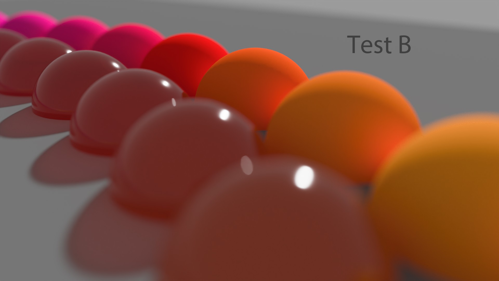
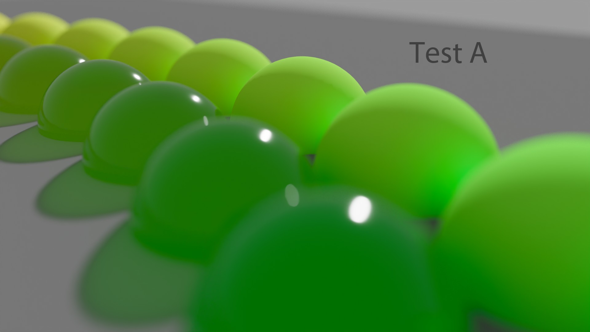
We are now going to look at a sweep of sRGB/BT.709 primaries with this config. It will show an interesting phenomenon known as the “Notorious 6“ . The setup is super simple : in Nuke, I have set a range of sRGB/BT.709 primaries vertically and I increase by 1 stop for each column (horizontally). Let’s have a look !
现在,我们将使用此配置查看 sRGB/BT.709 原色的扫描。它将显示一个有趣的现象,称为 “臭名昭著的 6” 。设置非常简单:在 Nuke 中,我垂直设置了一系列 sRGB/BT.709 原色,并将每一列(水平)增加 1 档。让我们来看看!
... 您可以从 12 个值开始(左侧)...")


Revelation #2 : With this config, no matter how many values you use, you will ALWAYS end up on these six values at display : Red, Green, Blue, Cyan, Magenta and Yellow. Pay attention to this behaviour since we will observe it with several Color Management Workflows.
启示 #2: 使用此配置,无论您使用多少个值,最终显示结果始终为这六个值:红色、绿色、蓝色、青色、洋红色和黄色。请注意此行为,因为我们将通过多个颜色管理工作流程观察它。
This config should be avoided at all cost for CGI work. It may be useful in some edge cases such as albedo textures. But that’s about it !
对于 CGI 工作,应不惜一切代价避免使用此配置。 在某些极端情况下(例如反照率纹理),它可能有用。但仅此而已!
A friendly reminder…
温馨提醒……
spi-动画 / spi-视觉特效 spi-anim / spi-vfx
spi-anim 描述 spi-anim description
There is a very complete description of the spi-vfx config in the OCIO docs (which is like a “sister” config of spi-anim). For the record, both configs are from Sony Picture Imageworks (spi).
OCIO 文档中对 spi-vfx 配置有非常完整的描述(它就像 spi-anim 的“姊妹”配置)。据记录,这两个配置均来自Sony Picture Imageworks (spi)。
Since we focus on Display Transforms in this post, we will have a look at the “Film (sRGB) ” View from the spi-anim OCIO Config. Here is a quick quote :
由于我们在本文中重点介绍显示变换,因此我们将从 spi-anim OCIO 配置中查看“胶片 (sRGB) ”视图。以下是简短的引述:
The vd spaces are mappings of linear image data into display space. The main part of the transformation is defined as a single curve that is conceptually two parts. The first is a ln to lg (linear to logarithmic) conversion. The second is lg to sRGB conversion. This is based off the neutral channel response of the sRGB film emulation lut used in the profile.
vd 空间是线性图像数据到显示空间的映射。转换的主要部分定义为一条曲线,从概念上讲,该曲线分为两部分。第一部分是 ln 到 lg(线性到对数)的转换。第二部分是 lg 到 sRGB 的转换。这是基于配置文件中使用的 sRGB 胶片模拟 lut 的中性通道响应。
The spi-anim OCIO config uses a 1D LUT for its “Film” View. For sRGB Displays, the LUT file used is called “vd16.spi1d“. Here is an example from the config which I believe uses the correct OCIO terminology :
spi-anim OCIO 配置使用 1D LUT 作为其“ Film ”视图。对于 sRGB 显示器,使用的 LUT 文件称为“ vd16.spi1d ”。以下是配置中的一个示例,我认为它使用了正确的 OCIO 术语:
displays:
  DCIP3:
    - !<View> {name: Film, colorspace: p3dci8}
    - !<View> {name: Log, colorspace: lm10}
    - !<View> {name: Raw, colorspace: nc10}
  sRGB:
    - !<View> {name: Film, colorspace: vd16}
    - !<View> {name: Log, colorspace: lm10}
    - !<View> {name: Raw, colorspace: nc10}
We do have access to two displays : “sRGB” and “DCIP3“. And three different ways of “viewing” our renders : “Film“, “Log” and “Raw“. This is a simple and correct OCIO setup, very clear and easy to understand.
我们确实可以使用两个显示器:“ sRGB ”和“ DCIP3 ”。还有三种不同的“查看”渲染的方式:“ Film ”,“ Log ”和“ Raw ”。这是一个简单而正确的 OCIO 设置,非常清晰易懂。
spi-anim 视觉示例 spi-anim visual examples
Let’s now have a look at some renders !
现在让我们看一些渲染!


spi-vfx 描述 spi-vfx description
For completeness, I have also used the same renders through the “srgb8” View from the spi-vfx OCIO config. Here its description from the OCIO docs :
为了完整起见,我还通过spi-vfx OCIO 配置中的“ srgb8 ”视图使用了相同的渲染。以下是来自 OCIO 文档的描述:
srgb8 bakes in the film3d emulation lut. This table can be used for either QuickTime generation or output to the sRGB display. The transformation is a 3d film emulation table with gray balance compensation, so a value of 445,445,445 in lg10 space is modified to become equal RGB values in sRGB. Additionally the lut is scaled so that at least one of the color channels on maximum white uses the display max. The transformation takes place in three parts. First the linear data is converted to the show log space. Then a film emulation table is applied. Then the grey balance and white scaling compensation are applied. This table is designed to be evaluated in a dimly lit office environment on a sRGB display.
srgb8烘焙 film3d 仿真 lut。此表可用于 QuickTime 生成或输出到 sRGB 显示器。转换是具有灰平衡补偿的 3d 胶片仿真表,因此 lg10 空间中的值 445,445,445 被修改为 sRGB 中的相等 RGB 值。此外,lut 被缩放,以便最大白色上至少一个颜色通道使用显示最大值。转换分为三个部分。首先将线性数据转换为显示日志空间。然后应用胶片仿真表。然后应用灰平衡和白色缩放补偿。此表旨在在 sRGB 显示器上在光线昏暗的办公环境中进行评估。
spi-vfx 视觉示例 spi-vfx visual examples
And here are our usual renders for comparison :
以下是我们通常用于比较的渲染图:


For your information, I haven’t used any compositing trick for my render. The “glow” around the light sabers is actually a volumetrics shader, affected by the Mesh Light. Straight from Guerilla Render.
供您参考,我没有在渲染中使用任何合成技巧。光剑周围的“光晕”实际上是体积着色器,受网格光的影响。直接来自 Guerilla Render。
I got really really really surprised when I looked at these images… I did not expect a Display Transform called “Film” to behave like that ! My two main surprises were :
当我看到这些图片时,我真的非常非常惊讶……我没想到一个名为“ Film ”的显示变换会是这样的!我最惊讶的是以下两个方面:
- sRGB/BT.709 primaries do not go to white !
- sRGB/BT.709 原色不会变成白色!
- We end up on the “Notorious 6” values, just like a simple sRGB EOTF !
- 我们最终得到了“ Notorious 6 ”值,就像一个简单的sRGB EOTF!
Which made me arrive at this earth-shaking conclusion… Revelation #3 : an s-curve has nothing to do with the “Filmic” behaviour. Certainly, it will add a nice “contrast” to the image and perform some kind of luminance lookup. But does this really qualify as “Filmic” ? I’m not sure…
这让我得出了这个惊天动地的结论…… 启示 3 :S 曲线与“电影”行为无关。当然,它会给图像增加一个很好的“对比度”并执行某种亮度查找。但这真的符合“电影”的条件吗?我不确定……
To me, “filmic tone-mapping” means that there is a visual “path-to-white” (some people calls it “desaturated highlights“). The fact that sRGB/BT.709 primaries light sabers do not go to white with a “film3d emulation lut” looks wrong to me. It tells me that maybe something else is at play here ! So, yeah, s-curves have nothing to do with the “path-to-white“.
对我来说,“电影色调映射”意味着存在视觉上的“白色路径”(有些人称之为“去饱和高光”)。sRGB/BT.709 原色光剑没有通过“ film3d 模拟 lut ”变为白色,这在我看来是不对的。这告诉我,这里可能有其他东西在起作用 !所以,是的,s 曲线与“白色路径”无关。
I did look for a “filmic” reference to illustrate my thoughts. And “Star Wars” was the best example I could come with. This is the “Look” I would expect for my light sabers : a white “core” with a colored glow.
我确实寻找了“电影”参考来阐明我的想法。而“星球大战”是我能想到的最好的例子。这是我期望我的光剑的“外观”:白色“核心”带有彩色光芒。

Agreed, these OCIO configs are a bit old but they’re still used by some small studios. And I love doing this OCIO archeology because we learn so much on the way.
同意,这些 OCIO 配置有点旧了,但一些小工作室仍在使用它们。我喜欢做这种 OCIO 考古,因为我们在过程中学到了很多东西。
边缘情况? Edge cases ?
One may argue that my examples are edge cases : “hey Chris, stupid you, just use 0.001 instead of 0 and you’re good to go ! ” And this is true. It is a common and known practice to limit the range of input colors to get some kind of “path-to-white“. But doesn’t it reveal something ?
有人可能会说我的例子是极端情况:“嘿,克里斯,你真笨,只要用 0.001 代替 0 就可以了! ”这是真的。限制输入颜色的范围以获得某种“白色路径”是一种常见且众所周知的做法。但这难道没有揭示出什么吗?


To be clear, I am not even using any wide gamut rendering in these examples. But rather the lowest common denominator : sRGB/BT.709 primaries through several Display Transforms. Since lasers are BT.2020 primaries, I believe that using sRGB/BT.709 primaries is not an edge case. Not at all !
需要说明的是,我在这些示例中甚至没有使用任何宽色域渲染。而是通过几个显示变换使用最低公分母:sRGB/BT.709 原色。由于激光是 BT.2020 原色,我相信使用 sRGB/BT.709 原色不是极端情况。一点也不!
I reckon no one should have to overcome the stimulus encoding to avoid errors.
我认为没有人应该克服刺激编码来避免错误。
A fellow color nerd.
一位色彩迷。
But, of course, we need to put things back in their context here. These two configs from Sony did a great job back in 2011, color managing amazing movies such as “Cloudy with a chance of meatballs“. Again, I’m trying to dig a bit in History to understand where my own misconceptions come from. Nothing more.
但是,当然,我们需要把事情放回到它们的背景中。索尼的这两个配置在 2011 年做得很好,对《美食从天而降》等精彩的电影进行了色彩管理。再次,我试图挖掘一下历史,以了解我自己的误解来自哪里。仅此而已。
The VFX config was film-scan Cineon based… whereas the Anim was using per-channel 1D LUTs for the Display Rendering Transform (DRT). spi-vfx is well beyond its shelf-life… spi-anim can still be informative to simple animation productions, but the naive RGB tonecurve will make their lives unpleasant for multi-deliverable scenarios.
VFX 配置是基于胶片扫描 Cineon 的......而 Anim 使用每通道 1D LUT 进行显示渲染转换 (DRT)。spi-vfx 远远超出了它的保质期......spi-anim 仍然可以为简单的动画制作提供参考,但简单的 RGB 色调曲线会让它们在多可交付场景中变得不愉快。
Great summary by Sean Cooper.
肖恩·库珀 (Sean Cooper) 的总结很精彩。
More recently, this movie “My Little Pony” was done using the spi-anim OCIO config :
最近,这部电影“我的小马驹”是使用 spi-anim OCIO 配置完成的:
电影混合器 Filmic Blender
Filmic Blender 描述 Filmic Blender description
Not the easiest OCIO config to start with, but it is actually super simple. And a pretty damn good option ! I highly recommend to read the README from GitHub as it describes exactly what “Filmic” does.
这不是最容易上手的 OCIO 配置,但实际上非常简单。而且是一个非常好的选择!我强烈建议阅读GitHub 上的 README,因为它准确描述了“ Filmic ”的作用。
It compresses the scene referred linear radiometric energy values down to the display / output referred range. This aspect is known as a transfer function or tone mapping. The shape of the Filmic Base Log with a contrast aesthetic roughly emulates a photographic film curve.
它将场景参考的线性辐射能量值压缩到显示/输出参考范围。这方面称为传递函数或色调映射。具有对比美感的 Filmic Base Log 的形状大致模拟了胶片曲线。
It compresses the gamut for high intensity values. As colour ratios increase in intensity, highly saturated ratios tend to be resistant to transfer function compression, which results in peculiar feeling imagery with some regions feeling appropriately over-exposed and others “lingering” behind. Filmic considers all colour values fair game, and attempts to blend colours into a consistent output that matches our learned expectations from film emulsion-like media.
它压缩了高强度值的色域。随着色彩比率的强度增加,高饱和度比率往往对传递函数压缩有抵抗力,这会导致图像产生奇怪的感觉,一些区域感觉过度曝光,而其他区域则“挥之不去”。Filmic 认为所有颜色值都是公平的,并试图将颜色混合成一致的输出,以符合我们从胶片乳剂类介质中学到的期望。
Great description by Troy Sobotka.
特洛伊·索博特卡 (Troy Sobotka) 的描述很精彩。
Filmic Blender 显示和视图 Filmic Blender Displays and Views
It should be needless to say that the “Filmic” OCIO Config will work in any DCC software that supports OCIO. Let’s have a quick look at the Displays and Views available in the config :
不用说, “Filmic” OCIO 配置可以在任何支持 OCIO 的 DCC 软件中使用。让我们快速看一下配置中可用的显示和视图:
displays:
  sRGB:
    - !<View> {name: sRGB OETF, colorspace: sRGB OETF}
    - !<View> {name: Non-Colour Data, colorspace: Non-Colour Data}
    - !<View> {name: Linear Raw, colorspace: Linear}
    - !<View> {name: Filmic Log Encoding Base, colorspace: Filmic Log Encoding}
  BT.1886:
    - !<View> {name: BT.1886 EOTF, colorspace: BT.1886 EOTF}
    - !<View> {name: Non-Colour Data, colorspace: Non-Colour Data}
    - !<View> {name: Linear Raw, colorspace: Linear}
    - !<View> {name: Filmic Log Encoding Base, colorspace: BT.1886 Filmic Log Encoding}
  Apple Display P3:
    - !<View> {name: sRGB OETF, colorspace: AppleP3 sRGB OETF}
    - !<View> {name: Non-Colour Data, colorspace: Non-Colour Data}
    - !<View> {name: Linear Raw, colorspace: Linear}
    - !<View> {name: Filmic Log Encoding Base, colorspace: AppleP3 Filmic Log Encoding}
# VRay users should uncomment the Filmic views below as VRay doesn't permit Looks
#    - !<View> {name: Filmic Very High Contrast, colorspace: Filmic Log Encoding, look: +Very High Contrast}
#    - !<View> {name: Filmic High Contrast, colorspace: Filmic Log Encoding, look: +High Contrast}
#    - !<View> {name: Filmic Medium High Contrast, colorspace: Filmic Log Encoding, look: +Medium High Contrast}
#    - !<View> {name: Filmic Very Low Contrast, colorspace: Filmic Log Encoding, look: +Very Low Contrast}
#    - !<View> {name: Filmic Medium Low Contrast, colorspace: Filmic Log Encoding, look: +Medium Low Contrast}
#    - !<View> {name: Filmic Low Contrast, colorspace: Filmic Log Encoding, look: +Low Contrast}
#    - !<View> {name: Filmic Base Contrast, colorspace: Filmic Log Encoding, look: +Base Contrast}
#    - !<View> {name: Filmic False Colour, colorspace: Filmic Log Encoding, look: +False Colour}
#    - !<View> {name: Debug, colorspace: Debug}
Just like the spi-anim/vfx OCIO configs, the Displays and Views are setup correctly, according to the OCIO terminology. But there is one more element available : Looks. And it can be unsettling if you’re not used to them. Let’s check the documentation again :
就像 spi-anim/vfx OCIO 配置一样,根据 OCIO 术语,显示和视图设置正确。但还有一个可用的元素:外观。如果你不习惯它们,可能会感到不安。让我们再次检查文档:
This basic view (Filmic Log Encoding Base) is designed to be coupled with one of the contrast looks.
该基本视图(电影日志编码基础)被设计为与其中一种对比外观相结合 。
But there is a tiny issue here. Only a couple of DCC softwares permit interactive “Look Overrides” : Blender and Renderman 24. So most users modify the OCIO config to combine the “Look” with the “View” as a workaround.
但这里有一个小问题。只有少数 DCC 软件允许交互式“外观覆盖”:Blender和Renderman 24。因此大多数用户修改 OCIO 配置以将“外观”与“视图”结合起来作为一种解决方法。
OCIO 观看体验和角色 OCIO Viewing experience and Roles
When this article was published, the following revelation has caused a bit of waves. So I have updated it to be as accurate as I could.
这篇文章发表后,以下爆料引起了一些波澜。因此,我对其进行了更新,使其尽可能准确。
Nowadays, OCIO itself does behave the same way in all DCCs that I’m aware of, and that’s been the case since at least 2017 — which is to say, viewing is a consistent experience across DCCs. That’s fundamentally the most important thing about OCIO for most folks — that once you set up an OCIO config for a show or a facility, you can rely on DCC implementations of OCIO to provide a consistent viewing experience throughout the pipeline, without any additional technical intervention.
如今,据我所知,OCIO 本身在所有 DCC 中的行为方式都相同,至少从 2017 年开始就是如此——也就是说,在 DCC 中观看是一种一致的体验。对于大多数人来说,这从根本上来说是 OCIO 最重要的一点——一旦你为节目或设施设置了 OCIO 配置,你就可以依靠 DCC 的 OCIO 实现在整个流程中提供一致的观看体验,而无需任何额外的技术干预。
Proper explanation by Zach Lewis.
扎克·刘易斯 (Zach Lewis) 给出了正确的解释。
Revelation #4 : OCIO is NOT implemented the exact same way in all softwares. And yes, that’s a big one ! With OCIOv2, there is an effort trying to normalize it though. But if you look at the “color_picking” role for instance, it does not have the same behaviour between Maya and any other DCC softwares !
启示 #4:OCIO在所有软件中的实现方式并不完全相同。是的,这是一个大问题!不过,OCIOv2 正在努力使其标准化。但如果您以“color_picking ”角色为例,您会发现它在 Maya 和任何其他 DCC 软件之间的行为并不相同!
OCIO 实施和用户体验 OCIO implementation and UX
I will repeat for clarity : yes, OCIO provides a consistent viewing experience accross DCCs. But it is also worth noting that :
为了清楚起见,我再重复一遍:是的,OCIO 在 DCC 中提供了一致的观看体验。但还值得注意的是:
There are some slight differences in how the GPU and CPU paths process color in OCIOv1, so if one DCC uses the GPU path and another uses only the CPU path, that would provide a slight non-visual discrepancy across DCCs; but I think it would be disingenuous to suggest that DCCs aren’t capable of providing a consistent viewing experience across DCCs.
在 OCIOv1 中,GPU 和 CPU 路径处理颜色的方式略有不同,因此如果一个 DCC 使用 GPU 路径而另一个 DCC 仅使用 CPU 路径,那么 DCC 之间就会出现轻微的非视觉差异;但我认为,说 DCC 无法在 DCC 之间提供一致的观看体验是不诚实的。
Rv is a clear example of this behaviour. Thanks Zach !
Rv 就是这种行为的一个明显例子。谢谢 Zach!
So, I reckon I entangled a couple of things in the term “implementation” :
因此,我认为我在“实施”一词中纠结了以下几点:
- Most DCC softwares do not permit interactive “Look Overrides“, like a dropdown menu that would let you easily choose them from a list. This more an UX thing.
- 大多数 DCC 软件不允许交互式“外观覆盖”,例如下拉菜单,让您轻松从列表中选择。这更像是 UX 的问题。
- DCCs may use different OCIO roles, or the same roles for different purposes (“reference” and “color_picking” are ambiguous). I’d personnally say that this is an implementation thing.
- DCC 可能会使用不同的 OCIO 角色,或者将相同的角色用于不同的目的(“ reference ” 和 “ color_picking ” 含义不明确)。我个人认为这是一个实现问题。
- With OCIOv1, there are some visual differences between the CPU and the GPU processor that may cause you a little bit of headache. This is now fixed with OCIOv2.
- 使用 OCIOv1 时,CPU 和 GPU 处理器之间存在一些视觉差异,这可能会让您有点头疼。现在,OCIOv2 已修复此问题。
编辑 OCIO 配置 Editing an OCIO Config
So if you want to use “Looks” in your OCIO Config, there is an easy way to do that. Most users have this workaround, which looks like this :
因此,如果您想在 OCIO 配置中使用“外观”,有一个简单的方法可以做到这一点。大多数用户都有这种解决方法,如下所示:
displays:
  sRGB:
    - !<View> {name: sRGB OETF, colorspace: sRGB OETF}
    - !<View> {name: Non-Colour Data, colorspace: Non-Colour Data}
    - !<View> {name: Linear Raw, colorspace: Linear}
    - !<View> {name: Filmic High Contrast, colorspace: Filmic Log Encoding, look: High Contrast}

active_displays: [sRGB]
active_views: [Filmic High Contrast, Non-Colour Data]
As you can see, it is pretty simple to modify an OCIO config based on your needs. Just open it in notepad and you can directly edit it ! And that’s our Revelation #5 : it is recommended to edit the standard OCIO configs. So don’t be afraid to dive in !
如您所见,根据您的需要修改 OCIO 配置非常简单。只需在记事本中打开它,您就可以直接编辑它! 这就是我们的启示 #5:建议编辑标准 OCIO 配置。所以不要害怕深入研究!
This is very well explained in this thread :
此主题对此进行了很好的解释:
It’s very common practice to make a custom config by editing the standard ACES config in a text editor. […] Not only that but recommended ! One of the goals of the ACES config has always been to be a starting point for people to tailor it to their needs.
通过在文本编辑器中编辑标准 ACES 配置来创建自定义配置是一种非常常见的做法。[…] 不仅如此,而且值得推荐!ACES 配置的目标之一一直是成为人们根据自己的需求进行定制的起点。
Nick Shaw and Thomas Mansencal for the win !
尼克·肖 (Nick Shaw) 和托马斯·曼森卡尔 (Thomas Mansencal) 获胜!
Filmic Blender 视觉示例 Filmic Blender visual examples
Let’s have a look at our images with Filmic !
让我们用 Filmic 看看我们的图像!


A few observations :
一些观察:
- Light sabers are white ! Yay !
- 光剑是白色的!耶!
- We still end up on the “Notorious 6” ! Noooo ! Why ?
- 我们最终还是被列入“臭名昭著的六人组”!不!为什么?
If you ever wondered what animation feature film has been color managed by Troy’s Filmic, here is the trailer of this great movie “Next Gen” (I loved it !) :
如果你想知道哪部动画电影是由 Troy's Filmic 进行色彩管理的,这里是这部伟大电影“ Next Gen ”的预告片(我很喜欢它!):
Another very impressive project done with Filmic is “The Witness” short film (from “Love, Death & Robots) :
与 Filmic 合作完成的另一个非常令人印象深刻的项目是短片“证人”(来自“爱、死亡和机器人”):
Let’s keep on going with our investigations and see if we can find more answers to our questions !
让我们继续调查,看看是否能找到更多问题的答案!
ACES
ACES 显示和视图 ACES Displays and Views
我已经写完了有关 ACES 的完整章节...所以我将尝试在这里提供一些新的信息。
I have already written a complete chapter about ACES… So I’ll try to come up with some new information here.
First of all, if we have a look at the ACES 1.2 OCIO Config, you may notice something weird. Revelation #6: Displays and Views have been inverted/swapped in the ACES OCIOv1 configs. This has caused me a bit of headache when I tried to learn about OCIO. Here is a sample from the current config :
首先,如果我们看一下 ACES 1.2 OCIO 配置,您可能会注意到一些奇怪的事情。启示 #6:在 ACES OCIOv1 配置中,显示和视图已被反转/交换。当我尝试了解 OCIO 时,这让我有点头疼。以下是当前配置的一个示例:
displays:
  ACES:
    - !<View> {name: sRGB, colorspace: Output - sRGB}
    - !<View> {name: DCDM, colorspace: Output - DCDM}
    - !<View> {name: DCDM P3D60 Limited, colorspace: Output - DCDM (P3D60 Limited)}
    - !<View> {name: DCDM P3D65 Limited, colorspace: Output - DCDM (P3D65 Limited)}
    - !<View> {name: P3-D60, colorspace: Output - P3-D60}
    - !<View> {name: P3-D65 ST2084 1000 nits, colorspace: Output - P3-D65 ST2084 (1000 nits)}
    - !<View> {name: P3-D65 ST2084 2000 nits, colorspace: Output - P3-D65 ST2084 (2000 nits)}
    - !<View> {name: P3-D65 ST2084 4000 nits, colorspace: Output - P3-D65 ST2084 (4000 nits)}
    - !<View> {name: P3-DCI D60 simulation, colorspace: Output - P3-DCI (D60 simulation)}
    - !<View> {name: P3-DCI D65 simulation, colorspace: Output - P3-DCI (D65 simulation)}
    - !<View> {name: P3D65, colorspace: Output - P3D65}
    - !<View> {name: P3D65 D60 simulation, colorspace: Output - P3D65 (D60 simulation)}
    - !<View> {name: P3D65 Rec.709 Limited, colorspace: Output - P3D65 (Rec.709 Limited)}
    - !<View> {name: P3D65 ST2084 108 nits, colorspace: Output - P3D65 ST2084 (108 nits)}
    - !<View> {name: Rec.2020, colorspace: Output - Rec.2020}
    - !<View> {name: Rec.2020 P3D65 Limited, colorspace: Output - Rec.2020 (P3D65 Limited)}
    - !<View> {name: Rec.2020 Rec.709 Limited, colorspace: Output - Rec.2020 (Rec.709 Limited)}
    - !<View> {name: Rec.2020 HLG 1000 nits, colorspace: Output - Rec.2020 HLG (1000 nits)}
    - !<View> {name: Rec.2020 ST2084 1000 nits, colorspace: Output - Rec.2020 ST2084 (1000 nits)}
    - !<View> {name: Rec.2020 ST2084 2000 nits, colorspace: Output - Rec.2020 ST2084 (2000 nits)}
    - !<View> {name: Rec.2020 ST2084 4000 nits, colorspace: Output - Rec.2020 ST2084 (4000 nits)}
    - !<View> {name: Rec.709, colorspace: Output - Rec.709}
    - !<View> {name: Rec.709 D60 sim., colorspace: Output - Rec.709 (D60 sim.)}
    - !<View> {name: sRGB D60 sim., colorspace: Output - sRGB (D60 sim.)}
    - !<View> {name: Raw, colorspace: Utility - Raw}
    - !<View> {name: Log, colorspace: Input - ADX - ADX10}
In the above example, the Display is “ACES” which is incorrect since we do not buy ACES monitors… And the Views are “sRGB“, “Rec.709” or “P3D65” which are basically “monitors”. It should be the other way around !
在上面的例子中,Display 是“ ACES ”,这是不正确的,因为我们不买 ACES 显示器……而 Views 是“ sRGB ”、“ Rec.709 ”或“ P3D65 ”,它们基本上是“显示器”。 应该反过来!
True, the configs are being fixed with the OCIOv2 Configs, which is great ! They will be soon available here.
没错,配置正在使用 OCIOv2 配置进行修复,这很棒!它们很快就会在这里提供。
Thanks Thomas !
谢谢托马斯!
Good news is that it is super easy to fix it ! And if you don’t want very long “Display” menus in Nuke or Maya, you may simply modify the OCIO config file. Let’s have a look ! For instance, these are the “active_displays” and “active_views” in the default ACES 1.2 OCIO Config :
好消息是,修复它非常容易!如果您不想在 Nuke 或 Maya 中使用很长的“显示”菜单,您可以简单地修改 OCIO 配置文件。让我们来看看!例如,这些是默认 ACES 1.2 OCIO 配置中的“ active_displays ”和“ active_views ”:
active_displays: [ACES]
active_views: [sRGB, DCDM, DCDM P3D60 Limited, DCDM P3D65 Limited, P3-D60, P3-D65 ST2084 1000 nits, P3-D65 ST2084 2000 nits, P3-D65 ST2084 4000 nits, P3-DCI D60 simulation, P3-DCI D65 simulation, P3D65, P3D65 D60 simulation, P3D65 Rec.709 Limited, P3D65 ST2084 108 nits, Rec.2020, Rec.2020 P3D65 Limited, Rec.2020 Rec.709 Limited, Rec.2020 HLG 1000 nits, Rec.2020 ST2084 1000 nits, Rec.2020 ST2084 2000 nits, Rec.2020 ST2084 4000 nits, Rec.709, Rec.709 D60 sim., sRGB D60 sim., Raw, Log]
So, if we want to shorten the long list of options and fix the “Display/View” menu, you may simply do this :
因此,如果我们想缩短长长的选项列表并修复“显示/查看”菜单,您可以简单地这样做:
displays:
  sRGB:
    - !<View> {name: ACES, colorspace: out_srgb}
    - !<View> {name: Raw, colorspace: raw}
    - !<View> {name: Log, colorspace: acescct}

active_displays: [sRGB]
active_views: [ACES, Raw, Log]
And in case you didn’t know, there is an ACES 1.1 OCIOv1 CG config (which is very light, like less than 48 MB) available at the CAVE ACADEMY website. It can be used for full CG stuff for example.
如果您不知道的话, CAVE ACADEMY 网站上有一个 ACES 1.1 OCIOv1 CG 配置(非常小,小于 48 MB)。例如,它可以用于完整的 CG 内容。
ACES 视觉示例 ACES visual examples
Let’s have a look at our images now !
现在让我们看看我们的图像!


Hum, what’s going on ? Two interesting things to observe :
嗯,发生了什么事?有两件有趣的事情值得观察:
- Light sabers are white ! But the red light saber goes orange, the green one goes yellow and the blue neons go magenta… These are called Hue Skews/Shifts. It’s basically a “Look“.
- 光剑是白色的!但红色光剑变成橙色,绿色光剑变成黄色,蓝色霓虹灯变成洋红色……这些被称为色调倾斜/偏移。它基本上是一种“外观”。
- We still observe hue paths going towards the “Notorious 6” ! Noooo ! Why ?
- 我们仍然观察到色调路径朝着“臭名昭著的 6 ”发展!不!为什么?
We will detail the “ACES Look” a bit later. But it is important to notice that this look is embedded in the Output Transform. You cannot escape from it.
稍后我们将详细介绍“ACES 外观”。但需要注意的是,此外观嵌入在输出变换中。你无法摆脱它。
For completeness, I will run the same renders using ACEScg primaries this time. Let’s have a look !
为了完整起见,这次我将使用 ACEScg 主色运行相同的渲染。让我们来看看吧!


Same observations can be made… By using ACEScg primaries, we can see :
可以进行相同的观察...通过使用 ACEScg 原色,我们可以看到:
- Gamut Clipping.
- 色域剪切。
- We still end up on the “Notorious 6” values, just like an sRGB EOTF ! Why does this keep happening ?
- 我们最终还是得到了“ Notorious 6 ”值,就像 sRGB EOTF 一样!为什么这种情况一直发生?
Revelation #7: Contrary to what I may have written in the past, the ACES Output Transforms do not solve anything. We observe with ACES a similar behaviour than the others OCIO configs.
启示 #7:与我过去所写的内容相反,ACES 输出转换并没有解决任何问题。我们观察到 ACES 的行为与其他 OCIO 配置类似。
It’s a bit tricky to know exactly which projects have used the ACES Output Transform. So I’ll just add a link to this video game since it has been confirmed on ACESCentral :
要确切知道哪些项目使用了 ACES 输出变换有点棘手。因此,我只需添加此视频游戏的链接,因为它已在 ACESCentral 上得到确认:
原始视频:https://www.youtube.com/watch?v=K4zm30yeHHE
ENSI, a French school in Avignon, also uses ACES “out-of-the-box”. Here is one their short films :
阿维尼翁的一所法国学校 ENSI 也采用了 ACES 的“即用型”技术。以下是他们的一部短片:
It took me a while to understand this but “going-to-white” (like on the light sabers for instance) is not an end in itself. I will repeat in bold and with emphasis because it is CRITICAL… Revelation #8 : having these sweeps “going-to-white” does not mean necessarily that the Display Transform is working properly. The path itself is important ! And this is where it gets tricky and awesome !
我花了一段时间才明白这一点,但“变白”(例如在光剑上)本身并不是目的。我会用粗体和强调来重复,因为它很关键…… 启示 #8:这些扫描“变白”并不一定意味着显示变换正常工作。路径本身很重要! 这就是它变得棘手和令人惊叹的地方!
比较与总结 Comparison and Summary
We have compared four OCIO configs with some visual examples. Here is a little summary with pros and cons for each of them.
我们通过一些直观的示例比较了四种 OCIO 配置。下面是每种配置的优缺点的简要总结。
| Pros | Cons | Date | |
|---|---|---|---|
| nuke-default | Super light, less than 3 MB. | Should be avoided at all costs for CGI work. Useful in some edge cases for albedo textures, for example. | 2011 |
| spi-anim/vfx | Super light, less than 30 MB. Used on several Sony movies. Free. |
No path-to-whiteon sRGB/BT.709 primaries. “Notorious 6”. No Wide Gamut rendering. No HDR Display Transforms. |
2011 |
| Filmic Blender | Super light, less than 20 MB. Path-to-white. Contrast Looks. Free. |
“Notorious 6”. No Wide Gamut rendering. No HDR Display Transforms. |
2017 |
| ACES 1.2 | Cross platform “standard”. Wide Gamut rendering. Free. |
Super heavy, more than 1.89 GB. “Notorious 6”. Hue Shifts. Gamut clipping. Color appearance mismatch. |
2014 – 2021 |
| 优点 | 缺点 | 日期 | |
|---|---|---|---|
| 核默认 | 超轻,小于 3 MB。 | 对于 CGI 工作,应不惜一切代价避免使用。例如,在某些极端情况下,对于反照率纹理很有用。 | 2011 |
| spi-动画/视觉特效 | 超轻量,不到 30 MB。 用于多部索尼电影。 免费。 |
没有 sRGB/BT.709 原色上的白色路径。 “臭名昭著的 6”。 没有广色域渲染。 没有 HDR 显示转换。 |
2011 |
| 电影混合器 | 超轻量,不到 20 MB。 路径转白。 对比外观。 免费。 |
“臭名昭著的 6”。 没有广色域渲染。 没有 HDR 显示转换。 |
2017 |
| ACES 1.2 | 跨平台“标准”。 宽色域渲染。 免费。 |
超级重,超过 1.89 GB。 “臭名昭著的 6”。 色调偏移。 色域剪切。 颜色外观不匹配。 |
2014 – 2021 |
We could stop this post right there, right ? We have compared several OCIO configs, pointed out their strength and flaws. So the image maker can make an informed choice when it comes to pick a Color Management Workflow. We could even finish on this beautiful quote :
我们可以就此结束这篇文章,对吧?我们比较了几种 OCIO 配置,指出了它们的优点和缺点。因此,图像制作者在选择色彩管理工作流程时可以做出明智的选择。我们甚至可以用这句美丽的引言来结束这篇文章:
Each approach reflects the ZeitGeist of an era.
每种方法都体现了一个时代的时代精神。
This is a great quote by Daniele Siragusano. Zeitgeist is the defining spirit or mood of a particular period of history as shown by the ideas and beliefs of the time.
这是 Daniele Siragusano 的一句名言。时代精神是特定历史时期的决定性精神或情绪,通过当时的思想和信仰体现出来。
But no… We cannot stop here, we’re only half-way. We need to dig deeper to understand where the “Notorious 6” come from and what Tone Mapping really is about.
但不行……我们不能就此止步,我们才走了一半。我们需要更深入地了解“臭名昭著的 6 人”从何而来,以及色调映射的真正含义。
So, what we have learned so far ?
那么,到目前为止我们学到了什么?
- We have compared several Color Management OCIO Configs.
- 我们比较了几种色彩管理 OCIO 配置。
- All of them have shown the same “Notorious 6” behaviour.
- 他们都表现出了同样的“臭名昭著的六人组”行为。
- Maybe because they all use the same fundamental mechanics !
- 可能是因为它们都使用相同的基本力学!
- So where these mechanics would come from ? Let’s see…
- 那么这些机制从何而来?让我们看看……
迷失于误解之中 Lost in misconception
In the context of the ACES Output Transforms VWG, we have been challenged to define some terms such as “Tone” or “Filmic“. Since I was not able to define them precisely, I wanted to go back to the first time I ever heard them. Friendly reminder : yes, my goal is still the same ! Understanding how my own misconceptions have lead me on the wrong path for the past 15 years.
在 ACES 输出变换 VWG 的背景下,我们面临的挑战 是定义一些术语,例如“音调”或“电影”。由于我无法准确定义它们,所以我想回到我第一次听到它们的时候。友情提醒:是的,我的目标仍然是一样的!了解我自己的错误观念如何在过去 15 年里将我引向错误的道路。
Here are the few questions I have been torturing myself in 2021 :
以下是我在 2021 年一直在折磨自己的几个问题:
- When was the first time I ever heard about tone-mapping ?
- 我第一次听说色调映射是什么时候?
- What does tone-mapping really mean ? What does it do ?
- 色调映射到底是什么意思?它起什么作用?
- What does an s-curve do ?
- S 曲线起什么作用?
- What does “filmic” really mean ?
- “电影” 的真正含义是什么?
All these concepts may seem overloaded but I was curious to question my whole knowledge about them. And funny thing, I was wrong about most of them ! So let’s go back in time for another beautiful journey through color.
所有这些概念似乎都太过复杂,但我很好奇,想质疑我对它们的全部了解。有趣的是,我对其中大部分的了解都是错误的!所以让我们回到过去,通过色彩进行另一次美妙的旅程。
历史 A bit of History
First time I ever heard the words “tone-mapping” was at Axis Studios back in 2012… They were mentioned in this fx guide article about Mass Effect 3 and Digic Pictures. It confused me a lot back then !
我第一次听到“色调映射”这个词是在2012 年的Axis Studios ……这篇关于《质量效应 3》和 Digic Pictures 的fx 指南文章中提到了它们。当时我非常困惑!
Then at Illumination I heard those terms again ! They came from the John Hable’s talk at GDC about Uncharted 2 (Video and slides), which was probably a game changer in the industry ! In his presentation John Hable describes a 1D LUT called “Filmic” that originally came from Haarm-Pieter Duiker (here are two of his presentations : one at Electronic Arts and one at SIGGRAPH 2010).
然后在 Illumination 我又听到了这些术语!它们来自 John Hable 在 GDC 上关于《神秘海域 2》(视频和幻灯片)的演讲,这可能是业界的一个游戏规则改变者!在他的演讲中,John Hable 描述了一种名为“ Filmic ”的 1D LUT,它最初来自Haarm-Pieter Duiker(这里有他的两个演讲:一个在 Electronic Arts,一个在 SIGGRAPH 2010)。
Revelation #9: this 1D s-curve LUT is not applied on open domain, aka on infinite values or scene-linear values. It is applied on logarithmic values !
启示 #9:此 1D S 曲线 LUT 不适用于开放域,即无限值或场景线性值。它适用于对数值!


So back in 2010 during his second talk, Haarm-Pieter Duiker was already ackowledging the limitations of a 1d LUT and mentioning Gamut Mapping !
所以早在 2010 年第二次演讲中,Haarm-Pieter Duiker 就已经承认了 1d LUT 的局限性并提到了色域映射!
This Gamut Mapping/Compress thing seems like an important thing…
色域映射/压缩似乎很重要……
按渠道方法 The per-channel approach
So here is the fundamental mechanics at play :
以下是发挥作用的基本机制:
- The “filmic s-curve” is a 1d LUT…
- “电影 S 曲线” 是一个 1d LUT……
- Applied on the channels R, G, B separately…
- 分别应用于 R、G、B 通道……
- This is called per-channel/RGB lookup…
- 这被称为每通道/RGB 查找...
- And it will ALWAYS results in the “Notorious 6” !
- 并且它总是会导致“臭名昭著的六人组”!
Revelation #10: Any curve that asymptotes/converges/saturates at 1, like this “filmic s-curve“, will end up on the “Notorious 6“.
启示#10:任何在 1 处渐近/收敛/饱和的曲线,就像这个“电影 S 曲线”,最终都会达到“臭名昭著的 6 ”。
Generic per channel means taking the light data emissions and rendering them on a per-channel basis, one by one, through some sort of curve. Aka the existing flawed approach used all over.
通用每通道意味着获取光数据发射,并根据某种曲线逐一渲染每个通道。也就是目前普遍使用的有缺陷的方法。
A fellow colour nerd.
一位色彩迷。
And if that was not clear enough :
如果这还不够清楚的话:
Per-channel (or RGB) lookup is a skewed and posterized solution, that does not respect the intention of the ratios. It changes the “hue”, changes the “saturation” and changes the “luminance” of the intended light mixture.
按通道 (或 RGB) 查找是一种歪曲且色调分离的解决方案,它不尊重比率的意图。它会改变“色调”,改变“饱和度”,并改变预期光混合的“亮度”。
A fellow colour nerd.
一位色彩迷。
There’s nothing better than a CIE 1976 diagram to show what’s happening. But before that I would strongly recommend to read Question#15 and Question#16 by Troy Sobotka. It explains very clearly what the CIE 1976 chromaticity diagram is. And it has this very cool diagram where it shows the connection between “spectral light energy” (aka the wavelengths) to “numbers” (aka chromaticities). A must-read !
没有什么比 CIE 1976 图表更能展示正在发生的事情了。但在此之前,我强烈建议您阅读Troy Sobotka的问题#15和问题#16。它非常清楚地解释了 CIE 1976 色度图是什么。它有一个非常酷的图表,显示了“光谱光能”(即波长)与“数字”(即色度)之间的联系。必读!
图和色度图 Plots and Chromaticity Diagrams
Let’s have a look at some plots :
让我们看一些情节:


Revelation #11: All the scenes I have lit, rendered and displayed for the past 15 years have the “Notorious 6” look. Yes, that’s a biggie ! It took me a while to accept it, like a leap of faith almost : I have NEVER seen the colours as encoded. They have always been distorted at display by a “filmic s-curve 1d LUT“. OMG.
启示 #11:过去 15 年里,我所布光、渲染和展示的所有场景都具有“臭名昭著的六人组”的外观。是的,这很重要!我花了一段时间才接受它,几乎就像一次信仰的飞跃:我从来没有看到过编码的颜色。它们总是被“电影 S 曲线 1D LUT ”扭曲。天哪。
This is how I have been working for the past 15 years :
这是我过去 15 年的工作方式:
Most CG artists do not have a good understanding of what happens when the image data is rendered for a display device and assume it is “the correct colors”. Then they fight with “weird stuff” they don’t understand until they end up with something they are happy with.
大多数 CG 艺术家无法很好地理解图像数据在显示设备上渲染时会发生什么,并假设它是“正确的颜色”。然后他们与他们不理解的“奇怪的东西”作斗争,直到他们最终得到他们满意的东西。
Jed Smith.
杰德·史密斯。
And at the risk of repeating myself, I’ll add a similar explanation here :
并且,尽管有重复的风险,我还是会在这里添加类似的解释:
But at the most basic level, yes you’ve probably never looked at stimulus that matched what the texture artists poured many hours into. They just looked at their work “under a LUT” and made something they thought was acceptable.
但从最基本的层面来说,是的,你可能从未见过与纹理艺术家投入大量时间制作的作品相匹配的刺激。他们只是在“LUT”下查看自己的作品,然后做出他们认为可以接受的东西。
A fellow colour nerd.
一位色彩迷。
图的值 Values for the plots
To be very clear about which values have been used for each plot, here is a recap of the colors used in the “Red to Yellow Notorious 6 sweep” :
为了清楚地了解每个图使用了哪些值,这里是对“红色到黄色臭名昭著的 6 个扫描”中使用的颜色的回顾:
| Color Management | Sweep Primaries | R | More G | More G | More G | More G | Y |
|---|---|---|---|---|---|---|---|
| Filmic Hable | sRGB | 1, 0.00001, 0.00001 | 1, 0.0001, 0.00001 | 1, 0.0003, 0.00006 | 1, 0.0003, 0.0001 | 1, 0.0003, 0.0002 | 1, 1, 0.00001 |
| spi-anim | sRGB | 1, 0.00001, 0.00001 | 1, 0.0001, 0.00001 | 1, 0.0003, 0.00006 | 1, 0.0003, 0.0001 | 1, 0.0003, 0.0002 | 1, 1, 0.00001 |
| spi-vfx | sRGB | 1, 0.00001, 0.00001 | 1, 0.0001, 0.00001 | 1, 0.0003, 0.00006 | 1, 0.0003, 0.0001 | 1, 0.0003, 0.0002 | 1, 1, 0.00001 |
| Filmic High Contrast | ACEScg | 1, 0, 0 | 1, 0.003, 0 | 1, 0.01, 0 | 1, 0.05, 0 | 1, 0.2, 0 | 1, 1, 0 |
| sRGB (ACES) | ACEScg | 1, 0, 0 | 1, 0.05, 0 | 1, 0.2, 0 | 1, 0.5, 0 | 1, 0.8, 0 | 1, 1, 0 |
| sRGB (ACES) | ACEScg | 1, 0, 0 | 1, 0.005, 0 | 1, 0.015, 0 | 1, 0.03, 0 | 1, 0.1, 0 | 1, 1, 0 |
| 色彩管理 | 扫除初选 | R | 更多 G | 更多 G | 更多 G | 更多 G | 是 |
|---|---|---|---|---|---|---|---|
| 电影哈勃 | sRGB | 1,0.00001,0.00001 | 1、0.0001、0.00001 | 1、0.0003、0.00006 | 1、0.0003、0.0001 | 1、0.0003、0.0002 | 1,1,0.00001 |
| spi 动画 | sRGB | 1,0.00001,0.00001 | 1、0.0001、0.00001 | 1、0.0003、0.00006 | 1、0.0003、0.0001 | 1、0.0003、0.0002 | 1,1,0.00001 |
| spi-vfx | sRGB | 1,0.00001,0.00001 | 1、0.0001、0.00001 | 1、0.0003、0.00006 | 1、0.0003、0.0001 | 1、0.0003、0.0002 | 1,1,0.00001 |
| 电影高对比度 | 血管紧张素转换酶 | 1,0,0 | 1, 0.003, 0 | 1、0.01、0 | 1、0.05、0 | 1、0.2、0 | 1,1,0 |
| sRGB(ACE) | 血管紧张素转换酶 | 1,0,0 | 1、0.05、0 | 1、0.2、0 | 1、0.5、0 | 1、0.8、0 | 1,1,0 |
| sRGB(ACE) | 血管紧张素转换酶 | 1,0,0 | 1、0.005、0 | 1, 0.015, 0 | 1、0.03、0 | 1、0.1、0 | 1,1,0 |
Please notice what kind of crazy tiny values I had to use in order to get these “nice readable” plots… Insane ! We’ll do more plots later with a regular step, so you can see the differences !
请注意,为了得到这些“可读性好”的图,我不得不使用什么样的疯狂小值……太疯狂了!我们稍后会用常规步骤制作更多图,这样你就能看到差异了!
有关每个频道的更多信息 More about per-channel
So are we doomed ? Since all these open-source approaches use the same mechanics. Well, let’s have a look at other rendering solutions ?
那么我们注定失败吗?因为所有这些开源方法都使用相同的机制。好吧,让我们看看其他渲染解决方案?
Wait, what ? Rendering solutions ? What do you mean ? Like Arnold, Renderman or Guerilla Render ? No, I’m talking about a complete different rendering operation here. So before we have a look at these other possibilities, we need to talk about something super important and just mind-blowing… Buckle up !
等等,什么?渲染解决方案?你是什么意思?像 Arnold、Renderman 或 Guerilla Render 那样?不,我在这里谈论的是完全不同的渲染操作。因此,在我们了解这些其他可能性之前,我们需要讨论一件非常重要且令人兴奋的事情……系好安全带!
渲染 exr 文件 Rendering exr files
When I was starting in the industry, my supervisor Barbara Meyers gave me this great definition of “rendering” :
当我刚进入这个行业时,我的主管Barbara Meyers给了我“渲染”这个很棒的定义:
Rendering is the transition from a 3d scene (of your favorite DCC application) to a 2d image.
渲染是从 3D 场景(您最喜欢的 DCC 应用程序)到 2D 图像的过渡。
It has taken me 15 years to realize that this definition could be split in two because there are actually two different types of rendering in the CG world ! Yes ! This is HUGE ! Let’s take a deep breath and explain it properly.
我花了 15 年的时间才意识到这个定义可以一分为二,因为 CG 世界中实际上有两种不同类型的渲染!是的!这太重要了!让我们深呼吸并正确解释一下。
When you hit “render” in a 3d software and wait for sampling to happen, what you are generating ? Most likely, you’ll be saving exr files from a batch render. Can this exr file be considered an image ? Well, not exactly… It becomes an image once it is “Viewed” on a “Display“.
当您在 3D 软件中点击“渲染”并等待采样时,您会生成什么?最有可能的是,您会从批渲染中保存 exr 文件。这个 exr 文件可以被视为图像吗?嗯,不完全是……一旦在“显示器”上“查看”,它就会变成图像。
Revelation#12 : a “beauty” exr file is NOT an image, it is a file containing light data. It only becomes an image when displayed on your monitor. Hence the expression “Image Formation Chain” : we’re trying to form/create an image from “light data” that can be “Viewed” on a “Display” .
启示#12:“美”的 exr 文件不是图像,而是包含光数据的文件。它只有在显示器上显示时才会变成图像。因此有“图像形成链”这个表述:我们试图从“光数据”中形成/创建一个可以在“显示器”上“查看”的图像。
EXRs are data encodings. They could hold normals, depth, random spectral data, you name it.
EXR 是数据编码。它们可以保存法线、深度、随机光谱数据等等。
A fellow colour nerd.
一位色彩迷。
两种渲染类型 Two types of rendering
Therefore we can distinguish two types of rendering in CG. Just like this :
因此,我们可以区分 CG 中的两种渲染类型。就像这样:
3D scene -> Data -> Image
Revelation#13 : There are two rendering operations in CG. The first one is from scene to data and the second one from data to image.
启示#13:CG中有两种渲染操作。第一种是从场景到数据,第二种是从数据到图像。
Here are some quick definitions in case of it is not clear enough :
如果还不够清楚的话,这里有一些快速定义:
- Scene rendering : this is what I have been doing for the past fifteen years… Hit “render” and wait for sampling to happen and generate an exr file. This can take hours.
- 场景渲染:这是我过去十五年来一直在做的事情……点击“渲染”,等待采样并生成 exr 文件。这可能需要几个小时。
- Display rendering : then load this exr and display it in your Render View, maybe using OCIO… And yes ! This is a color rendering operation, that most likely will be in real-time.
- 显示渲染:然后加载此 exr 并将其显示在您的渲染视图中,可能使用 OCIO... 是的!这是一个彩色渲染操作,很可能是实时的。
If you’re not convinced, just think at we have been doing since the beginning of this post. The same “beauty” exr can generate many different images. They’re just light data.
如果你不相信,那就想想我们从这篇文章开始就一直在做的事情。同样的“美丽”exr可以生成许多不同的图像。它们只是光数据。
And here is the best part ! These two rendering operations are both dependent on the primaries ! Yes, this is crazy ! Revelation#14 : applying an s-curve on different primaries will yield a different result. Boom ! Mind blown !
最精彩的部分来了!这两个渲染操作都依赖于原色!是的,这太疯狂了!启示#14:在不同的原色上应用 S 曲线将产生不同的结果。轰!令人震惊!
自定义显示渲染原色实验 Custom Display Rendering Primaries experiment
So when we talk about “Display Transforms“, or “Display Rendering Transforms” as Baselight calls them… We must acknowledge that these words have a meaning :
因此,当我们谈论“显示变换”或Baselight所称的“显示渲染变换”时,我们必须承认这些词是有意义的:
- Display : the monitor/screen.
- 显示:监视器/屏幕。
- Rendering : from data to image.
- 渲染:从数据到图像。
- Transform : we need to change the values from scene-referred to display-referred (change of primaries, white point, EOTF…)
- 变换:我们需要将值从场景相关更改为显示相关(改变原色、白点、EOTF……)
Jed Smith did an amazing per-channel experiment to show the importance of primaries for “Display Rendering“. It is a super simple setup based on ARRI K1S1 model, described here by Jed :
Jed Smith 做了一个惊人的每通道实验,以展示原色对于“显示渲染”的重要性。这是一个基于 ARRI K1S1 模型的超级简单设置,Jed 在此处进行了描述:
[ARRI K1S1 is] Essentially a tonemap in Alexa Wide Gamut, and a display encoding, which includes a custom AWG → Rec.709 matrix which desaturates the red and green primaries a little. So I decided to make my own, inspired by this simple though highly effective approach to a display transform. I built a little setup that lets you position the coordinate of the three primaries positions using a 2d position knob, which then automatically calculates a matrix to convert your incoming image into this “custom rendering gamut”.
[ARRI K1S1] 本质上是 Alexa Wide Gamut 中的色调图和显示编码,其中包括自定义 AWG → Rec.709 矩阵,可稍微降低红色和绿色原色的饱和度。因此,我决定自己制作一个,灵感来自这种简单但非常有效的显示转换方法。我构建了一个小装置,让您使用 2d 位置旋钮定位三个原色位置的坐标,然后自动计算矩阵以将传入的图像转换为此“自定义渲染色域”。
Jed Smith and another amazing experiment !
杰德史密斯和另一项令人惊叹的实验!
Here are a few examples, comparing a tonemap applied on RED Wide Gamut primaries and ACEScg ones :
下面是一些示例,比较了应用于 RED 广色域原色和 ACEScg 原色的色调图:


Crazy, right ? It is the exact same setup using different “Display Rendering” primaries to apply the tonescale. Here is the list of operations :
太疯狂了吧?这完全是使用不同的“显示渲染”原色来应用色调的设置。以下是操作列表:
- First, we choose the source gamut of the input. In this case, it is ACEScg.
- 首先,我们选择输入的源色域。在本例中,它是 ACEScg。
- Then we convert to some “Display Rendering” primaries. Using a simple Matrix 3×3.
- 然后我们将其转换为一些“显示渲染”原色。使用简单的 3×3 矩阵。
- Then we apply the tone-mapping. In this example, it is the “*Siragusano*” one.
- 然后我们应用色调映射。在这个例子中,它是“ Siragusano ”色调映射。
- And then we convert back to the”Display Gamut”, using again a simple Matrix 3×3.
- 然后我们转换回“显示色域”,再次使用简单的 3×3 矩阵。
And for clarity, this beautiful quote :
为了清楚起见,引用这句美丽的引语:
The working space (primaries) and the Display Rendering Transform need to be considered together.
工作空间(原色)和显示渲染变换需要一起考虑。
Daniele Siragusano.
丹尼尔·西拉古萨诺。
阿莱ALF-2 ARRI ALF-2
So, back to our main thread. Let’s have a look at an another rendering solution. I would have loved to talk about ARRI K1S1 since it is probably the most famous colour rendering solution out there. But I was not able to generate an OCIO config based on it. So I will use its newer version as an example : ARRI Look File 2 (ALF-2), which is quite similar.
那么,回到我们的主要话题。让我们看看另一个渲染解决方案。我本来很想谈谈ARRI K1S1, 因为它可能是最著名的色彩渲染解决方案。但我无法基于它生成 OCIO 配置。所以我将使用它的较新版本作为示例:ARRI Look File 2 (ALF-2),它非常相似。
The ALF-2 transforms don’t diverge too far aesthetically from the K1S1, and include HDR versions. The K1S1 itself was only ever SDR AFAIK. The K1S1 is very simple. Harald explains pretty much exactly what’s in it here.
ALF-2 变换在美学上与 K1S1 相差无几,并包括 HDR 版本。据我所知,K1S1 本身只是 SDR。K1S1非常简单。Harald在这里几乎准确地解释了它的内容。
From Nick Shaw.
来自尼克·肖。
Jed Smith was kind enough to summarize the whole K1S1 process here :
Jed Smith 非常友善地在这里总结了整个 K1S1 流程:
Scene-Linear AWG -> Tonemap to display-linear AWG -> 3x3 Matrix to BT.709 -> 3x3 Matrix 10% BT.709 weighted desaturation -> Custom 2.4 Power Inverse EOTF with Linear Extension
Here are the two K1S1 matrices if you’re curious :
如果你好奇的话,这里有两个 K1S1 矩阵:
ALEXA Wide Gamut to ITU-R BT.709:

 [[ 1.61752447 -0.53728621 -0.08023815]
 [-0.07057271  1.33461286 -0.26404021]
 [-0.02110205 -0.22695361  1.24805592]]

ALEXA Wide Gamut to ITU-R BT.709, 90% saturation:

 [[ 1.48496742 -0.40117349 -0.08379383]
 [-0.03432004  1.28353567 -0.24921569]
 [ 0.01020356 -0.12187415  1.11167083]]
Okay, let’s have a look at our images :
好的,让我们看看我们的图像:


This an interesting colour rendering solution, that is used really often. It is still using the per-channel mechanics that will skew towards the “Notorious 6“. But the change of primaries makes it more “acceptable“. To be very clear about the ALF-2 plot, here is a recap of the values used in the “Red to Yellow Notorious 6 sweep” :
这是一个有趣的色彩渲染解决方案,使用频率很高。它仍然使用每个通道机制,这将偏向“ Notorious 6 ”。但原色的变化使其更“可接受”。为了清楚地了解 ALF-2 图,以下是“红色到黄色 Notorious 6 扫描”中使用的值的回顾:
| Color Management | Sweep Primaries | R | More G | More G | More G | More G | Y |
|---|---|---|---|---|---|---|---|
| Filmic Hable | sRGB | 1, 0, 0 | 1, 0.03, 0 | 1, 0.1, 0 | 1, 0.25, 0 | 1, 0.6, 0 | 1, 1, 0 |
| 色彩管理 | 扫除初选 | R | 更多 G | 更多 G | 更多 G | 更多 G | 是 |
|---|---|---|---|---|---|---|---|
| 电影哈勃 | sRGB | 1,0,0 | 1、0.03、0 | 1、0.1、0 | 1、0.25、0 | 1、0.6、0 | 1,1,0 |
The fact that I did not have to use crazy small values to get a nice readable plot is also a good sign.
事实上,我不需要使用非常小的值就能得到清晰易读的图表,这也是一个好兆头。
We’re on the right path !
我们走在正确的道路上!
I am also mentioning ARRI K1S1 because it is somehow related to the ACES 2.0 talks and some inacurracies I did in a talk last year (summer 2020). Let’s dive in !
我还提到了 ARRI K1S1,因为它与 ACES 2.0 演讲以及我去年(2020 年夏季)演讲中的一些不准确之处有某种关联。让我们深入了解一下!
我的过失 Mea Culpa
ACES 历史 ACES History
First of all, a few informations I have recently discovered about ACES worth sharing :
首先,我最近发现一些有关 ACES 的信息,值得分享:
- The making of ACES 1.0 was “complex” because of “contradictory design requirements”.
- ACES 1.0 的制作因“相互矛盾的设计要求”而“复杂” 。
- No CG images were available during the conception of ACES 1.0.
- 在 ACES 1.0 构思期间没有可用的 CG 图像。
- Originally ACES was just the color space and encoding (IIF – Image Interchange Framework).
- 最初 ACES 只是颜色空间和编码(IIF – 图像交换框架)。
- ACES 0.1.1 is still available and used by some colorists out there since it is quite popular.
- ACES 0.1.1 仍然可用,并且被一些调色师使用,因为它相当流行。
- ACES 0.1.1 was arguably an interesting color rendering solution as the images below show.
- ACES 0.1.1 可以说是一个有趣的色彩渲染解决方案,如下图所示。


All these examples can be found at this Dropbox Paper link. And here’s an article mentioning ACES issues on Spider-Man : Homecoming. The purple fringing issue can be seen on the cars’ headlights examples.
所有这些示例都可在此 Dropbox Paper 链接中找到。这里有一篇文章提到了《蜘蛛侠:英雄归来》中的 ACES 问题。在汽车前灯示例中可以看到紫边问题。
Here is a link to the background paper about the ACES 0.1.1 Output Transform, co-developed by Mister Uchida from Fujifilm. It was developed in 2011 (exactly ten years ago !) and some may say that this was the only good ACES rendering. It was quite “filmic” in its look and was used on Lego 1.
这是有关 ACES 0.1.1 输出变换的背景论文链接,由富士胶片的 Uchida 先生共同开发。它是在 2011 年开发的(正好是十年前!),有些人可能会说这是唯一好的 ACES 渲染。它的外观相当“电影化”,并用于Lego 1。
乐高电影和 ACES Lego movies and ACES
During the talk I mentioned this video about ACES. A few things worth noticing though :
在演讲中我提到了关于 ACES 的这个视频。不过有几点值得注意:
- The Lego movies were rendered in Linear – P3-D60, not ACEScg.
- 乐高电影采用线性 P3-D60渲染,而不是ACEScg。
- Lego 1 used ACES 0.1.1.
- Lego 1 使用ACES 0.1.1。
- Animal Logic has an in-house colorist using BaseLight…
- Animal Logic 有一位内部调色师使用 BaseLight……
- Who used the Gamut compress tool from Baselight 5.0 to create the Rec.709 delivery for Lego Batman.
- 他使用Baselight 5.0 中的Gamut 压缩工具为乐高蝙蝠侠创建了 Rec.709 版本。
Hum, another mention of Gamut Compression… This may look like an important ingredient of an Output Transform.
嗯,再次提到了色域压缩...这看起来像是输出变换的重要组成部分。
ACES 影片和输出变换列表 List of ACES movies and Output Transforms
Another mistake I did in the talk was to mention a list of movies done with ACES. Here is the quote :
我在演讲中犯的另一个错误是提到了使用 ACES 制作的电影列表。以下是引文:
“ACES has been used in more than 300 movies and is a standard for Netflix. It is currently used by many VFX studios such as ILM, Animal Logic…”
“ACES 已在 300 多部电影中使用,是 Netflix 的标准。目前,许多 VFX 工作室都在使用它,例如 ILM、Animal Logic……”
This is not exactly true.Kevin Wheatley mentioned it in the TAC meeting of February 2021 (1:02:28). If I understood correctly, ACES is mostly used for exchanging files and archival (in ACES 2065-1). Not necessarily for colour reproduction at display. I guess it will be impossible anyway to know exactly which movies are using the ACES Output Transforms.
这不完全正确。Kevin Wheatley在 2021 年 2 月的 TAC 会议 (1:02:28) 中提到了这一点。如果我理解正确的话,ACES 主要用于交换文件和存档(在 ACES 2065-1 中)。不一定用于显示器上的色彩再现。 我想无论如何都不可能确切知道哪些电影正在使用 ACES 输出变换。
VFX 工作流程和工作室要求 VFX workflows and studio requirements
Here is the quote :
以下是引文:
I would come from the to the pragmatic “what actually happens in visual effects world”, and all of the ACES projects that we see do do not use the RRT as is out of the box. Or anything that we’ve come across. Maybe one or two projects that actually supply an LMT and a RRT as intended. But, it’s very rare, mostly, they just throw it all out and replace it with something else. Including ones that are on the ACES website promoting how they were ACES.
我会从务实的角度来思考“视觉效果世界中实际发生的事情”,我们看到的所有 ACES 项目都没有使用开箱即用的 RRT。或者我们遇到的任何情况。也许有一两个项目实际上按预期提供了 LMT 和 RRT。但这种情况非常罕见,大多数情况下,他们只是将其全部丢弃并用其他东西替换。包括那些在 ACES 网站上宣传他们如何成为 ACES 的项目。
Kevin Wheatley.
凱文·惠特利。
OMG. I did not expect that ! And it goes on like this :
天哪。我没想到会这样!事情是这样的:
From a visual effects standpoint, we get given a bunch of lookup tables, that are not at all like the RRT and that probably weren’t derived from it. And so, therefore, I believe they have just wholeheartedly replaced them. And then I believe the DI houses are then stuck trying to reverse engineer how they can shoe-horn this into an ACES project so they can tick the box for a studio requirement.And so, they struggled with that.
从视觉效果的角度来看,我们得到了一堆查找表,它们与 RRT 完全不同,可能不是从 RRT 衍生而来的。因此,我相信他们已经完全取代了它们。然后我相信 DI 公司只能尝试逆向工程,看看如何将其强行塞入 ACES 项目,以便满足工作室的要求。所以,他们在这方面遇到了困难。
Kevin Wheatley.
凱文·惠特利。


I reckon Joshua Pines said a similar thing at meeting#14. And this exact topic was discussed extensively during the TAC meeting of September 2021. It is worth a watch !
我认为 Joshua Pines 在第 14 次会议上也说过类似的话。2021年 9 月的 TAC 会议也广泛讨论了这个主题。值得一看!
ACES 看起来更好 ACES looking better
Finally I have provided two examples in this talk, which are still on my website, saying that ACES was making them look better. Terrible choice of words ! Because, and I hope this post will make up for it, if you pay attention to these renders :
最后,我在这次演讲中提供了两个例子,它们仍然在我的网站上,说 ACES 让它们看起来更好。措辞太糟糕了!因为,我希望这篇文章能弥补这一点,如果你注意这些渲染:
- Overexposed green goes yellow…
- 过度曝光的绿色会变黄……
- Overexposed red goes orange…
- 过度曝光的红色变成橙色……
- We don’t see it but overexposed blue goes magenta !
- 我们看不到它,但过度曝光的蓝色变成了洋红色!
It is basically a “look”, which doesn’t give you a choice. There is a look embedded in the Ouput Transform that you cannot compensate for. And you have every right to like the “ACES look” but I think it also important to be aware of it.
它基本上是一种“外观”,不给你选择。输出变换中嵌入了一种外观,你无法弥补。你完全有理由喜欢“ ACES 外观”,但我认为意识到这一点也很重要。


Yes, in these examples I have used a Display Transform which is called “DisplayTransform_JzAzBz“. But you don’t need to worry about that yet. The point here is to compare an Output Transform that will distort the colors in an accidental way and one that doesn’t.
是的,在这些示例中,我使用了名为“ DisplayTransform_JzAzBz ”的显示变换。但您现在还不必担心这一点。这里的重点是比较会意外扭曲颜色的输出变换和不会意外扭曲颜色的输出变换。
It’s just another great experiment from Jed.
这只是杰德的另一个伟大的实验。
补偿行为? Compensating the behaviour ?
There is a couple of animated GIFS (done by Nick Shaw) that shows the issue very well. Could we tweak the values to compensate the ACES Output Transform’s behaviour ? Like in the example above with the blue SRGB sphere : “Hey Chris, why don’t you add just a bit of green to compensate ? ” Sure, let’s have a look :
有几个动画 GIFS(由Nick Shaw制作)很好地展示了这个问题。我们可以调整值来补偿 ACES 输出变换的行为吗?就像上面蓝色 SRGB 球体的例子一样:“嘿 Chris,你为什么不加一点绿色来补偿呢? ”当然,让我们看看:
So, we may think that adding a bit of green would fix the issue ? But it only makes the colors take a different path. In this case, towards cyan instead of magenta. That’s all. You cannot escape the “Notorious 6“.
那么,我们可能认为添加一点绿色就能解决这个问题?但这只会让颜色走上不同的道路。在这种情况下,颜色会偏向青色而不是洋红色。就是这样。你无法逃脱“臭名昭著的 6 号”。
Revelation#15 : There is no compensation possible since the Display Transform is behaving like a kitchen sink, or a funnel if you will.
启示#15:由于显示变换就像厨房水槽或漏斗一样,因此不可能进行补偿。
These animated GIFs were originally posted on ACESCentral here. Interesting thread !
这些动画 GIF 最初发布在 ACESCentral 上。有趣的帖子!
在 ACEScg 中渲染 Rendering in ACEScg
My final inacurracy was about ACEScg being the “ultimate rendering space” or thinking that ACEScg would make my renders look better. First of all, “looking better” does not mean anything. It is just a “bait” word.
我最后的错误是认为 ACEScg 是“终极渲染空间”,或者认为 ACEScg 会让我的渲染看起来更好。首先,“看起来更好”并不意味着什么。它只是一个“诱饵”词。
Secondly, I’m not convinced that all animated feature films should be rendered in ACEScg. The rendering primaries (or working space) could be a choice based on the Art Direction, just like the Display Transform.
其次,我并不认为所有动画长片都应该用 ACEScg 渲染。渲染原色(或工作空间)可以根据艺术指导进行选择,就像显示变换一样。
And that’s our Revelation #16 : RGB rendering is kind of broken from first principles. The different rendering spaces just try to make it a bit less broken.
这就是我们的启示 #16:RGB 渲染从基本原理上来说有点不合理。不同的渲染空间只是试图让它不那么不合理。
RGB rendering spectrally speaking is so far away from a real scene that everyone would agree that RGB based rendering is not really what we would like to do. But constraints force us to use RGB based engines […].
从光谱上讲,RGB 渲染与真实场景相差甚远,每个人都会同意基于 RGB 的渲染并不是我们真正想要做的。但限制迫使我们使用基于 RGB 的引擎 [...]。
Daniele Siragusano.
丹尼尔·西拉古萨诺。
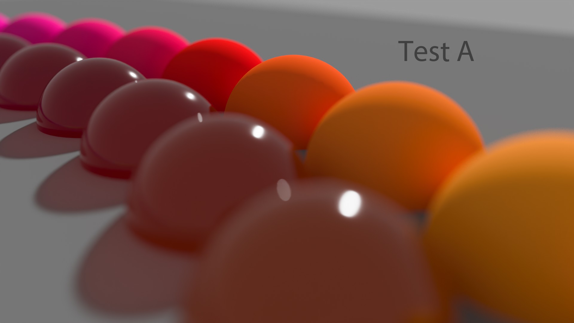
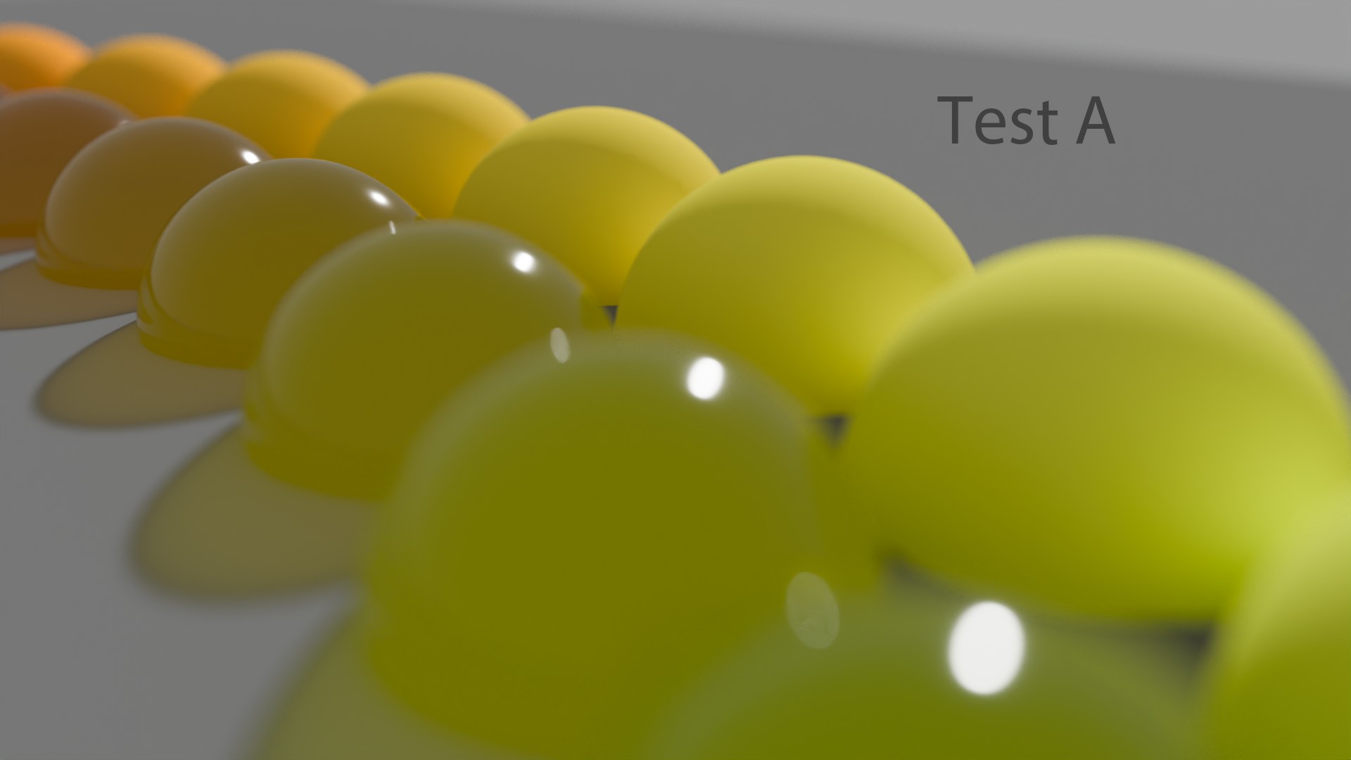
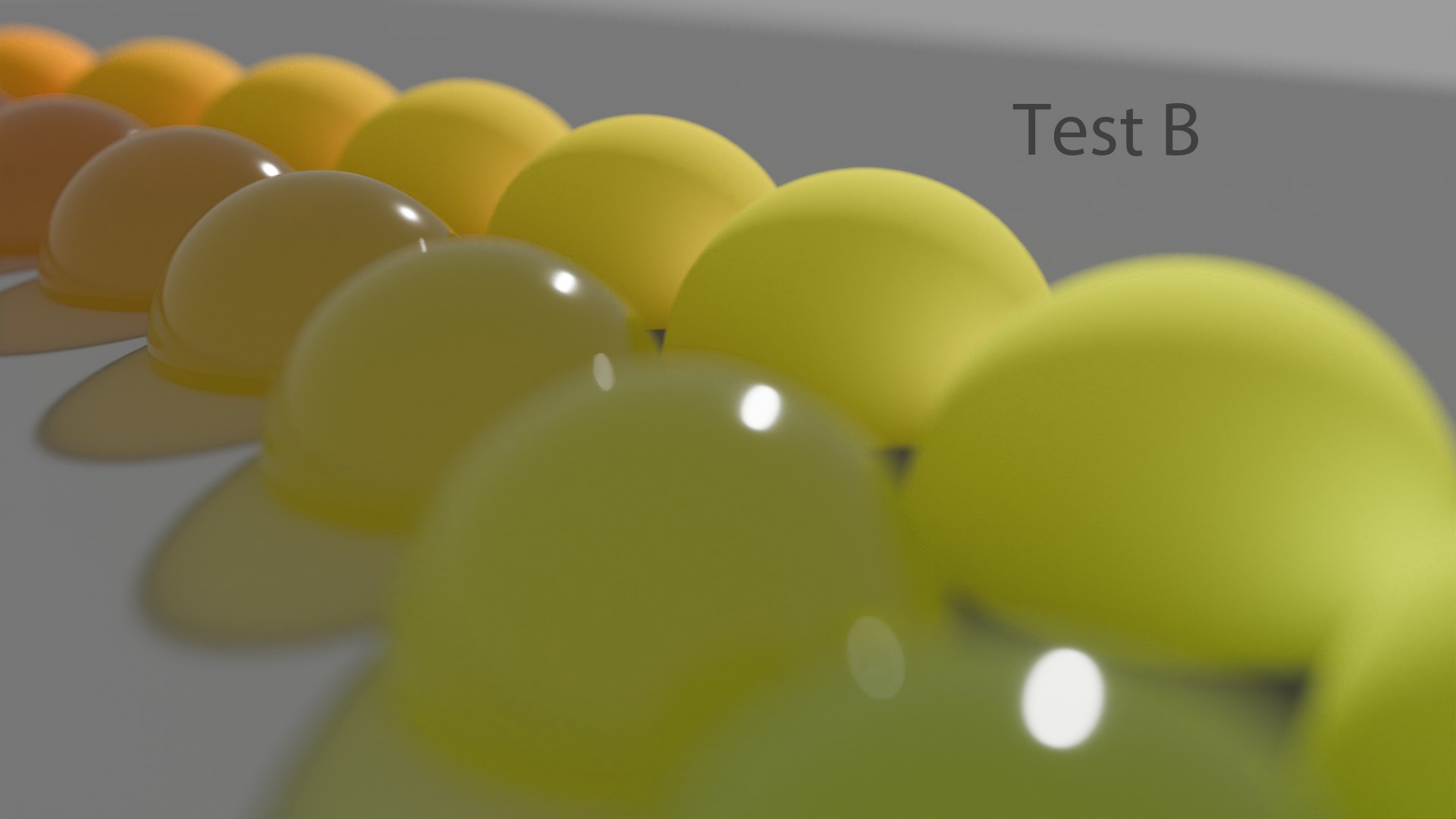
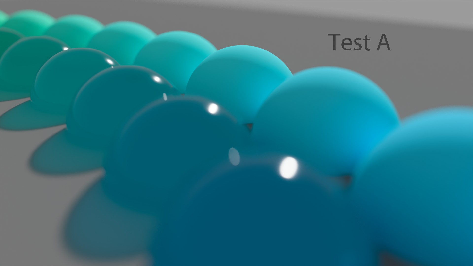
The only thing I can say is that rendering in ACEScg brings us closer to Spectral Rendering. Not that it looks better. Here a few tests done with some colored spheres. I’ll let you guess which ones have been rendered in ACEScg and which ones in “Linear_sRGB/Rec.709” :
我唯一能说的是,ACEScg 中的渲染使我们更接近光谱渲染。并不是说它看起来更好。下面是使用一些彩色球体进行的几个测试。我让你猜猜哪些是在 ACEScg 中渲染的,哪些是在“Linear_sRGB/Rec.709”中渲染的:
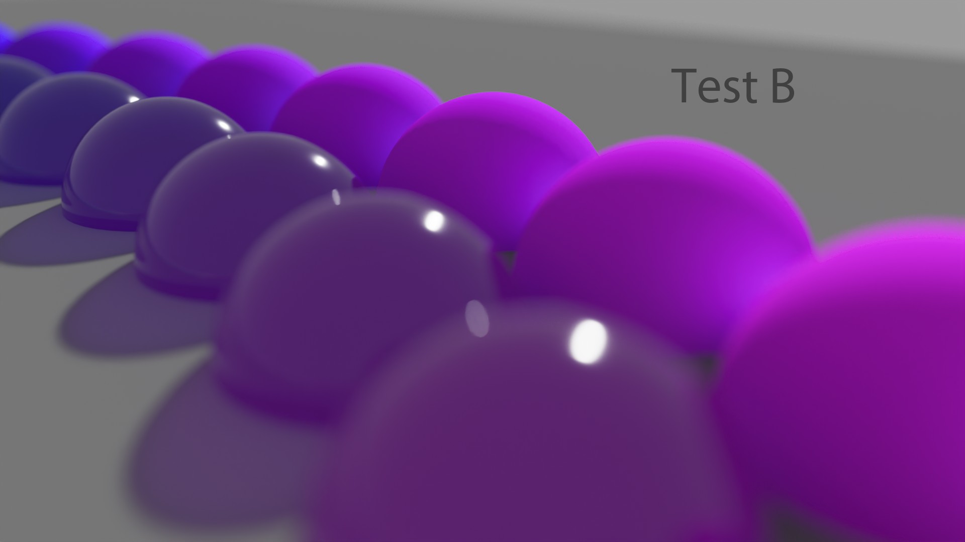
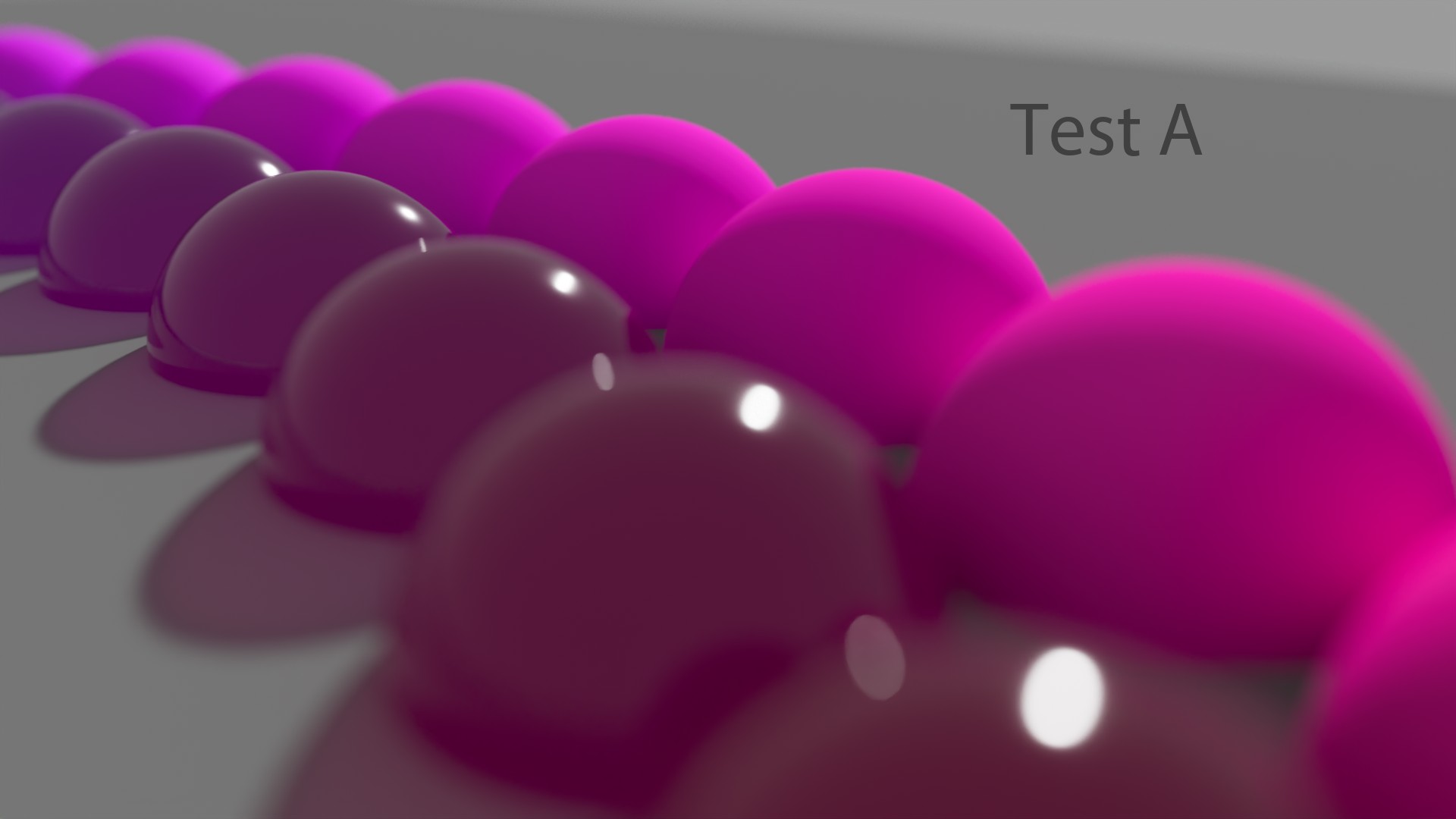
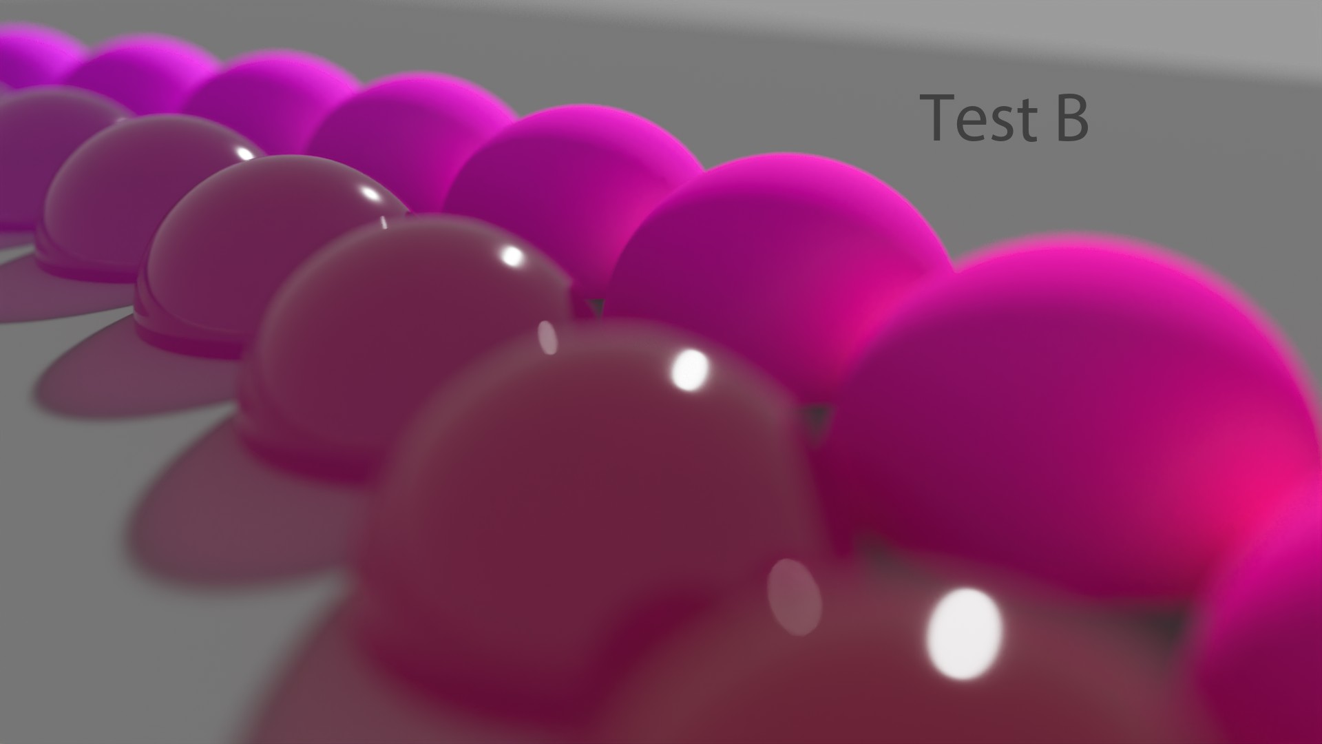
ACEScg is the jack of all trades.
ACEScg 是万事通。
Thomas Mansencal, about RGB Scene Rendering.
Thomas Mansencal,关于 RGB 场景渲染。
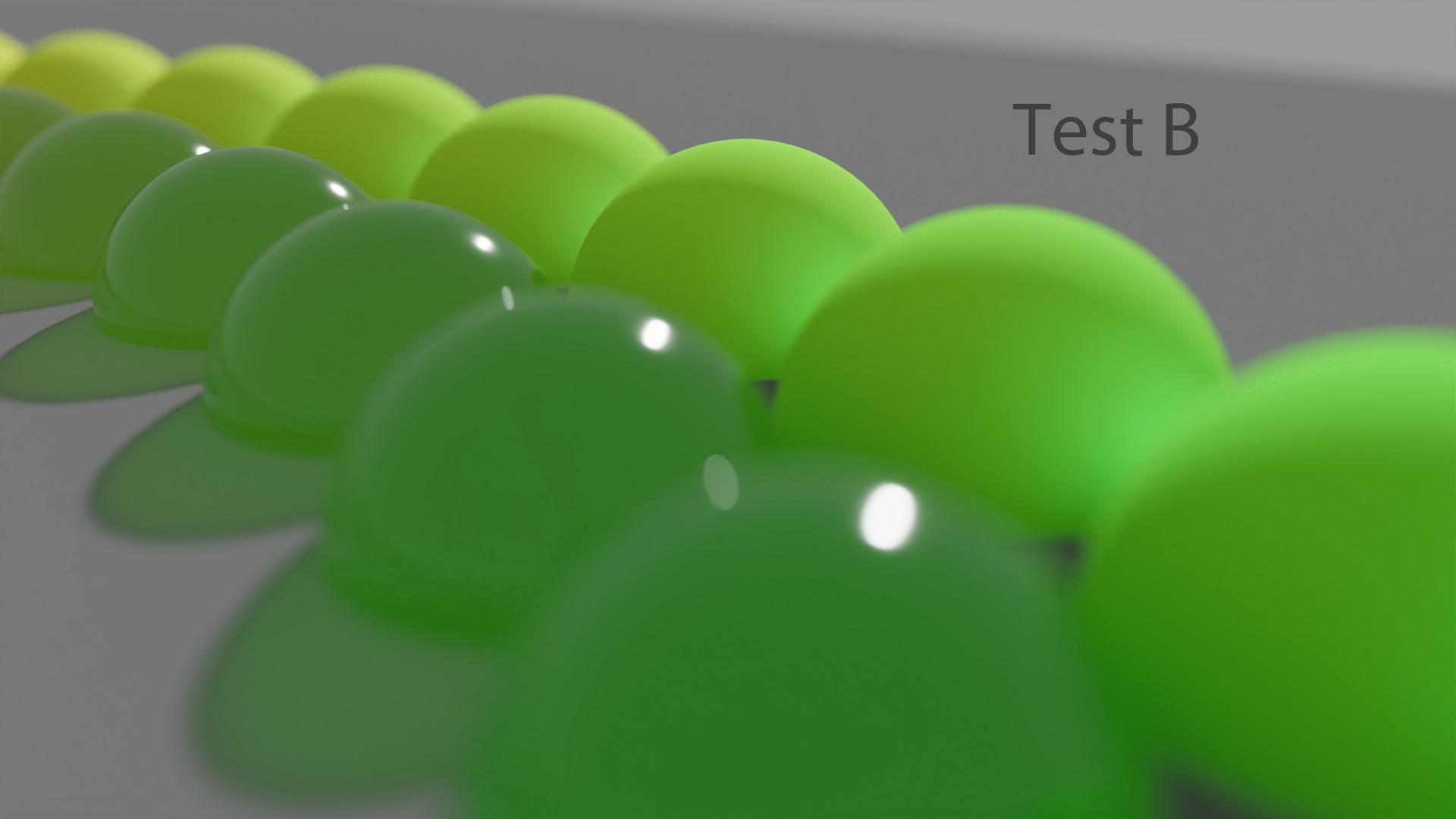
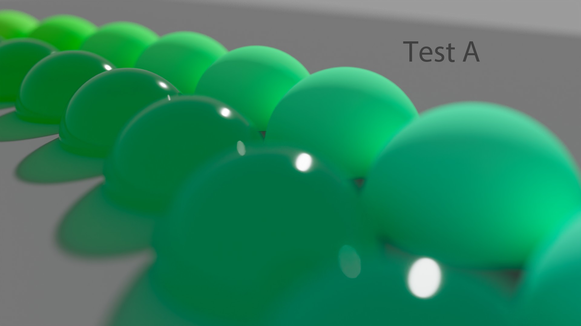
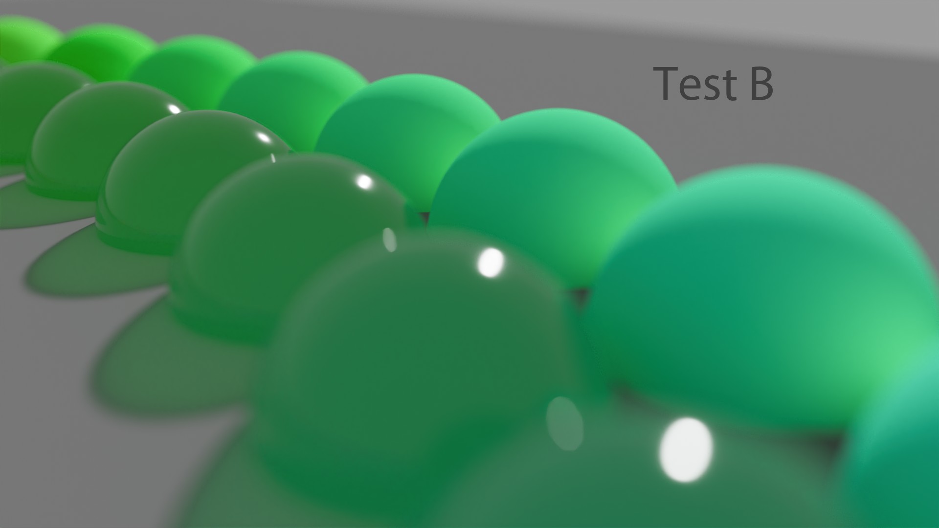
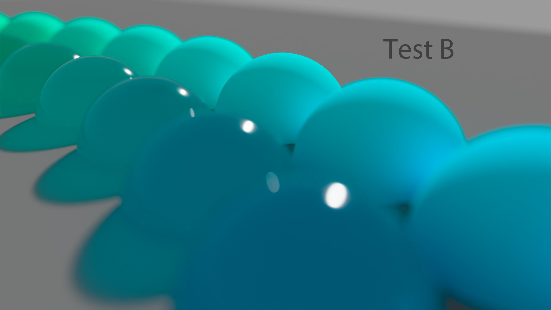
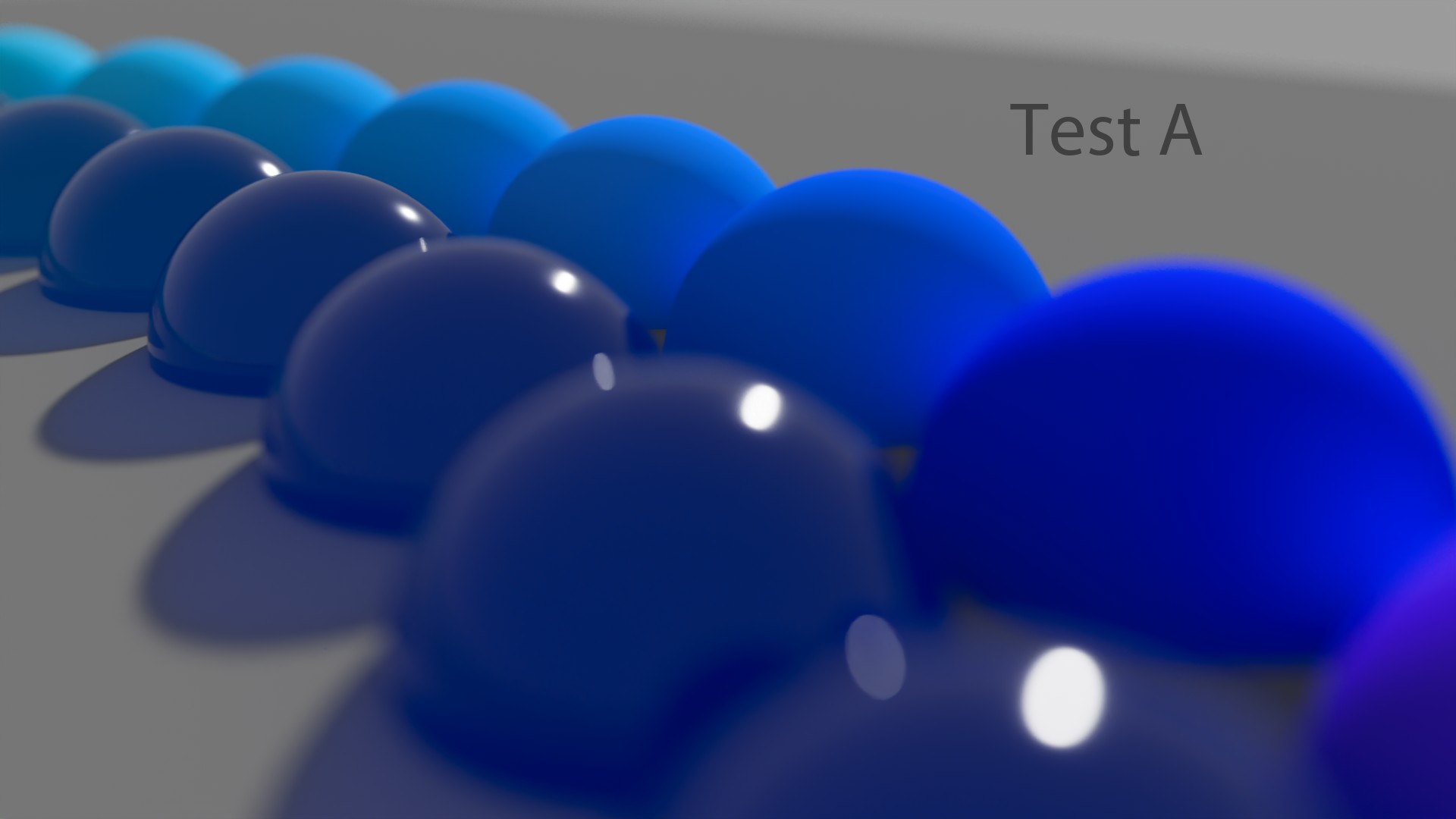
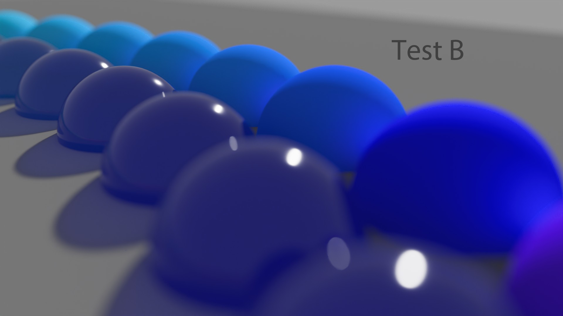
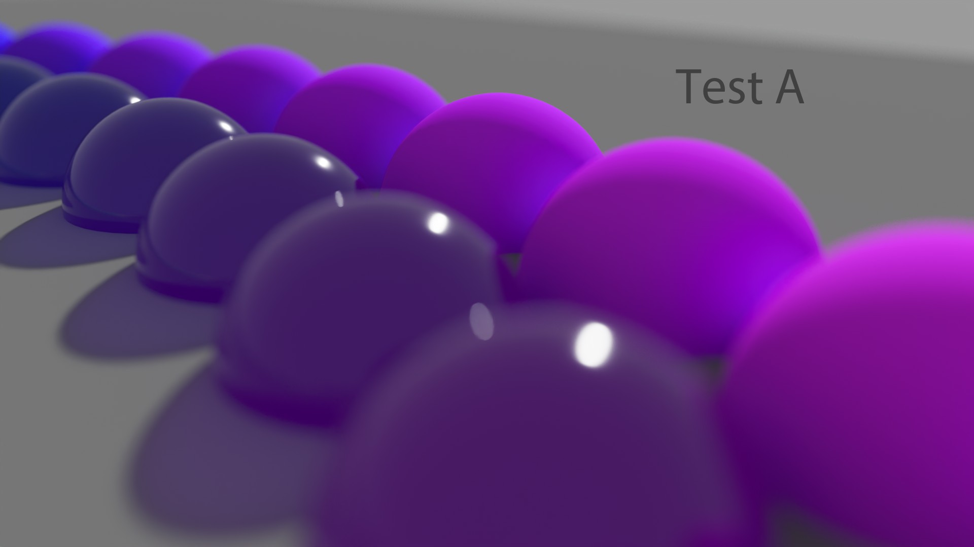
So, yeah, normally the “typical” answer about these colored spheres is : “Easy ! Test B has been rendered in ACEScg ! There is more bounce and Global Illumination (GI). ” But nope ! That’s the other way around. All of these “Test B” images have been rendering in “Linear_sRGB/Rec.709” and all the “Test A” in ACEScg. Crazy, right ?
所以,是的,通常关于这些彩色球体的“典型”答案是:“简单!测试 B 已在 ACEScg 中渲染!有更多的反弹和全局照明 (GI)。 ”但事实并非如此!情况正好相反。所有这些“测试 B”图像都在“Linear_sRGB/Rec.709”中渲染,而所有“测试 A”都在 ACEScg 中渲染。疯狂吧?
But I will not repeat my past mistake here : I cannot honestly say one colorspace is better than the other. They give different results and ACEScg is closer to Spectral Rendering. That’s all I can say.
但我不会在这里重复我过去的错误:我不能诚实地说一个色彩空间比另一个更好。它们给出不同的结果,ACEScg 更接近光谱渲染。我只能说这些。
地面实况 Ground Truth
So, we have seen different Display Transforms, all based on Per-Channel/RGB lookup. Some of them work better than others. But where does this leaves us ? Is there some kind of neutral ground truth somewhere ? How can we possibly know if what we’re viewing is “correct” ?
因此,我们已经看到了不同的显示变换,它们都基于每个通道/RGB 查找。其中一些比其他的效果更好。但这给我们带来了什么?是否存在某种中立的地面事实?我们如何才能知道我们看到的是否“正确”?
I’ll just quickly add that even though a per-channel approach may give “acceptable” results (such as ARRI ALF-2), you’ll probably face its limitations if you are doing multiple deliveries on a show (such as SDR/HDR for instance).
我只想快速补充一点,即使每个通道方法可能会产生“可接受的”结果(例如 ARRI ALF-2),但如果您在节目中进行多次交付(例如 SDR/HDR),您可能会面临它的局限性。
See Daniele’s post about that.
请参阅Daniele关于该内容的帖子。
色度线性方法 Chromaticity linear approach
I can only think of two options so far… Remember the plots we have done for each Output Transform ? We could consider straight lines in the chromaticity domain as “neutral”, aka no deformation of the chromaticities through the Display Transforms.
到目前为止,我只能想到两个选项……还记得我们为每个输出变换绘制的图吗?我们可以将色度域中的直线视为“中性”,也就是说,通过显示变换不会对色度造成变形。
These plots with Open DRT (using v0.0.83b2) were the only ones where I did not have to put crazy tiny values to show properly the chromaticities’ paths towards the achromatic axis. Just look how the stepping is regular and neat. No distortion at all !
这些使用Open DRT(使用 v0.0.83b2)绘制的图是唯一不需要输入极小值就能正确显示色度朝向消色差轴的路径的图。看看步进是多么规则和整齐。一点失真都没有!


Here are the values used for these plots. A more regular step to show exactly what’s going on :
以下是这些图所使用的值。更常规的步骤可以准确显示正在发生的事情:
| Color Management | Sweep Primaries | R | + 0.2 G | + 0.4 G | + 0.6 G | + 0.8 G | Y |
|---|---|---|---|---|---|---|---|
| Open DRT | sRGB | 1, 0, 0 | 1, 0.2, 0 | 1, 0.4, 0 | 1, 0.6, 0 | 1, 0.8, 0 | 1, 1, 0 |
| Filmic Hable | sRGB | 1, 0.00001, 0.00001 | 1, 0.2, 0.00001 | 1, 0.4, 0.00001 | 1, 0.6, 0.00001 | 1, 0.8, 0.00001 | 1, 1, 0.00001 |
| spi-anim | sRGB | 1, 0.00001, 0.00001 | 1, 0.2, 0.00001 | 1, 0.4, 0.00001 | 1, 0.6, 0.00001 | 1, 0.8, 0.00001 | 1, 1, 0.00001 |
| spi-vfx | sRGB | 1, 0.00001, 0.00001 | 1, 0.2, 0.00001 | 1, 0.4, 0.00001 | 1, 0.6, 0.00001 | 1, 0.8, 0.00001 | 1, 1, 0.00001 |
| Filmic High Contrast | ACEScg | 1, 0, 0 | 1, 0.2, 0 | 1, 0.4, 0 | 1, 0.6, 0 | 1, 0.8, 0 | 1, 1, 0 |
| sRGB (ACES) | ACEScg | 1, 0, 0 | 1, 0.2, 0 | 1, 0.4, 0 | 1, 0.6, 0 | 1, 0.8, 0 | 1, 1, 0 |
| sRGB (ACES) | ACEScg | 1, 0, 0 | 1, 0.2, 0 | 1, 0.4, 0 | 1, 0.6, 0 | 1, 0.8, 0 | 1, 1, 0 |
| 色彩管理 | 扫除初选 | R | + 0.2 克 | + 0.4 克 | + 0.6 克 | + 0.8 克 | 是 |
|---|---|---|---|---|---|---|---|
| 打开DRT | sRGB | 1,0,0 | 1、0.2、0 | 1、0.4、0 | 1、0.6、0 | 1、0.8、0 | 1,1,0 |
| 电影哈勃 | sRGB | 1,0.00001,0.00001 | 1、0.2、0.00001 | 1、0.4、0.00001 | 1、0.6、0.00001 | 1、0.8、0.00001 | 1,1,0.00001 |
| spi 动画 | sRGB | 1,0.00001,0.00001 | 1、0.2、0.00001 | 1、0.4、0.00001 | 1、0.6、0.00001 | 1、0.8、0.00001 | 1,1,0.00001 |
| spi-vfx | sRGB | 1,0.00001,0.00001 | 1、0.2、0.00001 | 1、0.4、0.00001 | 1、0.6、0.00001 | 1、0.8、0.00001 | 1,1,0.00001 |
| 电影高对比度 | 血管紧张素转换酶 | 1,0,0 | 1、0.2、0 | 1、0.4、0 | 1、0.6、0 | 1、0.8、0 | 1,1,0 |
| sRGB(ACE) | 血管紧张素转换酶 | 1,0,0 | 1、0.2、0 | 1、0.4、0 | 1、0.6、0 | 1、0.8、0 | 1,1,0 |
| sRGB(ACE) | 血管紧张素转换酶 | 1,0,0 | 1、0.2、0 | 1、0.4、0 | 1、0.6、0 | 1、0.8、0 | 1,1,0 |
I had to use 0.00001 instead of 0 for spi-anim, spi-vfx and Hable’s Filmic in order to get the “path-to-white” working and a proper plot. Hopefully the comparisons still stand !
我必须对 spi-anim、spi-vfx 和 Hable's Filmic 使用 0.00001 而不是 0,才能使“path-to-white”正常工作并产生正确的情节。希望比较仍然有效!
色度线性定义 Chromaticity linear definition
It is probably worth taking a bit of time to define what those words mean. There has been some very interesting debate about them on ACESCentral. Several expressions have been used to describe what we’re trying to achieve : “hue-linear“, “hue-preserving“, “chromaticity preserving” or “dominant wavelength preserving“… I won’t go in which expression seems more appropriate since it has been debated by greater minds here.
也许值得花点时间来定义这些词的含义。ACESCentral上有一些关于它们的非常有趣的争论。有几种表达方式被用来描述我们试图实现的目标:“色调线性”、“色调保留”、“色度保留”或“主波长保留”……我不会讨论哪种表达方式更合适,因为这里的大人物已经对此进行了辩论。
So I’ll just quote Thomas because his explanation is simple and efficient :
所以我只引用托马斯的话,因为他的解释简单而有效:
We are saying that one of its quality [aka a chromaticity linear path to white] is that it preserves the dominant wavelength of any chromaticity coordinates it affects.
我们说,它的一个特性 [又名色度线性路径到白色] 是它保留了它影响的任何色度坐标的主波长。
Great definition by Thomas Mansencal.
托马斯·曼森卡尔 (Thomas Mansencal) 的出色定义。
消色差图像 Achromatic images
The second option I have been playing with is super simple and almost “stupid“. We can desaturate at 100% our images and the tonality is back ! It sounds ridiculous but it is an interesting exercise to do. It was inspired to me by the excellent video by Peter Postma (tree example at 04:55).
我一直在尝试的第二个选项非常简单,甚至可以说是“愚蠢”。我们可以将图像的饱和度降低到 100%,色调就会恢复!这听起来很荒谬,但这是一个有趣的练习。我的灵感来自 Peter Postma 的精彩视频(04:55 处的树示例)。
原始视频:https://www.youtube.com/watch?v=M47YdERx11s
There are probably more sophisticated ways to calculate the Luminance/Brightness of an image. I have used the simplest one because… I don’t know better !
可能有更复杂的方法来计算图像的亮度。我使用了最简单的方法,因为……我不知道更好的方法!
Let’s have a look !
让我们看看吧!


You need to use the proper “luminance math.” in order to desaturate correctly based on the primaries. You can use Jed’s Saturation tool for ACEScg.
您需要使用正确的“亮度数学”,以便根据原色正确地去饱和。您可以使用Jed 的ACEScg饱和度工具。
That’s what I did in this post.
这就是我在这篇文章中所做的。
I think it is an interesting exercise because it can be very difficult to define exactly what looks “wrong” with the “colour versions“. Let’s try :
我认为这是一个有趣的练习,因为很难准确定义“颜色版本”中哪些地方看起来“不对劲” 。让我们尝试一下:
“It looks weird”, ‘it looks flat”, “it doesn’t look natural”, “it looks clipped”… are few expressions I may have used to describe these images.
“它看起来很奇怪”,“它看起来很平”,“它看起来不自然”,“它看起来很剪裁”...... 是我用来描述这些图像的几个表达。
什么是声调? What is tone ?
And we’re coming to a key element here ! All these previous examples use a s-curve for tone-mapping. But what exactly does this mean ? What do these two words mean ?
现在我们来谈谈一个关键元素!所有这些前面的示例都使用 S 曲线进行色调映射。但这到底是什么意思?这两个词是什么意思?
- “Tone” as in “Tonality“, which is a range (or a system) of tones used in a picture.
- “色调” 即 “音调”,是图片中使用的色调范围(或系统)。
- A range of tones ? Like luminance for instance ? Or brightness ?
- 一系列色调?例如亮度?或者亮度?
So what would Tone-Mapping mean then ? This is best definition I have found online :
那么色调映射是什么意思呢?这是我在网上找到的最佳定义:
The handling of gray scale information in a patterned, predictable way.
以模式化、可预测的方式处理灰度信息。
Rory Gordon nailing it.
罗里·戈登 (Rory Gordon) 表现出色。
I also like very much this definition :
我也很喜欢这个定义:
We seek to map luminance (or brightness) to the display.
我们试图将亮度(或亮度)映射到显示器。
This is what Tone-Mapping should do. Definition by a fellow color nerd.
这就是色调映射应该做的事情。由一位色彩迷定义。
Revelation #17: According to this definition, we have never tone-mapped. Never. Yeah, thats’s a big one. Hard to believe, right ? But if you followed my steps closely, you should see and realize that none of the OCIO Configs described in this post maps properly the brightness to the display. None of them.
启示 #17:根据这个定义,我们从未进行过色调映射。从来没有。是的,这是一个大问题。很难相信,对吧?但如果你仔细按照我的步骤操作,你应该会看到并意识到这篇文章中描述的所有 OCIO 配置都不能正确地将亮度映射到显示器上。一个都没有。
And if you have difficulties to trust me, I don’t blame you ! But just look at these two images and tell me which one is using a simple sRGB EOTF and which one is “color managed” ?
如果你很难相信我,我不会责怪你!但只要看看这两幅图像,告诉我哪一个使用了简单的 sRGB EOTF,哪一个是“色彩管理”的?


And even better, there is an amazing post on ACESCentral about tone-mapping that was a game changer for me ! Let’s have a look !
更棒的是,ACESCentral 上有一篇关于色调映射的精彩文章,它改变了我的想法!我们来看看吧!
历史性的帖子 An historic post
So let’s dive in this great post by Sean Cooper :
那么让我们深入了解Sean Cooper 的这篇精彩文章:
I think the term “Tone Mapping” and “Tone Mapping Operator” largely comes from the computer graphics side of the coin whereas in historical terminology the topic as a whole is referred to as “Tone Reproduction” and the “Tone Reproduction Curve”. Where the former is largely used in the context of Image to Image “mapping”: HDR EXR to SDR JPEG for example. Whereas the latter definition is largely used in reference to Scene to Image “reproduction”, where both the Scene and resulting Image have “Tone” or “Tone Scale”, but the objective quality metric is the “reproduction” of “Tone” from one domain to another.
我认为“色调映射”和“色调映射运算符”这两个术语主要来自计算机图形学,而在历史术语中,整个主题被称为“色调再现”和“色调再现曲线”。前者主要用于图像到图像“映射”的上下文中:例如 HDR EXR 到 SDR JPEG。而后者的定义主要用于场景到图像的“再现”,其中场景和生成的图像都具有“色调”或“色调比例”,但客观质量指标是从一个域到另一个域的“色调”的“再现”。
关于语气 About tone
Sean goes on like this :
肖恩继续说道:
The term “Tone” its self is not scientific. There is a reason this does not show up in any color appearance models, nor the CIE Vocabulary, it is exclusive to the media/imaging community. I would place the origin of this concept in our community/domain first to Hurter and Driffield and their pioneering work on sensitometry, and later to L.A. Jones for his investigation of Tone Reproduction across the full imaging chain. I’ll leave it to the reader to explore the works of these individuals.
“色调”一词本身并不科学。它没有出现在任何色彩外观模型中,也没有出现在CIE 词汇表中,这是有原因的,因为它是媒体/成像社区所独有的。我认为这个概念在我们的社区/领域中的起源首先是 Hurter 和 Driffield 及其在感光度测定方面的开创性工作,后来是 LA Jones 对整个成像链中色调再现的研究。我将让读者去探索这些人的作品。
关于琼斯图 About Jones Diagram
This is really an historic post :
这真是一个历史性的帖子:
Specifically with respect to Jones and his 1920 “On the theory of tone reproduction, with a graphic method for the solution of problems”. He defines the problem space as “…the extent to which it is possible by the photographic process to produce a pictorial representation of an object which will, when viewed, excite in the mind of the observer the same subjective impression as that produced by the image formed on the the retina when the object its self is observed…”. He then goes on to say “The proper reproduction of brightness and brightness differences…is of preeminent importance…”.
具体来说,琼斯在 1920 年发表了“关于色调再现理论,以及解决问题的图形方法”。他将问题空间定义为“……通过摄影过程产生物体图像的可能性,当观察该物体时,该物体在观察者心中产生的主观印象与观察物体本身时在视网膜上形成的图像产生的主观印象相同……”。然后他继续说:“正确再现亮度和亮度差异……至关重要……”。
关于亮度 About Brightness
It is really an amazing explanation :
这真是一个令人惊奇的解释:
Brightness does have a definition in the color science community, to quote Fairchild “…visual sensation according to which an area appears to emit more or less light”. Jones utilises an explicit simplifying assumption, which I believe is largely implicit in most discussions of “Tone Curves” or “Tone Mapping Operators”. That is, that all objects in the scene are non-selective, and the imaging forming mechanism is also non-selective. Non-selective meaning it absorbs/reflects all incident electromagnetic energy equally. He uses this simplification because “under such conditions values of visual brightness are directly proportional to photographic brightness.”
色彩科学界对亮度有一个定义,引用 Fairchild 的话来说,“……视觉感觉,根据该感觉,一个区域似乎发出更多或更少的光”。Jones 使用了一个明确的简化假设,我相信这在大多数关于“色调曲线”或“色调映射运算符”的讨论中都隐含着。也就是说,场景中的所有物体都是非选择性的,成像机制也是非选择性的。非选择性意味着它会平等地吸收/反射所有入射的电磁能量。他使用这种简化是因为“在这种情况下,视觉亮度值与摄影亮度成正比。”
There’s more to it. Let’s keep going !
还有更多。我们继续吧!
There are of course deviations in perceived brightness of the scene and reproduction with respect to many factors, reflective selectivity being one of them, that breaks the simplifying assumption. However, the simplifying assumption is used both for convenience, and to focus analysis on the primary principal component of Image Reproduction, or more specifically Tone Reproduction. With the added assumption that the dominant illuminant in the scene and the image viewing environment is the adopted illuminant, you could call this problem space more specially “Neutral Scale Tone Reproduction”.
当然,场景的感知亮度和再现会因多种因素而存在偏差,反射选择性就是其中之一,这打破了简化假设。然而,简化假设既是为了方便,也是为了将分析重点放在图像再现的主要主成分上,更具体地说是色调再现。再加上场景和图像观看环境中的主要光源是采用的光源的假设,你可以更特别地将这个问题空间称为“中性尺度色调再现”。
关于繁殖 About Reproduction
All that to say, “Tone Reproduction” is largely focused on the reproduction of Scene brightness (and relative brightness) of non-selective objects onto a non-selective Image medium.
总而言之,“色调再现”主要集中于将非选择性物体的场景亮度(和相对亮度)再现到非选择性图像介质上。
关于“电影” About “Film”
I would argue that the implicit assumption (of neutrality/ non-selectivity) is generally held by most that discuss the topic, and that rather the reference to “Film” is significantly more vague and less defined than “Tone”. “Film” being an incredibly varied and complex quantum mechanical piece of technology with over a century’s worth of innumerable manifestations. “Film” has done many things, from image my teeth at the dentist, help prove Einstein’s general theory of relativity, to being scratched with a knife by an animator and projected.
我认为,大多数讨论该主题的人都持有隐含的假设(中立性/非选择性),而“电影”一词比“音调”更加模糊和模糊。“电影”是一种极其多样化和复杂的量子力学技术,拥有一个多世纪的无数表现形式。“电影”做过很多事情,从在牙医那里拍摄我的牙齿,帮助证明爱因斯坦的广义相对论,到被动画师用刀刮擦并投影出来。
This is the part where I struggle the most : define “Film”.
这是我最困难的部分:定义“电影”。
We would do well to define “Film” in the same rigour as “Tone”, because I don’t believe the objective here is to emulate a single batch of a single brand of photo-chemical film processed on a certain day.
我们最好以与“色调”同样严格的标准来定义“胶片”,因为我不认为这里的目的在于模拟某一天处理的某个品牌的某一批光化学胶片。
S 曲线和路径转白 S-curves and Path-to-white
Finally this leads us directly to our next point… We have explained earlier that “s-curves” have nothing to do with this desired “path-to-white“. Nothing ! So what is at play here ?
最后,这直接引出了我们的下一个观点……我们之前已经解释过,“S 曲线”与这个期望的“白色路径”无关。一点关系都没有!那么这里到底发生了什么?
Revelation #18: the s-curve is only one module out of several for a Display Transform. This took me a while as well ! And without this enlightening post from Jed, I would have probably never figured it out myself !
启示 #18:S 曲线显示变换的多个模块中的一个。这也花了我一段时间!如果没有Jed 的这篇启发性帖子,我可能永远也不会自己弄明白!
If you have read carefully this post, you may have noticed that I have hinted at a very special ingredient. So special that it is only used in “Filmic Blender” and “OpenDRT“. Yes, I’m talking about Gamut Compress/Mapping. Check this demo out :
如果您仔细阅读了这篇文章,您可能已经注意到我暗示了一种非常特殊的成分。如此特殊以至于它仅在“ Filmic Blender ”和“ OpenDRT ”中使用。是的,我说的是色域压缩/映射。查看此演示:

. 例如您在这个 3d 图(左侧)中看到的点。")


Revelation #19 : In digital RGB land, the path-to-white must be engineered. Values do NOT go magically to white on a digital monitor. They can “only reach” 100% emission on R, G and B channels.
启示 #19 : 在数字 RGB 领域,必须设计通向白色的路径。数字显示器上的值不会神奇地变成白色。它们“只能达到” R、G 和 B 通道上的 100% 发射率。
But wait ! If all these OCIO configs use the same mechanics (per-channel or RGB lookup), why some of them “go-to-white” and some don’t ? Here are a few hints :
但是等等!如果所有这些 OCIO 配置都使用相同的机制(每个通道或 RGB 查找),为什么有些会“转为白色”,而有些则不会?以下是一些提示:
- A change of primaries in the Output Transform, like ACES.
- 输出变换中的原色发生改变,如 ACES。
- Gamut compression, like Filmic Blender.
- 色域压缩,如 Filmic Blender。
- Some secret sauce as well may interfere like the ACES “sweeteners” or the “ARRI Desaturation Matrix“.
- 一些秘密武器也可能会产生干扰,比如 ACES“甜味剂”或“ ARRI 去饱和矩阵”。
I won’t go more in detail here but yeah, that’s a big one. The path-to-white must be engineered properly for digital displays. I’m still properly amazed by this finding !
我不会在这里详细阐述,但确实,这是一个大问题。白色路径必须经过适当设计才能适应数字显示。我仍然对这一发现感到惊讶!
色度线性看起来很奇怪 Chromaticity linear looks weird
Okay, let’s take a deep breath. Where were we ? Yes, we were looking at Open DRT and its “chromaticity-linear” approach on the path-to-white. So, problem solved ? Colors don’t get distorted… Are we happy with that ? Well not exactly ! And this is where the most fascinating part kicks in.
好吧,让我们深吸一口气。我们说到哪儿了?是的,我们正在研究 Open DRT 及其在白色路径上的“色度线性”方法。那么,问题解决了吗?颜色不会失真……我们对此感到满意吗?其实并不完全满意!而这正是最迷人的部分。
Revelation #20 : Even if a “chromaticity linear” approach is desirable, it does not create necessarily pleasing images. It is just a layer of “ground truth” that we may build upon.
启示 #20:即使“色度线性”方法可取,它也不一定能创造出令人愉悦的图像。它只是一层我们可以在其上构建的“基本事实”。
As suprising as it sounds, we do NOT want necessarily straight lines in the chromaticity domain to display our images. Because if you have a look at the BT.709 blue primary going to white on a straight line in the 1976 CIE diagram, you may observe what we call the *Abney Effect*.
听起来可能有点奇怪,但我们并不希望色度域中的直线显示我们的图像。因为如果您查看 1976 CIE 图中 BT.709 蓝原色沿直线变为白色,您可能会观察到我们所谓的*Abney 效应*。

, you can bend the straight line in the chromaticity diagram to take this effect into account. 通过使用感知色彩空间(例如 ICtCp),您可以弯曲色度图中的直线以考虑这种影响。")


Yup, we have just opened a big can of worms : psychophysical effects happening in our brain (or to be more accurate in the “Human Visual System“). And you can only imagine the challenge it is to model those phenomenons with mathematics ! Because it is not only the Abney Effect… There’s a whole bunch of them !
是的,我们刚刚打开了一个大麻烦:我们的大脑中(或者更准确地说是“人类视觉系统”)发生的心理物理效应。你只能想象用数学建模这些现象的挑战!因为这不仅仅是阿布尼效应……还有很多!
It was Abney’s experiments which showed that a straight line to adopted white in chromaticity domain does not produce a hue isoline.
阿布尼 (Abney) 的实验表明,在色度域中采用的白色直线不会产生色调等值线。
Another great post by Sean Cooper.
肖恩·库珀 (Sean Cooper) 的另一篇精彩文章。
颜色外观模型 Color Appearance Models
We have now entered the fascinating world of Color Appearance Models, which divide in four types :
现在,我们已经进入了令人着迷的色彩外观模型世界,该模型分为四种类型:
- Contrast appearance (Stevens Effect, Simultaneous contrast…)
- 对比外观(史蒂文斯效应、同时对比……)
- Colorfulness appearance (Hunt effect…)
- 色彩外观(狩猎效应……)
- Hue appearance (Abney effect, Bezold-Brücke effect…)
- 色调外观(Abney 效应、Bezold-Brücke 效应……)
- Brightness appearance (Helmholtz-Kohlrausch effect, lateral-brightness adaptation…)
- 亮度外观(亥姆霍兹-科尔劳施效应、横向亮度适应……)
And Jed is using (in v0.0.83b2) the ICtCp colorspace to address this perceptual facet. Fascinating ! This is another argument in favor of a “chromaticity linear” approach. How can you build a perceptual system (based on sensation) without nailing first the stimulus part (the chromaticities) ?
Jed 正在使用(在 v0.0.83b2 中)ICtCp 色彩空间来解决这个感知方面的问题。太有趣了!这是支持“色度线性”方法的另一个论点。如果不先确定刺激部分(色度),你怎么能建立一个基于感觉的感知系统呢?
I would strongly encourage anyone to read Sean’s answer where he describes hue isolines in the Dolby ICtCp colorspace.
我强烈建议大家阅读Sean 的回答,他在其中描述了杜比 ICtCp 色彩空间中的色调等值线。
What an eye opener !
真是令人大开眼界!
This is what per-channel may never give you : a strong fundation to build your house on top. It is a happy engineered accident. There is this quote about Color Appearance Models that I found very interesting. It is from Ed Giorgianni, Color Management for Digital Cinema. I have slightly modified it to avoid any ambiguity :
这是每个通道可能永远无法给你的东西:一个坚实的基础,让你在上面建造房子。这是一个幸福的工程事故。有一段关于色彩外观模型的引言我觉得很有趣。它来自 Ed Giorgianni,《数字电影色彩管理》。我稍作修改以避免任何歧义:
Revelation#21 ** : For color appearance, the colorimetry of a displayed image always must be altered (rendered) in an engineered and controlled way ****** from that of an original live scene.
启示#21:对于色彩外观,所显示图像的色度总是必须以精心设计和控制的方式根据原始实时场景的色度进行改变(渲染)。
Because per-channel is altering the colorimetry in an accidental way…
因为每个通道都在以意外的方式改变比色法……
If you want to know more about the ACES Output Transform and Color Appearance models, I would suggest to read this thread from… 2017 !
如果您想了解有关 ACES 输出变换和颜色外观模型的更多信息,我建议您阅读2017 年的这个帖子!
TCAMv2
So now we have understood what Display Transforms are about (hopefully !), you may ask yourself : is there an OCIO config out there that addresses the different topics discussed in this post ? And the answer is yes ! There is one !
现在我们已经了解了显示变换的含义(希望如此!),您可能会问自己:是否有一个 OCIO 配置可以解决本文中讨论的不同主题?答案是肯定的!有一个!
TCAMv2 描述 TCAMv2 description
I would like to state clearly that TCAMv2 is NOT open-source. It is the work of Filmlight’s engineers and I am only mentioning it in this article because I have been given permission. Let’s have a look at the config itself :
我想明确指出,TCAMv2 不是开源的。它是 Filmlight 工程师的作品,我之所以在本文中提及它,只是因为我已获得许可。让我们来看看配置本身:
displays:
  TCAMv2 100 nits office:
    - !<View> {name: "sRGB Display: 2.2 Gamma - Rec.709", colorspace: "sRGB Display: 2.2 Gamma - Rec.709"}
  TCAMv2 100 nits video dim:
    - !<View> {name: "Rec1886: 2.4 Gamma - Rec.709", colorspace: "Rec1886: 2.4 Gamma - Rec.709"}
  TCAMv2 48 nits cinema dark:
    - !<View> {name: "DCI: 2.6 Gamma - P3D65", colorspace: "DCI: 2.6 Gamma - P3D65"}
  TCAMv2 48 nits cinema dark - MWP D65:
    - !<View> {name: "DCI: 2.6 Gamma - XYZ", colorspace: "DCI: 2.6 Gamma - XYZ"}
  TCAMv2 100 nits videoWide dim:
    - !<View> {name: "Rec1886: 2.4 Gamma - Rec.2020", colorspace: "Rec1886: 2.4 Gamma - Rec.2020"}
  TCAMv2 100 nits officeWide:
    - !<View> {name: "AdobeRGB: 2.2 Gamma - AdobeRGB", colorspace: "AdobeRGB: 2.2 Gamma - AdobeRGB"}
  TCAMv2 1000 nits videoWide dim - OOTF 1.2:
    - !<View> {name: "Rec2100: HLG - 2020 - 1000 nits", colorspace: "Rec2100: HLG - 2020 - 1000 nits - OOTF 1.2"}
  TCAMv2 1000 nits videoWide dim:
    - !<View> {name: "Rec2100: PQ - 2020 - 1000 nits", colorspace: "Rec2100: PQ - 2020 - 1000 nits"}
  TCAMv2 4000 nits videoWide dim:
    - !<View> {name: "Rec2100: PQ - 2020 - 4000 nits", colorspace: "Rec2100: PQ - 2020 - 4000 nits"}
  USE ONLY FOR CHECKING COMPS:
    - !<View> {name: LowContrast, colorspace: "FilmLight: T-Log - E-Gamut"}
  USE ONLY FOR COMPARING RENDERS:
    - !<View> {name: ReferenceLINEAR, colorspace: "FilmLight: Linear - E-Gamut"}
“Displays” and “Views” are bit mixed up. But it’s not a big deal since we know how to fix this. This is what I have done in my custom TCAMv2 OCIO config :
“显示” 和 “视图” 有点混淆。但这不是什么大问题,因为我们知道如何解决这个问题。这是我在自定义 TCAMv2 OCIO 配置中所做的:
displays:
  sRGB 100 nits office:
    - !<View> {name: TCAMv2, colorspace: TCAMv2 - sRGB - 2.2 Gamma}
    - !<View> {name: Raw, colorspace: acescg}
    - !<View> {name: Log, colorspace: acescct}
  Rec.1886 100 nits video dim:
    - !<View> {name: TCAMv2, colorspace: TCAMv2 - Rec.709 - 2.4 Gamma}
    - !<View> {name: Raw, colorspace: acescg}
    - !<View> {name: Log, colorspace: acescct}
  P3D65 48 nits cinema dark:
    - !<View> {name: TCAMv2, colorspace: TCAMv2 - P3D65 - 2.6 Gamma}
    - !<View> {name: Raw, colorspace: acescg}
    - !<View> {name: Log, colorspace: acescct}

active_displays: [sRGB 100 nits office, Rec.1886 100 nits video dim,
P3D65 48 nits cinema dark]
active_views: [TCAMv2, Raw, Log]
One possible improvement in terms of terminology in the TCAM OCIO Config (and that’s what I have done in mine) is that the “Views” name are ambiguous… If the View is called “sRGB Display: 2.2 Gamma – Rec.709“, there is absolutely no way for me to know if this is using a “simple” 2.2 power law or the actual TCAMv2 DRT.
TCAM OCIO 配置中的术语方面的一个可能的改进(这就是我在我的配置中所做的)是“视图”名称不明确...如果视图被称为“ sRGB 显示:2.2 Gamma - Rec.709 ”,我绝对没有办法知道这是使用“简单”的 2.2 幂律还是实际的 TCAMv2 DRT。
TCAMv2 设置 TCAMv2 settings
I have been asked a couple of times about this config’s terminology. Yes, it is different from the ACES’ one and it can be unsettling… But don’t be afraid by a couple of terms that are here to help you ! Let’s see if we can classify the information from the config :
我已经多次被问到这个配置的术语了。是的,它与 ACES 的配置不同,而且可能令人不安……但不要害怕这几个术语,它们会帮到你!让我们看看我们能否对配置中的信息进行分类:
| Name | Screen’s brightness | Type | Viewing Environment | Primaries | White Point | Transfer Function | ACES “equivalent” |
|---|---|---|---|---|---|---|---|
| sRGB Display | 100 nits | office | X | Rec.709 | X | 2.2 Gamma | Output – sRGB |
| Rec.1886 | 100 nits | video | dim | Rec.709 | X | 2.4 Gamma | Output – Rec.709 |
| DCI | 48 nits | cinema | dark | P3 | D65 | 2.6 Gamma | Output – P3D65 |
| 姓名 | 屏幕亮度 | 类型 | 查看环境 | 初选 | 白点 | 传递函数 | ACES“等同” |
|---|---|---|---|---|---|---|---|
| sRGB 显示屏 | 100 尼特 | 办公室 | 十 | Rec.709 | 十 | 2.2 伽马 | 输出 – sRGB |
| 1886 年 | 100 尼特 | 视频 | 暗淡 | Rec.709 | 十 | 2.4 伽马 | 输出 – Rec.709 |
| 直流电源 | 48 尼特 | 电影 | 黑暗的 | P3 | D65 | 2.6 伽马 | 输出 – P3D65 |
sRGB and Rec.709 colorspaces have a fixed White Point of D65. I guess this is why it is not specified in the OCIO configs. And I’m not sure why the name “DCI” was used for the “P3-D65” Display Transform. […] Normally “DCI” would imply a DCI whitepoint. […] DCI has a “technical whitepoint” of the greenish DCI white (~D63). However you can encode any whitepoint you want within that container. Commonly this is D60 white in a DCI container. Could be D65 or D55.
sRGB 和 Rec.709 色彩空间的白点固定为 D65。我猜这就是为什么它未在 OCIO 配置中指定的原因。我不确定为什么“P3-D65”显示变换使用“DCI”这个名称。[…] 通常,“DCI”暗示 DCI 白点。[…] DCI 具有绿色 DCI 白色(~D63)的“技术白点”。但是,您可以在该容器内编码任何您想要的白点。通常这是 DCI 容器中的 D60 白色。可能是 D65 或 D55。
Zach and Jed to the rescue.
扎克和杰德前来救援。
By having these details directly in the OCIO config, you don’t have to guess which primaries or EOTF is being used. The TCAM OCIO Config is pretty handy since you have most of the important information in one place.
通过将这些详细信息直接放在 OCIO 配置中,您不必猜测正在使用哪个主设备或 EOTF。TCAM OCIO 配置非常方便,因为您可以将大多数重要信息集中在一个地方。
With the ACES Output Transform, if you have any doubt, you can check the CTL reference code. It is actually super easy to read and has lots of useful information in it. For instance, it clearly states for the sRGB ODT :
对于 ACES 输出变换,如果您有任何疑问,可以查看CTL 参考代码。它实际上非常容易阅读,并且包含许多有用的信息。例如,它清楚地说明了 sRGB ODT:
// Display EOTF :
//  The reference electro-optical transfer function specified in
//  IEC 61966-2-1:1999.
//  Note: This EOTF is *NOT* gamma 2.2
So please note because this is dead important, that the ACES Output – sRGB uses the sRGB piecewise function when the TCAMv2 sRGB Display uses the Gamma 2.2. That’s a big difference.
因此请注意,因为这非常重要,当 TCAMv2 sRGB 显示器使用 Gamma 2.2 时,ACES 输出 - sRGB 使用 sRGB 分段函数。这是一个很大的区别。
TCAMv2 术语 TCAMv2 terminology
The TCAMv2 OCIO Config is super light (26 MB) and only contains two families : “SceneReferred” and “DisplayReferred“. Simple and neat ! As you can see in the comparison below, the colorspaces and “general concepts” are the same. So it is fairly simple to switch from one to another (especially if you use “roles” properly) :
TCAMv2 OCIO 配置非常轻量(26 MB),仅包含两个系列:“ SceneReferred ”和“ DisplayReferred ”。简单又整洁!正如您在下面的比较中看到的,颜色空间和“一般概念”是相同的。因此,从一个切换到另一个相当简单(特别是如果您正确使用“角色”):
| ACES OCIO terminology | TCAM OCIO terminology |
|---|---|
| ACES – ACEScg | “ACEScg: Linear – AP1” |
| Input – ARRI – Linear – ALEXA Wide Gamut | “ARRI: Linear – WG” |
| Output – sRGB | “sRGB Display: 2.2 Gamma – Rec.709” |
| Utility – sRGB – Texture | X |
| Utility – Linear – sRGB | “CGI: Linear – Rec.709” |
| ACES OCIO 术语 | TCAM OCIO 术语 |
|---|---|
| ACES – ACEScg | “ACEScg:线性 – AP1” |
| 输入 – ARRI – 线性 – ALEXA 广色域 | “ARRI: 线性 – WG” |
| 输出 – sRGB | “sRGB 显示器:2.2 Gamma – Rec.709” |
| 实用程序 – sRGB – 纹理 | X |
| 实用 – 线性 – sRGB | “CGI:线性 – Rec.709” |
True, “Utility – sRGB – Texture” is missing from the TCAM config. You can either add it yourself or switch to a full “scene-linear” texture workflow.
确实,TCAM 配置中缺少“Utility – sRGB – Texture”。您可以自行添加,也可以切换到完整的“场景线性”纹理工作流程。
TCAMv2 视觉示例 TCAMv2 visual examples
Cool ! Let’s have a look at some images now to see how TCAMv2 performs.
太棒了!现在让我们看一些图像来了解 TCAMv2 的性能。
 and you may observe the Abney Effect with the blue sweep. 此显示渲染变换是“中性的”(色度图中的直线),您可以通过蓝色扫描观察阿布尼效应。")


A couple of comments :
一些评论:
- These are pretty good sweeps ! Path-to-white on sRGB primaries and no “Notorious6” !
- 这些扫描效果非常好!sRGB 原色上的路径为白色,没有“ Notorious6 ”!
- This looks like a neutral Display Rendering Transform. Finally !
- 这看起来像一个中性的显示渲染变换。终于!
Here is a great explanation about the TCAMv2’s philosophy :
以下是关于 TCAMv2 哲学的精彩解释:
TCAM is different from the other Colour Management workflows because it does not impart a creative “Look” to the display rendering transform. So the creative look belongs to the grading stack and not to the display transform.
TCAM 与其他色彩管理工作流程不同,因为它不会将创意“外观”赋予显示渲染转换。因此,创意外观属于分级堆栈,而不是显示转换。
Daniele Siragusano.
丹尼尔·西拉古萨诺。
And this is a great vantage of this Color Management Workflow. For the first time in my career, I’m going to be able to lookdev an asset in a neutral way, without any arbitrary “happy accident” distortion. And then, when we move to the Lighting/Rendering stage, we can choose a “Look” based on our preferences. Awesome ! If you want to know more about TCAMv2, here is a great video of explanation :
这是色彩管理工作流程的一大优势。在我的职业生涯中,我第一次能够以中性的方式对资产进行外观设计,而不会出现任何任意的“意外”扭曲。然后,当我们进入照明/渲染阶段时,我们可以根据我们的偏好选择“外观”。太棒了!如果你想了解更多关于 TCAMv2 的信息,这里有一个很棒的解释视频:
原始视频:https://www.youtube.com/watch?v=4BOhKOFtHyg&t=1s
But, wait… Should we check our ACEScg images through TCAMv2 to see how they look ? Sure, let’s do that ! But before a quick recap on the different Color Management Workflows and their colorspaces.
但是,等等……我们应该通过 TCAMv2 检查我们的 ACEScg 图像以查看它们的外观吗?当然,让我们这样做!但在快速回顾不同的色彩管理工作流程及其色彩空间之前。
不同的色彩空间 Different colorspaces
I have been told that in order to do a fair comparison between different Color Management Workflows, I should do sweeps in their “native primaries“. For this article I rather decided to do sRGB sweeps for two main reasons :
有人告诉我,为了公平地比较不同的色彩管理工作流程,我应该在它们的“原生原色”中进行扫描。在本文中,我决定进行 sRGB 扫描,主要有两个原因:
- sRGB/BT.709 primaries are our lowest common denominator (as explained above).
- sRGB/BT.709 原色是我们的最低公分母(如上所述)。
- In the studios where I have worked, textures were still done in this colorspace. Probably for the following reasons :
- 在我工作过的工作室里,纹理仍然在这个色彩空间中完成。可能是因为以下原因:
- Some softwares (such as Substance Painter) have no OCIO implementation.
- 有些软件(例如 Substance Painter)没有 OCIO 实现。
- By painting in ACEScg, you can reach extra-saturated values (such as lasers)… Not ideal for albedos !
- 通过在 ACEScg 中绘画,您可以达到超饱和值(例如激光)......对于反照率来说并不理想!
- Most resources (such as Megascans) are still in “Linear -sRGB” as far as I know.
- 据我所知,大多数资源(例如Megascans)仍处于“线性-sRGB ”。
- Legacy. When you have a library of several terabytes in “Linear – sRGB” in several formats and bit depths…
- 遗留问题。当您拥有一个包含数 TB 的“线性 - sRGB ”库,且包含多种格式和位深度时……
For sure, some places (such as Rising Sun Pictures) have been texturing in ACEScg since 2017. I am mostly talking about my “limited” experience in a couple of animation studios here.
当然,一些地方(例如Rising Sun Pictures)自 2017 年以来就一直在 ACEScg 中进行纹理处理。我主要在这里谈论我在几个动画工作室的“有限”经验。
But I thought it was interesting to observe (as I was building these OCIO configs) that each Color Management Workflow comes with a “Linear space” and a “Log space“. I will just list them here for your information :
但我认为观察(当我构建这些 OCIO 配置时)每个色彩管理工作流程都带有一个“线性空间”和一个“对数空间”是很有趣的。我在这里仅列出它们以供参考:
| “Linear” space | “Log” space | |
|---|---|---|
| ACES | ACES 2065-1 / ACEScg | ACEScc / ACEScct |
| ARRI | Linear – ALEXA Wide Gamut | LogC – ALEXA Wide Gamut |
| RED | Linear – REDWideGamutRGB | Log3G10 – REDWideGamutRGB |
| Sony | Linear – S-Gamut3 | S-Log3 – S-Gamut3 |
| TCAMv2 | Linear – E-Gamut | T-Log – E-Gamut |
| “线性”空间 | “对数”空间 | |
|---|---|---|
| 王牌 | ACES 2065-1/ACEScg | ACEScc / ACEScct |
| 阿莱 | 线性 – ALEXA 广色域 | LogC – ALEXA 广色域 |
| 红色的 | 线性 – REDWideGamutRGB | Log3G10 – REDWideGamutRGB |
| 索尼 | 线性——S-Gamut3 | S-Log3——S-Gamut3 |
| TCAMv2 | 线性 – E-Gamut | T-Log——E-Gamut |
“原住民”初选大获全胜 “Native” primaries sweeps
And yes, for completeness I have done these sweeps. I’m not sure if they tell us anything relevant, especially in a Full CG context. But here they are :
是的,为了完整性,我做了这些扫描。我不确定它们是否告诉我们任何相关信息,特别是在完整 CG 环境中。但它们在这里:


And finally here are our ACEScg images viewed with TCAMv2 :
最后,这是我们用 TCAMv2 查看的 ACEScg 图像:


One main observation :
一个主要观察结果:
- We do see some Gamut Clipping and Hue Skews by using ACEScg primaries. This is far from ideal.
- 使用 ACEScg 原色时,我们确实看到一些色域剪切和色调倾斜。这远非理想。
Why is this happening ? Well, there is actually a reason for that. Let’s dive in !
为什么会发生这种情况?其实是有原因的。让我们深入研究一下!
TCAMv2 理念 TCAMv2 philosophy
Revelation#22 : just like the Filmic Blender, the Display Rendering Transforms from TCAMv2 should not be used without a “Look“. Ideally, you should not use one without the other. As Daniele explains :
启示#22:就像 Filmic Blender 一样,TCAMv2 的显示渲染变换不能在没有“Look ”的情况下使用。理想情况下,您不应该只使用其中一个。正如 Daniele 解释的那样:
TCAM does not include Preferred Colour Reproduction by design but PCR is vital for a successful colour management workflow.
TCAM 在设计上不包含首选色彩再现,但 PCR 对于成功的色彩管理工作流程至关重要。
Daniele Siragusano.
丹尼尔·西拉古萨诺。
So a choice has been made for TCAMv2 to have a “loose” Display Transform, that does the strict minimum to give colourists as much freedom as they need. Otherwise, if the Display Transform is too “restrictive”, it can become a pain to achieve a certain “Look“. There is this great video that explains it properly :
因此,TCAMv2 选择采用“宽松”的显示变换,严格执行最低限度,为调色师提供所需的自由。否则,如果显示变换过于“严格”,实现某种“外观”可能会很麻烦。有一个很棒的视频对此进行了正确的解释:
原始视频:https://www.youtube.com/watch?v=DL4n6LErMbw
We are going to describe now a very important component of the TCAMv2 success : “Looks“. For clarity, I would like to state that TCAMv2 Looks are proprietary of FilmLight and should not be used without buying a license.
现在,我们将介绍 TCAMv2 成功的一个非常重要的组成部分:“外观”。为了清楚起见,我想声明 TCAMv2 外观是 FilmLight 的专有产品,未经购买许可证不得使用。
TCAMv2 看起来 TCAMv2 looks
What are “Looks” exactly ? What do we do with them ? They’re just a creative grade baked into a LUT, right ? How hard can it be to generate them ? That’s what I have thought for a very long time until Daniele said during one of the VWG meetings :
“ Looks ” 到底是什么?我们用它们做什么?它们只是嵌入 LUT 的创意等级,对吧?生成它们有多难?这是我很久以来一直在思考的问题,直到 Daniele 在一次 VWG 会议上说:
Building a good LMT is not trivial.
打造良好的 LMT 并非易事。
Daniele Siragusano, during meeting #14.
Daniele Siragusano,在第 14 次会议上。
Hum… I have probably misunderstood something then… This comment got me thinking really really hard ! Because a “Look” (or “LMT”) is generally a color correction baked into a LUT and that’s pretty much it. So I asked and I got this amazing answer :
嗯……我可能误解了什么……这个评论让我非常认真地思考!因为“Look”(或“LMT”)通常是嵌入到 LUT 中的色彩校正,就是这样。所以我问了,得到了这个惊人的答案:
Where an LMT is “just a grade” (done in ACES) it’s trivial. Where you want to match a reference achieved by a completely different method, and often also define what happens with values which could not exist in your reference (e.g. match a film print look without limiting the dynamic range to that of a film print) it is absolutely not trivial.
当 LMT “只是一种等级”(在 ACES 中完成)时,它就很简单了。当您想要匹配通过完全不同的方法获得的参考,并且通常还定义使用参考中不存在的值会发生什么情况时(例如,匹配胶片印刷外观而不将动态范围限制为胶片印刷的动态范围),这绝对不是一件简单的事情。
Nick Shaw to the rescue.
尼克·肖 (Nick Shaw) 前来救援。
Okay, I did not expect that. Fascinating, really ! Revelation#23 : a look can contain much more than a grading node baked in. You can put way more complex and engineered stuff in a 3d LUT than a “simple” grading node.
好吧,我没想到这一点。真的很有趣!启示录#23:外观可以包含比内置分级节点更多的东西。与“简单”分级节点相比,你可以在 3D LUT 中放入更复杂、更工程化的东西。
外观和工作室 Looks and Studios
I completely acknowledge here that my understanding of “Looks” is pretty limited. I’d say that “Looks” are not very common in most animation studios I have worked at. I’ll quote Kevin Campbell here :
我完全承认我对“外观”的理解非常有限。我想说“外观”在我工作过的大多数动画工作室中并不常见。我在这里引用凯文·坎贝尔的话:
I’d make a stringer distinction between normal working practice in feature animation shows vs. normal working practice on vfx shows. On animation shows (with a normal budget) we only really start to think about lmt choices close to the end when a DI house is chosen. On vfx projects, I’d expect the lmt to be chosen before they shoot on set, and a version of that lut would be used for on-set dailies. […] I’m used to having the look/lmt come from the client at the start of a vfx project, and being different on every project.
我会将动画片的正常工作实践与视觉特效节目的正常工作实践进行严格区分。在动画节目(预算正常)中,我们只有在选择 DI 公司后才真正开始考虑 lmt 的选择。在视觉特效项目中,我希望在拍摄前选择 lmt,并且该 lut 的一个版本将用于拍摄现场每日素材。[…] 我习惯于在视觉特效项目开始时让客户来决定外观/lmt,并且每个项目都有所不同。
Thanks Kevin for the precision. There are indeed differences between VFX and Animation workflows.
感谢 Kevin 的精准分析。VFX 和动画工作流程之间确实存在差异。
So let’s study one “Look” from TCAMv2 called “C-105 Vision” ! I have especially chosen this look on purpose because it is one of the most impressive from TCAMv2 and has a making-of available online about its genesis.
那么让我们来研究一下 TCAMv2 中的一个“外观”,即“ C-105 视觉”!我特意选择了这个外观,因为它是 TCAMv2 中最令人印象深刻的外观之一,并且网上有关于其起源的制作花絮。
C-105 视觉外观 C-105 Vision Look
Here is its description :
它的描述如下:
C-105 Vision – This look is a spectral simulation of a modern North-American camera negative and print film process. Main difference to other core looks is the correct rendering of saturated dark green tones.
C-105 视觉效果 – 此外观是对现代北美相机底片和印刷胶片工艺的光谱模拟。与其他核心外观的主要区别在于正确呈现饱和深绿色调。
There is a making-of about this look (at 00:26:25) where Daniele explains his method to spectrally simulate a film-negative. Yep, that’s crazy impressive ! This is probably one of the best Color Rendering solution out there. Do not hesitate to watch :
关于这个外观有一个制作花絮(00:26:25),其中 Daniele 解释了他光谱模拟胶片负片的方法。是的,这真是太令人印象深刻了!这可能是目前最好的色彩渲染解决方案之一。不要犹豫,观看吧:
原始视频:Colour Online: Creating the look for Netflix’s ‘Tribes of Europa’
So, let’s have a look at our images with the C-105 Vision Look :
那么,让我们来看看使用 C-105 Vision Look 拍摄的图像:


You have every right to like or dislike these images : the look is a creative and subjective choice. But here is the key : you have a choice ! So you could imagine for each feature film, to sit with the Director and the Art Director looking at sweeps, images, references and to choose your “Preferred Color Reproduction“.
您完全有权喜欢或不喜欢这些图像:外观是一种创造性和主观的选择。但关键是:您有选择权!因此,您可以想象一下,对于每一部故事片,与导演和艺术总监坐在一起,查看扫描图、图像、参考资料,并选择您“首选的色彩再现”。
This “Look” could be based on the story, the characters or the emotion you want to convey. It could be set at a movie, sequence or even shot level. Really the possiblities are endless since you’re starting with a neutral Display Transform. Power to the image makers.
这种“外观”可以基于故事、角色或您想要传达的情感。它可以设置为电影、序列甚至镜头级别。实际上,可能性是无穷无尽的,因为您从中性显示变换开始。图像制作者的力量。
This is exactly what Robert Eggers and Jarin Blaschke have done for their movie “The Lighthouse” (trailer, article and video about its look).
这正是罗伯特·艾格斯 (Robert Eggers) 和贾林·布拉施克 (Jarin Blaschke) 为他们的电影“灯塔” (预告片、文章和关于其外观的视频) 所做的。
Revelation #24: in a full CG feature film, chosing an OCIO Config (and even the rendering primaries) is as important as chosing the camera, lenses and film stock for a live-action Director of Photography !
启示#24:在一部完整的 CG 故事片中,选择 OCIO 配置(甚至渲染原色)与为真人摄影导演选择相机、镜头和胶片一样重要!
True; ARRI, RED and Sony also provide some looks for their Color Management Workflows.
没错;ARRI、RED和Sony也为他们的色彩管理工作流程提供了一些外观。
Thanks Scott for the links !
感谢 Scott 提供的链接!
品质与特性 Quality and Identity
As a studio or freelance artist, you may be looking for two things :
作为工作室或自由艺术家,您可能正在寻找两件事:
- Quality.
- 质量。
- Visual Identity.
- 视觉识别。
And if all studios and 3D shools end up using the same per-channel solution, we may never have both. So here is a little experiment I did to show you better the differences, especially the reange of values between different Display Transforms. Most of it was already described here on ACESCentral.
如果所有工作室和 3D 学校最终都使用相同的每通道解决方案,我们可能永远无法同时拥有这两种解决方案。因此,我做了一个小实验,以便更好地向您展示差异,尤其是不同显示变换之间的值范围。其中大部分内容已在ACESCentral 上进行了描述。
This test has been inspired by this thread on AC. I had been looking for a while to render something “iconic” for the Virtual Working Group (VWG). And by reading the notes on Gamut Compression, I thought : what is more iconic than a can of Coke ?
本次测试的灵感来自AC 上的这个帖子。我一直在寻找为虚拟工作组 (VWG) 渲染一些“标志性”的东西。通过阅读有关色域压缩的注释,我想:还有什么比一罐可乐更具标志性?
So I did a bit of research to get the coca-cola red values, convert them to “linear-sRGB” and ended up with an exr texture of (0.9047, 0, 0). I then lit with an HDRI (the “*treasure island*” one) and a distant light. Here are the results :
所以我做了一些研究来获取可口可乐的红色值,将它们转换为“ linear-sRGB ”,最终得到一个 exr 纹理 (0.9047, 0, 0)。然后我用 HDRI(“*金银岛*”)和远光进行照明。结果如下:


To avoid any confusion, here are the exact steps of this test :
为了避免任何混淆,以下是此测试的具体步骤:
-
A single render in the BT.709 footprint.
BT.709 占用空间内的单一渲染。
-
Which was then taken to the wider gamut working space of ACEScg (in Nuke).
然后将其带到 ACEScg(在 Nuke 中)的更宽色域工作空间。
-
Each was rendered from ACEScg through their respective transforms.
每个都是通过 ACEScg 各自的变换进行渲染的。
结论 Conclusion
Over the past years, colour has become a real obsession for me. I’m pretty sure I have lost some brain cells trying to understand this stuff. But hopefully, it was worth it ! Per-channel has given us for “free” a behaviour that seemed “filmic” (reduced saturation in highlights for instance)… But hopefully we know now the limits of this approach.
在过去的几年里,我对色彩产生了浓厚的兴趣。我确信自己已经失去了一些脑细胞,试图理解这些东西。但希望这是值得的!每通道为我们提供了一种看似“电影化”的行为(例如,降低高光部分的饱和度)……但希望我们现在知道这种方法的局限性。
There is a desperate need for an open-source Color Management Workflow and ACES has filled this spot. Especially for the CG community. But we must not forget that ACES is just one solution among many. And hopefully, in the near future, more solutions will emerge because the research is still going on.
迫切需要一个开源色彩管理工作流程,而 ACES 填补了这一空白。尤其是对于 CG 社区来说。但我们不能忘记,ACES 只是众多解决方案中的一个。希望在不久的将来,会出现更多的解决方案,因为研究仍在进行中。
Revelation #25: Digital Colour Rendering is not achieved. It is a work-in-progress and there are still many things to understand.
启示 #25:数字色彩渲染尚未实现。这项工作仍在进行中,仍有许多事情需要理解。
This is my original sin and I have learned from it the hard way : there is no perfect Color Management Workflow. Hopefully, by sharing with you these new informations, I have made up for my past errors. Because when someone’s wrong, you can either hide your head in the sand or learn from your mistakes and fix them.
这是我的原罪,我从中吸取了惨痛的教训:没有完美的色彩管理工作流程。希望通过与您分享这些新信息,我弥补了过去的错误。因为当有人犯错时,您要么把头埋在沙子里,要么从错误中吸取教训并改正错误。
旅程 The journey
On a personal level, I have learned so many things about myself and how truly studying things. Almost like a philosophical journey. Here are a few of the lessons learned :
从个人角度来说,我学到了很多关于我自己的知识,也学到了如何真正地研究事物。这几乎就像一场哲学之旅。以下是一些经验教训:
- We need brains, not role models.
- 我们需要的是智慧,而不是榜样。
- Use your eyes, trust your guts.
- 用你的眼睛,相信你的直觉。
- No appeal to authority, test for yourself !
- 无需诉诸权威,自己测试吧!
- The goal of this post is to think. Please examine what is said !
- 这篇文章的目的是为了思考。请检查一下所说的内容!
As the “most dangerous man in America” once said :
正如这位“美国最危险的人”曾经说过的:
Think for yourself. Question authority.
独立思考。质疑权威。
Obviously, I would like to thank Jed Smith for providing all these wonderful Nuke scripts and his support during the writing of this post. I would not have been able to generate any of the plots without him ! And I would like to finish with my favorite quote about Display Transforms, ever :
显然,我要感谢Jed Smith提供所有这些精彩的 Nuke 脚本,并在撰写本文时给予支持。如果没有他,我就无法生成任何图表!最后,我想用我最喜欢的关于 Display Transforms 的引言来结束本文:
I cannot understand why anybody would like to limit all of their productions to use the same output transform. It would be the same as limiting the Production to use a single camera. Documentaries, features, animation, hand drawn, all of them have their unique challenges. Do you think film would have flourished in the last 100 years if the Academy would have standardised the chemical receipt ? Instead the academy standardised the transport mechanism. The 35mm perf. And this was exactly the right thing to do. People could innovate and interchange.
我无法理解为什么有人会限制他们所有的作品使用相同的输出转换。这就像限制制作使用单个相机一样。纪录片、故事片、动画、手绘,它们都有其独特的挑战。你认为如果学院将化学收据标准化,电影在过去 100 年里会蓬勃发展吗?相反,学院标准化了传输机制。35 毫米齿孔。这正是应该做的事情。人们可以创新和交流。
Daniele Siragusano.
丹尼尔·西拉古萨诺。
Finally, once you have seen images through a neutral display transform, there is no going back. It is like seeing new and true colors for the first time. It is a leap of faith. Are you willing to take it ?
最后,一旦你通过中性显示变换看到了图像,就再也回不去了。这就像第一次看到新的、真实的颜色。这是一种信念的飞跃。你愿意接受吗?
概括 Summary
Through a series of 25 revelations, hopefully we have understood some stuff about Display Transforms :
通过这一系列 25 个启示,希望我们已经了解了有关显示变换的一些内容:
-
In the “nuke-default” OCIO config, the Rec.709 Transfer Function is a camera encoding OETF !
-
With the “nuke-default” OCIO config, you will ALWAYS end up on the “Notorious 6“.
-
An s-curve has nothing to do with the “Filmic” behaviour.
-
OCIO is NOT implemented the exact same way in all softwares.
-
It is rather recommended to edit the standard OCIO configs.
-
Displays and Views have been swapped in the ACES OCIOv1 configs.
-
The ACES Output Transforms do not solve anything. They’re essentially a Matrix 3×3 and a tonescale.
-
Having a path-to-white does not mean that the Display Transform is “correct” nor “neutral”.
-
A 1D s-curve LUT is applied on logarithmic (or semi-log) values.
-
Any curve that converges at 1 will end up on the “Notorious 6“.
-
All the scenes I have lit, rendered and displayed for the past 15 years have the “Notorious 6” look.
-
A “beauty” exr file is NOT an image, it is a file containing light data.
-
There are two rendering operations in CG : one from scene to data and one from data to image.
-
Applying an s-curve on different primaries will yield a different result.
-
There is no “compensation” possible with the ACES Output Transforms.
-
RGB rendering is kind of broken from first principles (compared to real/spectral light transport).
-
I have never used a proper tone-mapping solution. Does it exist ?
-
The s-curve is only one module out of several for a “modern” Display Transform.
-
In digital RGB land, the path-to-white should be engineered.
-
Even if a “chromaticity linear” approach is desirable, it does not necessarily create pleasing images.
-
The colorimetry of the displayed image must always be altered from that of the scene.
-
The Display Rendering Transforms from TCAMv2 should not be used without a “Look“.
-
A look can contain much more than a grading node baked in.
-
Chosing an OCIO Config is as important as chosing the camera, lenses and film stock !
-
Digital Colour Rendering has NOT been achieved yet.
-
在“ nuke-default ” OCIO 配置中,Rec.709 传输函数是相机编码 OETF!
-
使用“ nuke-default ” OCIO 配置,您将始终处于“ Notorious 6 ”状态。
-
S 曲线与“电影”行为无关。
-
OCIO在所有软件中的实现方式并不完全相同。
-
建议编辑标准 OCIO 配置。
-
ACES OCIOv1 配置中的显示器和视图已经交换。
-
ACES 输出变换并不能解决任何问题。它们本质上是一个 3×3 矩阵和一个色调刻度。
-
拥有白色路径并不意味着显示变换是“正确的”或“中性的”。
-
1D s 曲线 LUT 应用于对数(或半对数)值。
-
任何收敛于 1 的曲线最终都会落在“臭名昭著的 6 ”上。
-
过去 15 年来,我所照明、渲染和展示的所有场景都具有“臭名昭著的六人组”的外观。
-
“美丽”的 exr 文件不是图像,而是包含光数据的文件。
-
CG中有两种渲染操作:一个从场景到数据,一个从数据到图像。
-
在不同的原色上应用 S 曲线将产生不同的结果。
-
ACES 输出变换不可能实现“补偿”。
-
RGB 渲染在某种程度上违背了第一原理(与真实/光谱光传输相比)。
-
我从未使用过合适的色调映射解决方案。有这样的解决方案吗?
-
S 曲线只是“现代”显示变换的几个模块中的一个。
-
在数字 RGB 领域中,应该设计通向白色的路径。
-
即使“色度线性”方法是可取的,它也不一定能创建令人愉悦的图像。
-
显示图像的色度必须始终与场景的色度不同。
-
在没有“外观”的情况下,不应使用 TCAMv2 的显示渲染变换。
-
外观可以包含比内置的分级节点更多的内容。
-
选择 OCIO 配置与选择相机、镜头和胶片一样重要!
-
数字色彩渲染尚未实现。
来源 Sources
A series of threads on ACESCentral discussing the ACES 2.0 Output Transforms :
ACESCentral 上的一系列帖子讨论了 ACES 2.0 输出转换:
- Output Transform VWG Dropbox
- 输出变换 VWG Dropbox
- About issues and terminology
- 关于问题和术语
- Choose-your-own approach
- 选择你自己的方法
- ACES background document
- ACES 背景文件
- Gamut Mapping Part 2: Getting to the Display
- 色域映射第 2 部分:进入显示器
- Output Transform Tone Scale
- 输出变换色调比例
- Human perception VS Filmic reproduction
- 人类感知 VS 电影再现
- Open Display Transform by Jed Smith.
- 由 Jed Smith 开发的开放式显示变换。
Some links to OCIO archeology :
OCIO 考古学的一些链接:
- tonemap and s-curve (about spi-anim OCIO config)
- 色调映射和 S 曲线(关于 spi-anim OCIO 配置)
- spi workflow (google site, looks a pre-relase of the official OCIO docs)
- spi 工作流程(谷歌网站,看起来像是官方 OCIO 文档的预发布版本)
- Tonemap from Timothy Lottes
- Timothy Lottes 的色调映射
- Integrating CG Renders into Color Graded Film Footage
- 将 CG 渲染集成到调色电影素材中
- Purple fringing with ACES in Spiderman
- 《蜘蛛侠》中的 ACES 紫色边缘
- ALEXA Log C Curve – Usage in VFX
- ALEXA Log C 曲线 – 在视觉特效中的使用
- Colour artefacts or breakup using ACES
- 使用 ACES 进行颜色伪影或分解
- Colour inaccuracies and config files
- 颜色不准确和配置文件
- ACES OpenColorIO-Configs (and other stories)
- ACES OpenColorIO-Configs(及其他故事)
- The Future of OpenColorIO-Configs
- OpenColorIO-Configs 的未来
- PR: ACES 1.1 and ACES 1.2 Support
- PR:ACES 1.1 和 ACES 1.2 支持
- Studying Gamut Clipping
- 研究色域剪切
Outstanding meetings in the Output Transform VWG :
输出转换 VWG 中的未完成会议:
- Meeting#20 (2021/06/09) : interesting meeting about sigmoids and gaussian distribution.
- 会议#20(2021/06/09):关于 S 型函数和高斯分布的有趣会议。
- Meeting#26 (2021/09/15) : debate about Daniel’s meta-framework. “Running in circles”, “No progress has been made” and the big revelation : the ACES Output Transforms are “a 3×3 matrix and a tone curve“, not too different from the IDTs actually !
- 会议#26 (2021/09/15):关于 Daniel 元框架的辩论。“原地踏步”、“没有取得任何进展”和重大发现:ACES 输出变换是“一个 3×3 矩阵和一个色调曲线”,实际上与 IDT 没有太大区别!
- Meeting#27 (2021/09/27) : Netflix Vs. the Rest of the World. Also an interesting meeting to see if people are “smart enough and intelligent enough” to use ACES.
- 会议#27 (2021/09/27):Netflix 与世界其他地区。这也是一次有趣的会议,看看人们是否“足够聪明和智慧”来使用 ACES。
- TAC Meeting (2021/09/22) : what is an ACES show ? Has anyone the answer to this question ? Not sure…
- TAC 会议 (2021/09/22):什么是 ACES 展会?有人知道这个问题的答案吗?不确定……
- TAC Meeting (2021/11/17) : how could we force people to work for ACES ? Hum, maybe listen to them ?
- TAC 会议 (2021/11/17):我们怎么能强迫人们为 ACES 工作?嗯,也许听听他们的意见?
- Interestingly enough, Color Appearance Models were already discussed in October 2017 on ACESCentral. It is worth to read Daniele’s answers.
- 有趣的是,色彩外观模型早在 2017 年 10 月就已经在 ACESCentral 上进行了讨论。Daniele 的回答值得一读。
- All Meetings Summaries of the Output Transform VWG can be found here.
- 所有输出转换 VWG 的会议摘要均可在此处找到。
-
- 介绍 Introduction
- 伟大的社区 A great community
- 术语的重要性 The importance of terminology
- OCIO 配置示例 OCIO Configs examples
- 比较与总结 Comparison and Summary
- 迷失于误解之中 Lost in misconception
- 有关每个频道的更多信息 More about per-channel
- 我的过失 Mea Culpa
- 地面实况 Ground Truth
- 历史性的帖子 An historic post
- S 曲线和路径转白 S-curves and Path-to-white
- TCAMv2
- 品质与特性 Quality and Identity
- 结论 Conclusion
- 概括 Summary
- 来源 Sources
 粤公网安备44060602002818