CG Cinematography 第 2 章:色彩理论
- Chapter 2: Color Theory - Chris Brejon
- https://chrisbrejon.com/cg-cinematography/chapter-2-color-theory/
- CG Cinematography Color Theory is about this mysterious yet fascinating subject of mixing colors to convey an emotion. It's all about storytelling.
介绍 Introduction
It is fascinating to realize that after fifteen years in the industry I know so little about color. This chapter has been the most difficult to write since I am not a color artist. But hopefully I can still share a bit of knowledge with you.
令人惊奇的是,我在这个行业工作了 15 年,却发现我对色彩知之甚少。 这一章是最难写的,因为我不是色彩艺术家。但希望我仍然可以与你们分享一些知识。
When you work in lighting, you obviously know some tricks : like orange and blue go well together. This scheme (a combination of colors), called “orange and teal“, is probably the most used in Hollywood. Why that ? I guess that is because it is the most used (and less risky) of all.
当你从事灯光工作时,你显然知道一些技巧:比如橙色和蓝色搭配起来很好看。这种方案(颜色组合)称为 “橙色和青色”,可能是好莱坞最常用的方案。为什么呢?我猜是因为它是最常用的(风险最小) 。
They are actually a couple of posts that explain it pretty well. If you understand french, I suggest you read this one as well.
Since we have an Art Department doing Color Keys for us, it is easy for a (lazy) lighting artist to only scratch the surface when it comes to color : just match the reference !
由于我们有一个艺术部门为我们制作颜色键,所以对于一个(懒惰的)灯光艺术家来说,在颜色方面很容易只触及表面:只需匹配参考!
A color key is a concept painting, generally done in Photoshop by the Art Department.
色键是一种概念画,通常由艺术部门使用 Photoshop 完成。


Pretty good match of the color key, right ? It is not always the case but we will see about this later.
色键匹配得很好,对吧?情况并不总是如此,但我们稍后会看到这一点。
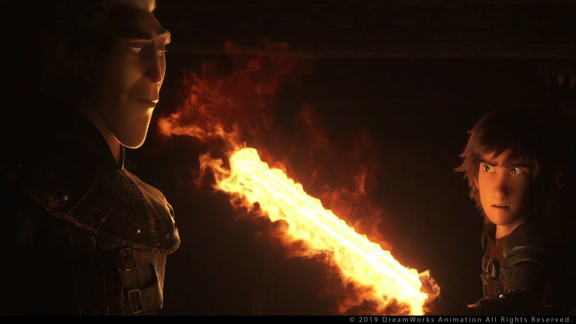
First, let’s have a look at the frames : orange is coming from the fire and blue is coming from the roof. Nice Complementary Scheme ! This scheme is the most used in the Animation Industry nowadays. But there are actually plenty of others schemes available. We will study them below.
首先,让我们看一下帧:橙色来自火焰,蓝色来自屋顶。很好的互补方案!这种方案是当今动画行业最常用的方案。但实际上还有很多其他方案可用。我们将在下面研究它们。
颜色术语 Color Terminology
Let’s go back a bit and start from the beginning. I really do not want to copy articles from Wikipedia. So I will just do a quick catch-up on terminology. All the information you need is on the internet ! For example, the Khan Academy of Pixar about Color Science is pretty interesting. To talk about color, we mainly use these three important terms :
让我们回顾一下,从头开始。我真的不想从维基百科上复制文章。所以我只是快速了解一下术语。你需要的所有信息都在互联网上!例如,皮克斯的可汗学院关于色彩科学的内容非常有趣。谈论颜色时,我们主要使用这三个重要术语:
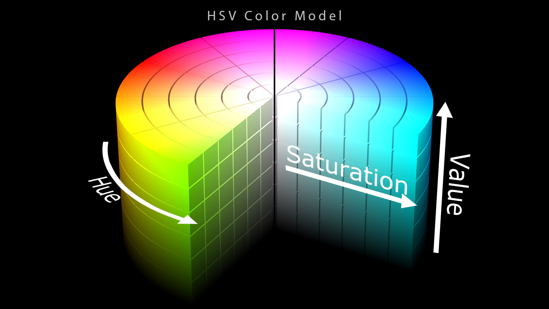
- Hue : also called color, tone, shade or tint.
- 色调: 也称为颜色、色调、明暗度或色彩。
- Saturation : also called colorfulness.
- 饱和度: 又叫色彩度。
- Value : also called lightness.
- 明度: 又称亮度。
From Sharon Callahan : The eye is more attracted to a color than to a neutral image, the more saturated the color, the more attention it grabs.
来自Sharon Callahan:与中性图像相比,颜色更容易吸引眼睛,颜色越饱和,越能吸引注意力。
色轮 Color Wheel
How do we organize colors ? Color Wheel is an interesting tool to start working with colors. They are two main different models of mixing colors :
我们如何组织颜色?色轮是一个有趣的工具,可以开始使用颜色。它们是混合颜色的两种主要不同模型:
- RGB : The RGB color model is an additive color model in which red, green and blue light are added together in various ways to reproduce a broad array of colors, used in Computer Graphics.
- RGB: RGB 颜色模型是一种加色 颜色模型,其中红、绿和蓝光以各种方式相加在一起以再现计算机图形学中使用的各种颜色。
- CMYK : The CMYK color model is a subtractive color model, used in color printing.
- CMYK: CMYK 颜色模型是一种减色模型,用于彩色印刷。
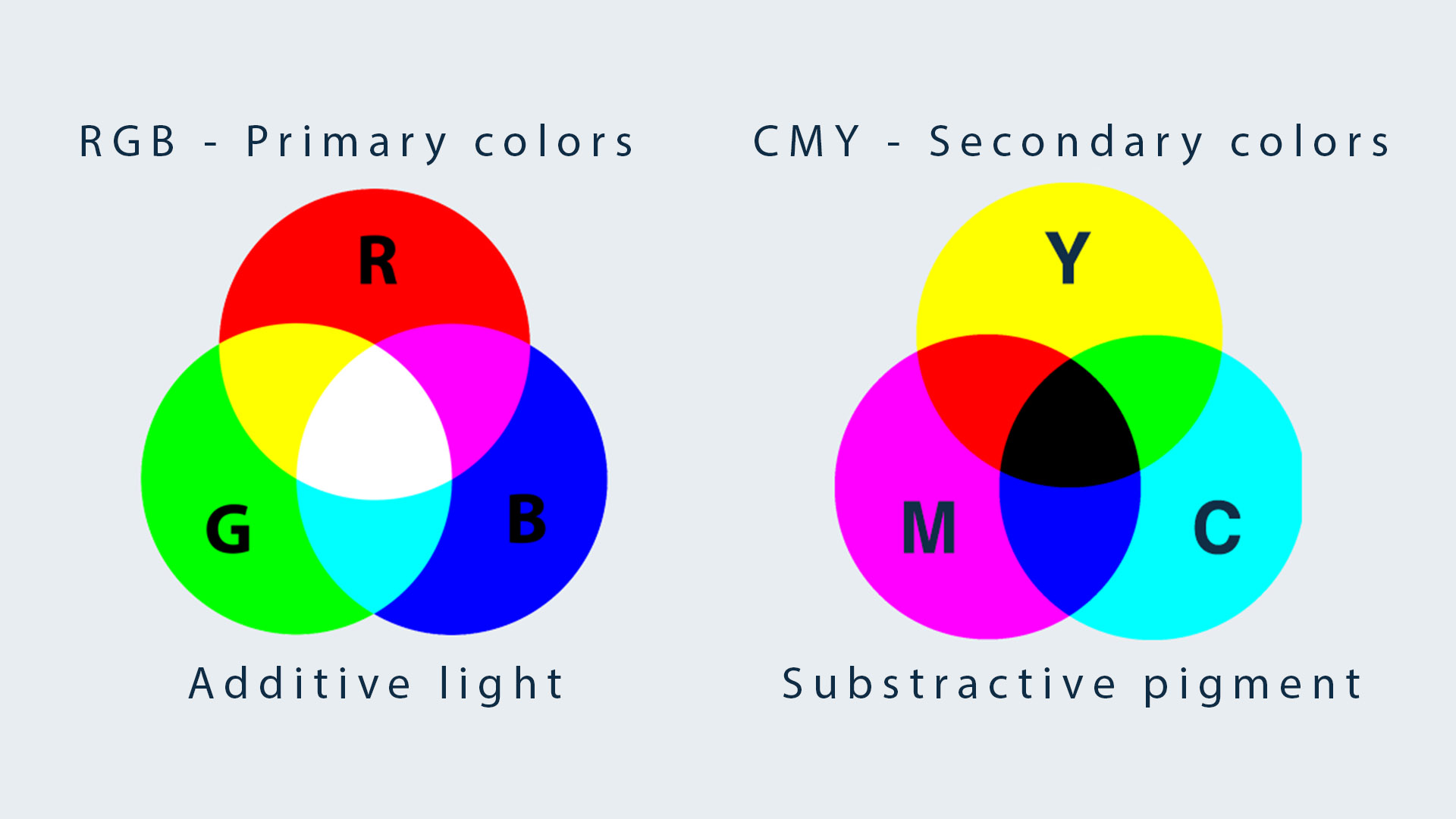
These are the two most famous models in the industry.
这是业界最著名的两种车型。
There is no model better than the other one. They just have different uses. Each model has its own Color Wheel, based on Primary, Secondary and Tertiary colors.
没有哪个模型比另一个更好。 它们只是用途不同。每个模型都有自己的色轮,基于原色、间色和复色。
There is a third model : RYB (red–yellow–blue, which makes up the primary color triad in a standard artist’s color wheel) described right below.
还有第三种模型:**RYB**(红-黄-蓝,构成标准艺术家色轮中的原色三色组),如下所述。
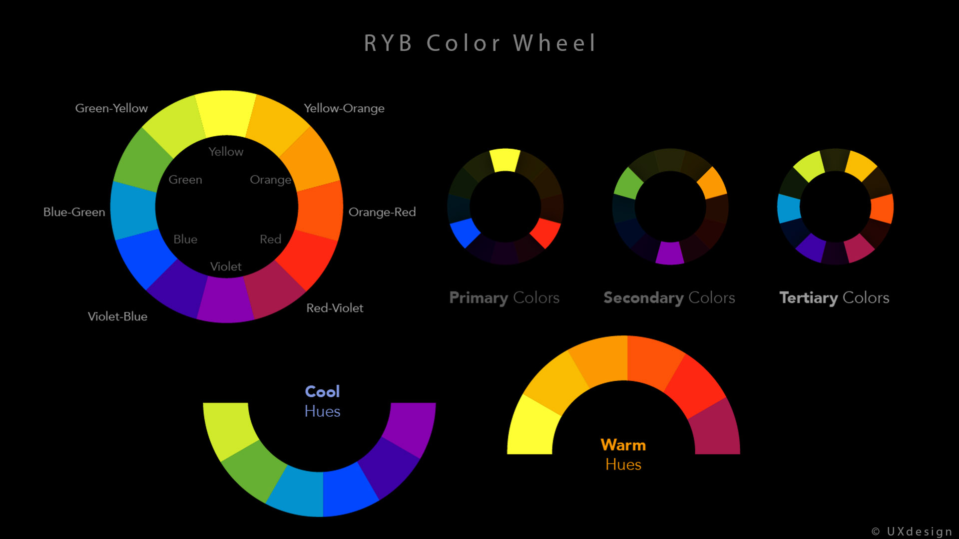
I am not very familiar with this model but it shows clearly how a color wheel is built.
我对这个模型不是很熟悉,但它清楚地展示了色轮是如何构建的。
The RGB Color Wheel with its additive model is the one used in Computer Graphics. I have done a render in Guerilla Render using 3 spotlights using pure Red, Green and Blue values. We have seen in the previous chapter that our cones are mostly sensitive to these three colors.
**RGB 色轮**及其加法模型是计算机图形学中使用的色轮。我在Guerilla Render中使用 3 个聚光灯进行了渲染,这些聚光灯分别使用纯红、绿和蓝值。我们在上一章中看到,我们的视锥细胞对这三种颜色最敏感。
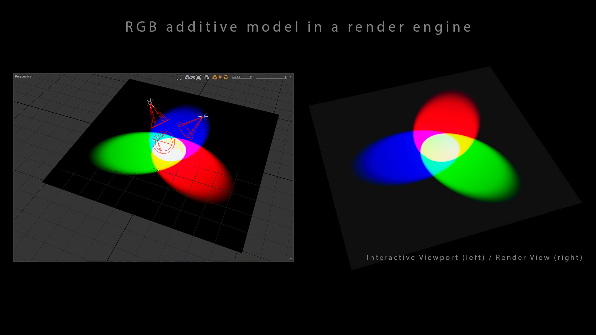
Guerilla Render is based on the RGB model, like most render engines.
与大多数渲染引擎一样,Guerilla Render 基于 RGB 模型。
开尔文温度表 Kelvin Temperature Chart
The use of Color Wheels is also important when it comes to temperature. It is something you will hear quite a lot in lighting dailies : “this is too warm” or “make this light cooler“.
在温度方面,色轮的使用也很重要。在日常照明中,你会经常听到这样的话:“这个太暖了”或“把这个光调冷一点”。

In most renderers you have access to several color picking options.
在大多数渲染器中,您可以使用多种颜色选择选项。
Color temperature is conventionally expressed in kelvins, using the symbol K, a unit of measure for absolute temperature. Color temperatures over 5000 K are called “cool colors” (bluish), while lower color temperatures (2700–3000 K) are called “warm colors” (yellowish).
色温通常以开尔文表示,使用符号 K,这是绝对温度的测量单位。色温超过5000 K称为“冷色”(偏蓝),而色温较低(2700–3000 K)称为“暖色”(偏黄)。
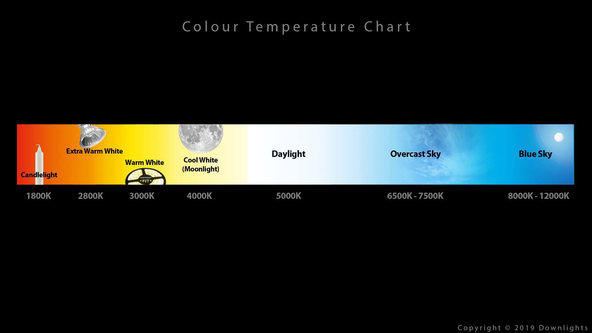
This Kelvin chart goes from orange to blue… It kind of reminds us something, right ? The “orange and teal” scheme ! When you take an interior photo and adjust your white balance on an artificial lighting, most of the time exterior goes blue. So, yes, “orange and teal” is quite basic but is also very close to natural lighting.
这张开尔文 图表从橙色变为蓝色……这让我们想起了一些东西,对吧? “橙色和青色”方案!当您拍摄室内照片并在人工照明下调整白平衡时,大多数情况下室外会变成蓝色。所以,是的,“橙色和青色”非常基本,但也非常接近自然光。
深入研究普朗克轨迹 An in-depth look at the Planckian locus
Get ready for some really interesting analysis by some fellow color scientists. Buckle up ! First of all, what is really a blackbody ?
准备好听听一些色彩科学家的精彩分析吧。系好安全带!首先,黑体到底是什么?
A blackbody itself is a theoretical construct, so by that definition nothing is a true blackbody (no reflected radiation) even blackholes don’t satisfy the formal definition. However, on the other end any object above absolute zero has some blackbody radiation emission, so from that vantage everything is a blackbody… Hence why thermal cameras are helpful to see us human light bulbs in the dark.
黑体本身是一种理论构造,因此根据该定义,没有任何东西是真正的黑体(没有反射辐射),甚至黑洞也不满足正式定义。然而,另一方面,任何高于绝对零度的物体都会发射一些黑体辐射,因此从这个角度来看,一切都是黑体……这就是为什么热像仪有助于在黑暗中看到我们人类的灯泡。
-- Sean Cooper
-- 肖恩·库珀
So blackbodies do not really exist. That’s the first thing !
所以黑体实际上并不存在。这是第一点!
Another thing to be aware of with black body emission, is that fire emission generally isn’t mainly black body radiation. Lots of light caused by the various molecules making up the fire (this is how fireworks work), so approximating with black body emission is quite limited.
关于黑体辐射,还有一点需要注意,那就是火焰辐射通常不是以黑体辐射为主。 火焰中各种分子会产生大量光(烟花就是通过这种光产生的),因此用黑体辐射进行近似是相当有限的。
-- Björn Ottosson
-- 比约恩·奥托森
Second thing, fire emission is mostly dependent on what burns. Fascinating !
第二点,火灾排放主要取决于燃烧的物质。 太有趣了!
Pure blackbody is an absolute term, in practice some sources do come very close to being a black body – take a piece of tungsten and run an electrical current through it and place it in a vacuum or an inert gas and you get pretty close, aka an old light bulb. […] Tungsten bulb is pretty much the only light source that is really close, spectrally that is ! You could still find light sources that gets very close from the blackbody locus even though their spectral composition is not at all that of a blackbody, those are metamers.
纯黑体是一个绝对术语,实际上有些光源非常接近黑体——取一块钨丝,通上电流,然后将其放在真空或惰性气体中,你就会得到非常接近的黑体,也就是旧灯泡。[…]钨灯泡几乎是唯一真正接近黑体轨迹的光源,从光谱上看就是这样!你仍然可以找到非常接近黑体轨迹的光源,即使它们的光谱组成与黑体完全不同,它们就是同色异谱体。
-- Kevin Wheatly and Thomas Mansencal
-- 凯文·惠特利和托马斯·曼森卡尔
And finally, incandescent light bulbs are the only source that come very close to the Planckian locus, except for metamers. We’ll see about solutions to these limitations right below.
最后,除了同色异谱灯外,白炽灯是唯一非常接近普朗克轨迹的光源。我们将在下文中讨论这些限制的解决方案。
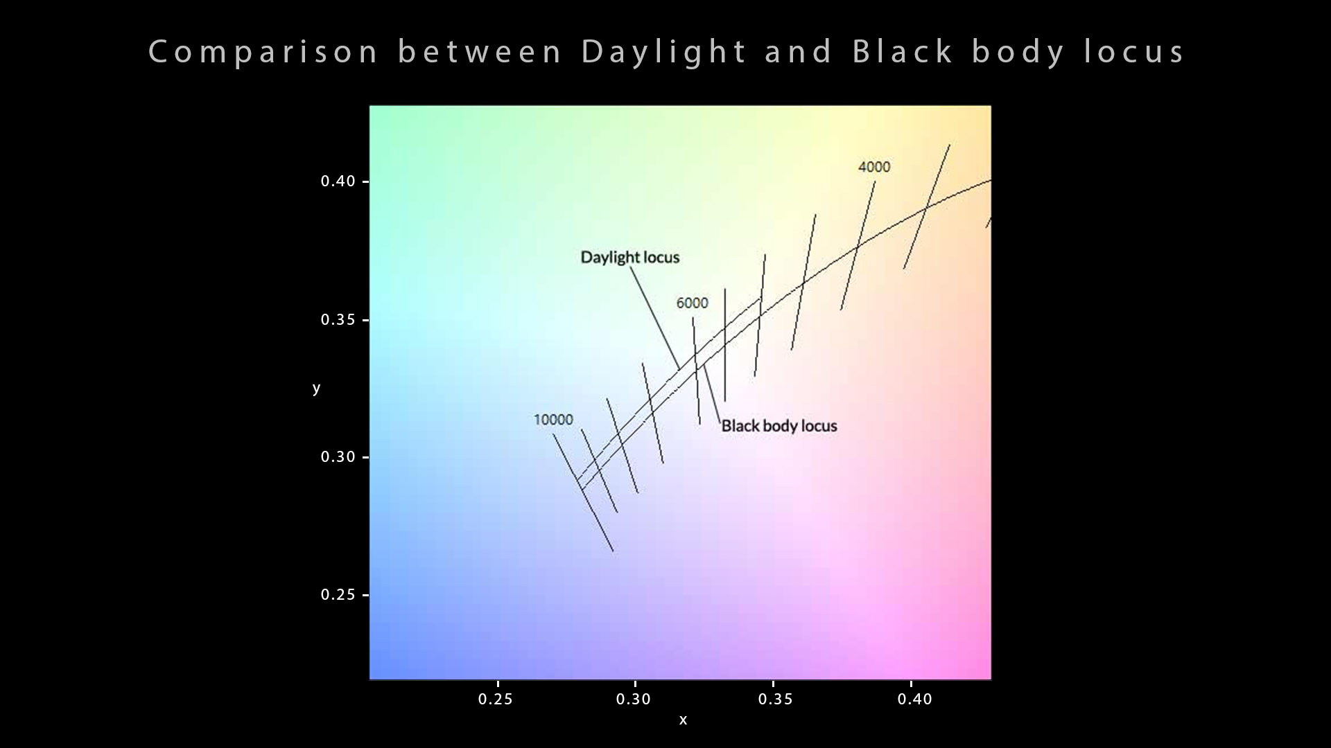
普朗克轨迹 VS 日光轨迹 Planckian locus VS Daylight locus
Something worth mentioning is that, contrary to what many diagrams show on the internet (included the one above), 10000K will not give you the “blue sky” colour. It is merely an attempt at classification ! If you have a look at the PxrBlackBody documentation from Renderman, you will see a table that could be misleading :
值得一提的是,与互联网上许多图表(包括上面的图表)显示的情况相反,10000K 不会给你“蓝天”的颜色。这只是一种分类尝试!如果你看一下Renderman 的 PxrBlackBody 文档,你会看到一个可能会产生误导的表格:
| Temperature Value | Source |
|---|---|
| 15000 to 27000 | Clear blue poleward sky |
| 温度值 | 来源 |
|---|---|
| 15000 至 27000 | 极地清澈蔚蓝的天空 |
There are actually two distinct “datasets” for each locus : Planckian locus and Daylight locus. This article describes them precisely. And since the sky is not an emissive/incandescent body, it is basically impossible for a lighting artist to achieve a blue sky colour by using the Planckian lockus. It is just the wrong dataset.
实际上,每个轨迹都有两个不同的“数据集”:普朗克轨迹和日光轨迹。本文对它们进行了精确描述。由于天空不是发射/白炽体 ,因此灯光艺术家基本上不可能使用普朗克轨迹来实现蓝色天空的颜色。这只是错误的数据集。
Here is a little summary about those two notions (from Wikipedia) :
以下是关于这两个概念的一个小总结(来自维基百科):
- Black body locus or Planckian locus is the path that the color of an incandescent black body would take in a particular chromaticity space as the blackbody temperature changes.
- 黑体轨迹或*普朗克轨迹*是白炽黑体的颜色随着黑体温度的变化在特定色度空间中的变化路径。
- Daylight locus is defined with a mathematical function (see CIE D series illuminants). For displays, we tend to match the daylight locus and most colour spaces have daylight whitepoints (such as D65).
- 日光轨迹用数学函数定义(参见 CIE D 系列光源)。对于显示器,我们倾向于匹配日光轨迹,大多数色彩空间都有日光白点(例如D65)。
一些很好的解释 Some great explanations
I am going to quote a few persons from a conversation we had on the osl-dev list, since their explanation is so brilliant :
我将引用我们在 osl-dev 列表中的几个人的对话,因为他们的解释非常精彩:
Blackbody for lights is for incandescent lights without filters. Anything else and the renderer should allow users to input colors in some other fashion, such as RGB. […] Take a look at this graph which shows how at 700nm the blue star is still outputting more red than the red star.
灯光的黑体适用于没有滤光片的白炽灯。 其他任何颜色,渲染器都应允许用户以其他方式输入颜色,例如 RGB。[…] 看看这张图,它显示了在 700nm 时蓝星输出的红色仍然比红星多。
Thiago Ize. 蒂亚戈·伊泽。
If you’re using a blackbody for a light colour it should be because you’re trying to simulate an incandescent of that temperature. Blackbody colours have precisely nothing to do with the colour of the sky. As others have mentioned the fact that literature refers to colours as “sky blue” is an attempt at classification.
*如果您使用黑体来表示光的颜色,那应该是因为您试图模拟该温度的白炽灯。*黑体颜色与天空的颜色完全无关。 正如其他人提到的那样,文献中将颜色称为“天蓝色”是一种分类尝试。
Anders Langlands. 安德斯·朗兰兹。
The blackbody function is good for figuring out the color of something that is purely an emissive warm body, no more and no less. An incandescent filament, a glowing hot piece of metal, molten lava, etc. There’s no particular reason to think this function would give you a good approximation to daylight sky, which is not a blackbody phenomenon.
黑体函数适合用来判断纯粹的辐射热体的颜色,不多也不少。白炽灯丝、炽热的金属片、熔岩等。没有特别的理由认为该函数可以很好地近似日光天空,这不是黑体现象。
Larry Gritz. 拉里·格里茨。
It could be interesting to implement a function that gives the range of plausible overall daylight colors given a 1D input, a bit like the blackbody_rgb function and the BB_TABLE. It could be called daylight_rgb_function and could rely on data such as CIE D series illuminants. Therefore a lighting artist could reach easily a “blue sky” colour for a rim light.
实现一个函数,根据 1D 输入给出合理的整体日光颜色范围,这可能很有趣,有点像blackbody_rgb 函数和BB_TABLE。它可以称为daylight_rgb_function,并且可以依赖于CIE D 系列光源等数据。因此,灯光艺术家可以轻松获得边缘光的“蓝天”颜色。
天光和荧光光源等复杂现象 Complex phenomenons such as Skylight and Fluorescent light sources
In the previous paragraph, I was mostly referring to the color selection process based on Kelvin temperatures that is available in most DCC softwares.
在上一段中,我主要指的是大多数 DCC 软件中可用的基于开尔文温度的颜色选择过程。
The Physical Sun & Sky (or Skylight) is a much more complex phenomenon to describe. And for the record, it looks like there are 16 CIE Standard General Skies (available in this webapp), which eventually gave birth to the Hosek-Wilkie Sky Dome that has been implemented in most render engines.
物理太阳和天空(或天光)是一种更复杂的现象。根据记录,看起来有 16 个 CIE 标准通用天空(可在此Web 应用程序中使用),最终催生了已在大多数渲染引擎中实现的Hosek-Wilkie 天空穹顶。
There are several computational models that have been published for sky color, and they are usually more complex than merely the raw daylight color temperature — they are a complex function of position on earth, time of day and year, direction, and atmospheric conditions.
目前已经发布了几种针对天空颜色的计算模型,它们通常比原始日光色温更复杂——它们是地球位置、一天中和一年中的时间、方向和大气条件的复杂函数。
Larry Gritz. 拉里·格里茨。
Fun fact : the bluest sky in the world was measured in Brazil.
有趣的事实:世界上最蓝的天空是在巴西测量的。
And if we want to push things even further, we could maybe go the extra mile :
如果我们想更进一步,我们也许可以做得更多:
Colour temperature as an input by itself is limited because pure blackbodies do not really exist in nature, so you want something that can model correlated colour temperature (CCT). With a tint control (based on CCT/Delta u’v’), you can also model fluorescent light sources & co.
色温作为输入本身是有限的,因为纯黑体在自然界中并不存在,所以你需要一些可以模拟相关色温(CCT) 的东西。使用色调控制(基于 CCT/Delta u'v'),您还可以模拟荧光光源等。
Thomas Mansencal 托马斯·曼森卡尔
开尔文比较 Kelvin comparison
Is there a better way between working in RGB and Kelvin ? I know that this question is quite controversial. Some studios almost had a holy war about it. In my opinion, it is only a matter of art direction and habits.
在 RGB 和开尔文之间,有没有更好的方法?我知道这个问题很有争议。一些工作室几乎为此展开了一场圣战。在我看来,这只是一个艺术指导和习惯的问题。
The secret life of pets (Director : Chris Renaud, Art Direction : Colin Stimpson) has been almost entirely lit with Kelvin temperatures to get a natural look. This would have been completely impossible on Lego Batman (Director : Chris McKay, Production Designer : Grant Freckelton) because of its saturated yet very original art direction.
《爱宠大机密》 (导演:Chris Renaud,艺术指导:Colin Stimpson)几乎完全采用开尔文温度照明,以获得自然的外观。这在 《乐高蝙蝠侠》 (导演:Chris McKay,制作设计师:Grant Freckelton)中是完全不可能的,因为它的艺术指导饱和但非常原创。
Some supervisors prefer to work with Kelvin to avoid unnatural colors. It is like a safety net to them. I personally prefer RGB.
有些主管喜欢使用开尔文色度来避免不自然的颜色。这对他们来说就像一张安全网。我个人更喜欢 RGB。
Honestly I don’t blame them.
说实话我不怪他们。
There is one BIG difference though between these two films : how compositing was used.
然而,这两部电影之间存在一个很大的区别:合成技术的使用方式。
- “Pets” mostly got his filmic look in compositing thanks to gamma, color corrector and saturation nodes. And of course 2D motion-blur and depth-of-field.
- “宠物” 的电影效果主要得益于伽玛、色彩校正器和饱和度节点的合成。当然还有 2D 运动模糊和景深。
- “Lego Batman” got his saturated look directly in lighting. I used the craziest values in my lights at Animal. It was almost a cultural shock to me.
- “乐高蝙蝠侠”的饱和外观直接来自灯光。我在 Animal 的灯光中使用了最疯狂的值。这对我来说几乎是一种文化冲击。
I know some people may disagree so let me explain better. I am not saying there was no compositing involved on Lego Batman. But since we rendered with 3D motion-blur and depth-of-field, it was the first time in my life that I could get the final result in my Render View.
我知道有些人可能不同意,所以让我更详细地解释一下。我并不是说乐高蝙蝠侠没有涉及合成。但由于我们用 3D 运动模糊和景深进行渲染,这是我一生中第一次能够在渲染视图中获得最终结果。
More on that later.
稍后将对此进行更详细的说明。


This is actually a huge debate in studios. How close a render should be to the final image ? I personally think that we should be as close as we can to the final render. But we will get to that later.
这实际上是工作室中一个很大的争论。渲染应该与最终图像有多接近?我个人认为我们应该尽可能接近最终渲染。 但我们稍后会讨论这个问题。
配色方案与和谐 Color Schemes and Harmonies
Interestingly enough the RYB Color Wheel is the most used for any study of the Color Scheme. It is probably due to the historic use of red, yellow, and blue pigments as primary colors in art and design, particularly painting.
有趣的是,RYB 色轮是色彩方案研究中使用最多的色轮。这可能是因为在艺术和设计(尤其是绘画)中,红色、黄色和蓝色颜料历来被用作原色。
Here is a representation of Color Schemes :
以下是颜色方案的表示:
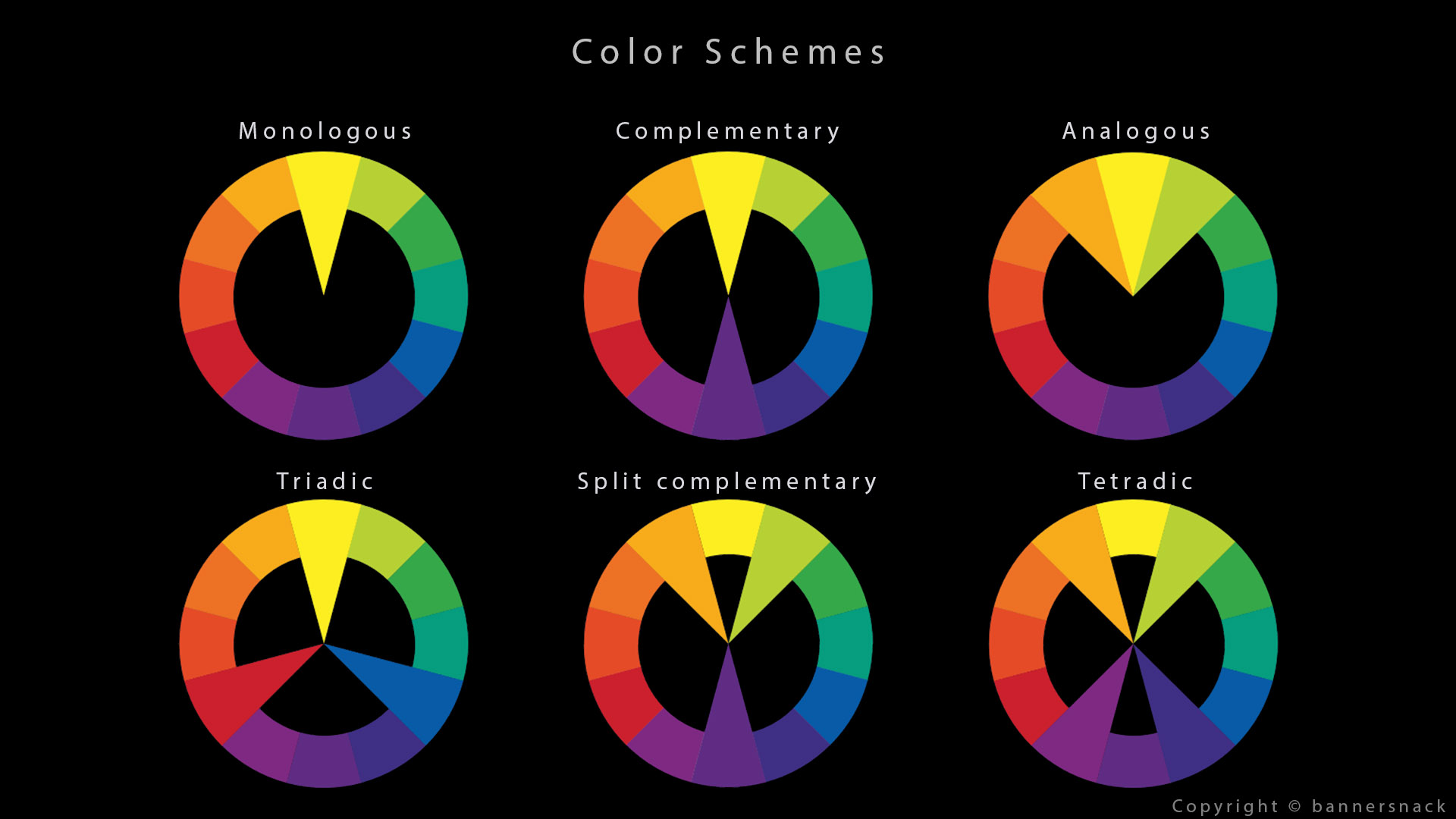
- Monochromatic colors are all the colors of a single hue.
- **单色**是指单一色调的所有颜色。
- Analogous colors are groups of three colors that are next to each other on the color wheel.
- **类似**色是色轮上彼此相邻的三种颜色的组合。
- Complementary colors are pairs of colors which, when combined or mixed, cancel each other out by producing a gray scale color like white or black. When placed next to each other, they create the strongest contrast for those two colors and are always opposite on the color wheel.
- **互补**色是指成对的颜色,当它们组合或混合时,会通过产生白色或黑色等灰度色而相互抵消。当它们彼此相邻放置时,它们会为这两种颜色产生最强烈的对比,并且在色轮上总是相反的。
- Split-complementary color scheme is a variation of the complementary color scheme. In addition to the base color, it uses the two colors adjacent to its complement. This color scheme has the same strong visual contrast as the complementary color scheme, but has less tension.
- **分裂补色**配色方案是补色配色方案的一种变体。除了基色外,它还使用补色相邻的两种颜色。这种配色方案与补色配色方案一样具有强烈的视觉对比,但张力较小。
- Triadic Colors that are evenly spaced around the color wheel. Triadic color harmonies tend to be quite vibrant, even if you use pale or unsaturated versions of your hues.
- **三色**在色轮上均匀分布。即使您使用浅色或不饱和的色调,三色和谐也往往非常鲜艳。
- Tetradic or Rectangle is a combination of four colors that consist of two sets of complementary colors. These colors form a rectangle on the color wheel. The colors on the short side of the rectangle are spaced one color apart.
- **四色或矩形**是由两组互补色组成的四种颜色的组合。这些颜色在色轮上形成一个矩形。矩形短边上的颜色间隔一种颜色。
- Square is a combination of four colors equally spaced around the color wheel.
- **正方形**是色轮上等距分布的四种颜色的组合。
You can find more explanation about color schemes here and from this great slide.
方案示例 Schemes examples
Some Color Scheme Generators are available here and here. Even Adobe has made one ! They are really fun to play with. I thought it was interesting to have a look at the full list of color schemes because animated feature films mostly use the Complimentary Scheme. It kinda becomes a cliché.
这里和这里有一些配色方案生成器。甚至 Adobe 也制作了一个!它们真的很有趣。我认为查看完整的配色方案列表很有趣,因为动画电影大多使用互补方案。 它有点成为陈词滥调。
Here is a quick study of the color schemes from Toy Story 4 (Director : Josh Cooley, DP : Jean-Claude Kalache and Patrick Lin). There is a great variety in this movie.
以下是对《玩具总动员 4》 (导演:Josh Cooley,摄影指导:Jean-Claude Kalache和Patrick Lin )配色方案的快速研究。这部电影的配色方案多种多样。


There is a website with some pretty good color schemes : the vivid theory.
有一个网站有一些非常不错的配色方案:生动的理论。
After a few years working on animated feature films for Hollywood, you kind of end up seeing only two colors : Orange and Blue. Like this movie, Coco (Director : Lee Unkrich, DP : Matt Aspbury and Danielle Feinberg) :
在好莱坞制作动画长片几年后,你最终只会看到两种颜色:橙色和蓝色。就像这部电影 《寻梦环游记》 (导演:Lee Unkrich,摄影指导: Matt Aspbury和Danielle Feinberg):


. 不确定为什么灯的热点是橙色。使用 ACES 时它会是白色(曝光过度)。")


What I really like though is that they change the scheme when introducing this new character Ernesto de la Cruz. The choice of green color is not fortuitous, it makes you feel uncomfortable. Maybe you don’t realize it when watching but your brain is probably like “something is off with this guy. ” We will come back to the green color a bit below.
不过,我真正喜欢的是,他们在介绍这个新角色埃内斯托·德拉克鲁斯时改变了方案。绿色的选择并非偶然,它让你感到不舒服。也许你在观看时没有意识到这一点,但你的大脑可能会觉得“这家伙有点不对劲”。我们稍后会回到绿色。
Since we are talking about standardization on a movie, I am going to make a public confession. I have used the same blue color for the past ten years in all of my sky-related lights such as top, rim or environment lights : R : 0.4 / G : 0.7 / B : 1. Same goes for the sun: R: 1 / G: 0.8 / B: 0.6. Yes I only use round values, they are easier to share and to remember.
既然我们在谈论电影的标准化,我要公开承认。过去十年来,我在所有与天空相关的灯光(如顶部、边缘或环境灯光)中都使用了相同的蓝色:R : 0.4 / G : 0.7 / B : 1。太阳也是如此:R:1 / G:0.8 / B:0.6。是的,我只使用整数值,这样更容易分享和记住。
-- These are non-ACEScg values by the way.
-- 顺便说一下,这些是非 ACEScg 值。
色彩心理学 Color Psychology
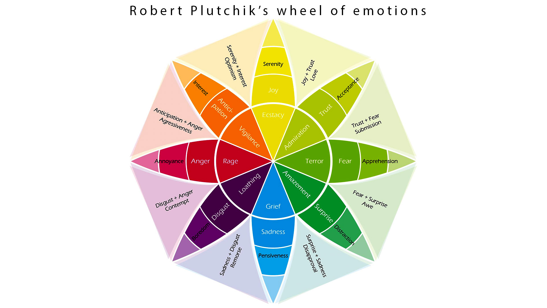
The use of colors is certainly not something to take slightly. Each color can have a strong impact on us based on our age, culture or gender. In 1980, Robert Plutchik constructed a diagram of emotions visualizing eight basic emotions : joy, trust, fear, surprise, sadness, disgust, anger and anticipation.
颜色的使用绝对不是一件可以掉以轻心的事情。每种颜色都会根据我们的年龄、文化或性别对我们产生强烈影响。1980年,罗伯特·普拉奇克 (Robert Plutchik)构建了一个情绪图表,其中形象化了八种基本情绪:喜悦、信任、恐惧、惊讶、悲伤、厌恶、愤怒和期待。
The sequence from Coco with Ernesto de la Cruz uses pink and green which gives Annoyance and Apprehension. Pretty accurate right ? Interestingly enough, Pixar has inverted the colors of Fear and Disgust for the movie “Inside Out”.
《寻梦环游记》中 Ernesto de la Cruz 的片段使用了粉色和绿色,表达了 “烦恼” 和 “忧虑”的感觉。很准确吧?有趣的是,皮克斯在电影《头脑特工队》中反转了“恐惧”和“厌恶”的颜色。
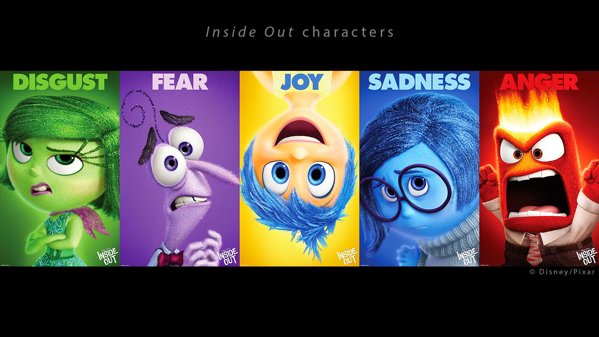
Here is an explanation on the Character Design :
以下是关于角色设计的解释:
We relied on some verbal idioms like I feel blue, I feel sad, I’m about to explode with rage, etc.[…] Joy was a star, or a spark. Golden and illuminated. Sadness was a teardrop. So her shape and color resemble a teardrop. Fear is like a raw nerve, just a squiggly line, that’s why he’s tight. Disgust is the shape and color of a stalk of broccoli. And of course anger is a brick, immovable.
我们依赖一些口头习语,如我心情不好,我感到难过,我快要怒不可遏了,等等。[…]快乐是一颗星星,或者一颗火花。金色而明亮。悲伤是一滴泪珠。所以她的形状和颜色就像一滴泪珠。恐惧就像一根生硬的神经,只是一条弯曲的线,这就是他紧张的原因。厌恶是一根西兰花茎的形状和颜色。当然,愤怒是一块砖,不可移动。
-- This makes sense but I am still not sure why “Fear” is purple though.
-- 这很有道理,但我仍然不确定为什么“恐惧”是紫色的。
色彩与情感 Color and Emotions
According to Paul Ekman, emotions are universal. But the way we show them, like our attitude, is cultural. He also says that what triggers the emotion is a personal factor. We can also state that the camera, music and lighting work are mostly addressed to the viewers’ emotions.
保罗·埃克曼认为,情绪是普遍存在的。但我们表达情绪的方式,就像我们的态度一样,是文化的。 他还说,引发情绪的因素是个人因素。我们还可以说,摄像机、音乐和灯光工作大多针对观众的情绪。
But we should be careful to interpret colors as symbols because they are mostly linked to a culture historically and geographically. Let me just quote Sharon Callahan here because I do not want you to think there is a universal color code. It is a bit more complicated than that.
但我们应该谨慎地将颜色解读为符号,因为它们大多与历史和地理上的文化有关。 我在这里只引用莎伦·卡拉汉的话,因为我不想让你认为存在一个通用的颜色代码。事实比这要复杂一些。
Not until the Renaissance was color appreciated as an aesthetic choice. […] There are enough common life experiences and contexts within which to draw some generalizations about how color affects us emotionally, especially in American culture where many of them have been stereotypically reinforced by advertising.
直到文艺复兴时期,色彩才被看作是一种审美选择。[…] 有足够多的共同生活经历和背景可以概括色彩如何影响我们的情感,尤其是在美国文化中,其中许多情感都通过广告得到了刻板的强化。
Color temperature for natural and artificial lighting are quite universal. To deviate from them will most likely provoke a reaction. But nothing says that this reaction will be the same for every culture of viewers.
自然光和人工照明的色温相当通用。偏离这些色温很可能会引起反应。但没有人能保证这种反应对于每种文化的观众来说都是相同的。
Perfect example for that is the white color : white being connected to weddings in the Western world but to funerals in China.
白色就是一个完美的例子:在西方世界,白色与婚礼有关,但在中国,白色与葬礼有关。
坏人综合症 Bad Guy Syndrome
Personally I have never heard a Lighting Supervisor arbitrarily say something like : “This character is angry. Light him in red. ” Most of the time the intention of color comes from the surroundings of the character : time of the day, weather and location chosen by the Art Department.
就我个人而言,我从未听过灯光总监随意说出这样的话:“这个角色很生气。用红色灯光照亮他。 ” 大多数情况下,颜色的意图来自于角色的周围环境:艺术部门选择的一天中的时间、天气和地点。


A quite common example would be the bad guy standing in front of the chimney. To enhance the drama, a fire is generally an interesting light source. It allows us to justify strong rims or even light coming from below, like Ninjago (Director : Charlie Bean, Cinematography : Craig Welsh) :
一个相当常见的例子是坏人站在烟囱前。为了增强戏剧效果,火通常是一个有趣的光源。它使我们能够证明强光甚至是来自下方的光线是合理的,就像Ninjago(导演:Charlie Bean,摄影:Craig Welsh):
We had a pretty accurate color key for this sequence. This is why we mostly focus on the White Balance in lighting. This is our primary concern. We also try to make our images look pleasant to the average viewer : easily readable, saturated, not too dark with a nice shaping and composition.
我们为这个序列设置了相当准确的颜色键。这就是为什么我们主要关注灯光中的白平衡。这是我们的主要关注点。我们还试图让我们的图像对普通观众来说看起来令人愉悦 : 易于阅读、饱和、不太暗,具有良好的造型和构图。
We will see how to achieve all of this in the next chapters.
我们将在下一章中看到如何实现所有这些。
生产实例 Production Examples
I am going to detail here different feature films. Each movie production can be quite unique due to various factors : art direction, size of the company, roles among the team… But let’s not kid ourselves. Most movies are a huge investment and most producers want to play it safe : I have lit the same way and used the same colors on “Planet 51“, “Pets“, “Ninjago” or “The Star“.
我将在这里详细介绍不同的故事片。由于各种因素,每部电影的制作都可能非常独特:艺术指导、公司规模、团队中的角色……但我们不要自欺欺人。大多数电影都是一笔巨大的投资,大多数制片人都想稳妥行事: 我在“ 51号星球”、“宠物”、“忍者世界”或“星星”中都以相同的方式布光并使用了相同的颜色。
Planet 51 和《爱宠大机密》 Planet 51 and The secret life of pets
Much like Planet 51, The secret life of pets has a naturalistic look. It does not mean we only used natural lights but that the look of the film is natural, as opposed to artificial. We will dive deep in this topic in Chapter 4.
与Planet 51一样, 《爱宠大机密》 具有自然主义风格。这并不意味着我们只使用自然光,而是说影片的画面是自然的,而不是人造的。我们将在第 4 章深入探讨这个主题。
One thing I missed on both movies was the presence of the Art Director (AD) in dailies. In my experience, production is way more interesting when the AD comments the shots directly with us. Since he is the one who painted the color keys, I think it makes sense to have him on board until the Digital Intermediate (DI).
这两部电影中我最怀念的一件事就是艺术总监( AD ) 在每日拍摄中的存在。根据我的经验,当艺术总监直接与我们一起评论镜头时,制作会更有趣。由于他是绘制色键的人,我认为让他参与到数字中间片( DI ) 中是有意义的。


Naturalistic looks are very common in animated movies.
自然主义的外观在动画电影中非常常见。
普莱摩比 Playmobil
I had the chance to work directly with Rémi Salmon, Production Designer of Playmobil the movie. Having him on the floor with the lighting crew was really useful : he was often available if I had any doubts or questions. Here is a couple of examples where Rémi used color to reinforce the story.
我有机会直接与*电影 Playmobil的制作设计师*Rémi Salmon**合作。让他和灯光组一起在现场真的很有用:如果我有任何疑问或问题,他总是可以回答。以下是 Rémi 使用颜色来强化故事的几个例子。
There is a sequence where two characters disagree and are arguing. How can you use color to translate this visually ? I thought Rémi’s solution was really clever :
有一个场景,两个角色意见不合,正在争吵。你如何用颜色来视觉化地表达这一点? 我认为雷米的解决方案非常聪明:
We are going to use the garland behind them as a justification for playing some colorful rims. However, Marla’s head will be lit in blue and Del’s in pink. And we will use a gradient to invert those colors on the seats. It is like if each character was in his own bubble.
我们将使用他们身后的花环作为播放一些彩色轮辋的理由。但是,Marla 的头部将以蓝色点亮,而 Del 的头部将以粉红色点亮。我们将使用渐变来反转座椅上的这些颜色。就好像每个角色都在自己的泡泡里一样。
I really thought this was a great idea. Unfortunately, I can only show you these screen grabs from YouTube but I hope you get the idea :
我真的认为这是一个好主意。不幸的是,我只能向您展示来自 YouTube 的这些屏幕截图,但我希望您能理解这个想法:


Apparently, a similar technique has been used on the movie… Se7en (Director : David Fincher, DP : Darius Khondji) ! Check this article, it is a must-read !
显然,类似的技巧也用在了电影《七宗罪》 (导演:大卫·芬奇,摄影指导:达利斯·康吉)上!看看这篇文章吧,这是必读之作!
The mismatched investigators examine a cache of revealing notebooks discovered in John Doe’s apartment — conflicting color temperatures adding to the scene’s unease.
两名调查人员在 John Doe 的公寓中发现了一批揭露真相的笔记本 ,而相互矛盾的色温更增添了现场的不安感。
Playmobil 夜间场景 Playmobil night sequence
We did another sequence with the same two characters where they land in an hostile city at night. Same challenge here : How do you make the viewer feel their discomfort ? Another great solution by Rémi :
我们又拍摄了两个角色的片段,他们在夜晚降落在一个充满敌意的城市。同样的挑战:如何让观众感受到他们的不适?Rémi 的另一个绝妙解决方案:
We are not going to make the sky blue. But green. This will show their discomfort. Green is a pretty uncomfortable color.
我们不会把天空变成蓝色。而是绿色。这会让他们感到不舒服。绿色是一种相当不舒服的颜色。
There was a debate about whether the sky should be blue or green. The blue version was nice but I thought green was more original and served better the story. I am really glad we could stick to this idea. Let’s say that the blue version was the safe one since 90% of CG movies have a blue night. Here is part of the sequence :
关于天空应该是蓝色还是绿色,曾经有过争论。蓝色版本很好看,但我认为绿色更原始,也更符合故事情节。我很高兴我们能坚持这个想法。可以说蓝色版本是安全的,因为 90% 的 CG 电影都有蓝色的夜晚。以下是序列的一部分:
物理但绿色 Physical but green
I had a debate recently on how to make the sky green in CG. The solution may seem pretty obvious but apparently it is not. Let’s say you are on a technically oriented show and for some dogmatic and/or practical reasons you only want to use a physical skylight. You have two solutions :
最近我讨论了如何在 CG 中将天空变成绿色。解决方案似乎很明显,但显然并非如此。假设您正在参加一个技术导向的节目,出于某些教条和/或实际原因,您只想使用物理天窗。您有两种解决方案:
- The green tint of the sequence comes from a grade in compositing. Not ideal at all since you won’t see it in lighting.
- 序列中的绿色色调来自合成等级。一点也不理想,因为在灯光下你看不到它。
- The green could come from the haze (volumetric effect) by tweaking its color. Not great since the green haze will probably be not part of GI and reflections.
- 通过调整颜色,绿色可能来自雾霾(体积效果)。效果不太好,因为绿色雾霾可能不是 GI 和反射的一部分。
My recommendation would be to put the green color in the environment light. No grade, no complicated setup. I personally like when the sky you see in your render is the one that illuminates the scene. Or you could ask Matte-Painting to deliver an HDR map, we did that a lot on Lego Batman. We will talk about this in Chapter 4.
我的建议是将绿色放在环境光中。无需等级,无需复杂设置。 我个人喜欢渲染中看到的天空照亮场景。或者您可以让 Matte-Painting 提供 HDR 贴图,我们在 《乐高蝙蝠侠》中经常这样做。我们将在第 4 章中讨论这一点。

It is fun to play with artificial skylights once in a while.
偶尔玩一下人工天窗还是很有趣的。
Some supervisors stick only to Physical Skylight to avoid big discrepancies between sequences. It is also the insurance to get a predictable result. But you also lose control. I guess the question is how much control do you want to give to your team ?
有些主管只坚持使用物理天窗,以避免序列之间出现巨大差异。这也是获得可预测结果的保证。但你也会失去控制权。我想问题是你想给你的团队多少控制权?
绿色问题 The green problem
This theory about green was confirmed to me in this book by James Gurney. It is funny because I read this book when I was working on the sequence above. And I started to connect the dots… Have a look at James’ blog, there is some amazing stuff there.
James Gurney的这本书证实了这个关于绿色的理论。有趣的是,我在研究上面的序列时读了这本书。然后我开始把这些点联系起来……看看James 的博客,那里有一些很棒的内容。
The Green Problem : In the paperback book field, there’s an old saying that “green covers don’t sell.” Costume designers have told me that green often looks ghastly in stage lighting. Gallery directors have reported that clients aren’t attracted to paintings with a strong greenish cast, especially if the color tends toward a bright yellow-green.
绿色问题:在平装书领域,有句老话叫“绿色封面卖不出去”。服装设计师告诉我,绿色在舞台灯光下看起来往往很可怕。画廊主管报告说,客户不喜欢带有强烈绿色色调的画作,尤其是颜色趋向于明亮的黄绿色时。
Why did I use Playmobil as my first two examples ? Because On Animation is a pretty small company (around 200 people) and we had the chance to have Rémi on the floor with us and during dailies. That is something we do not see that often unfortunately.
为什么我用Playmobil作为前两个例子?因为On Animation是一家很小的公司(大约 200 名员工),我们有机会让 Rémi 和我们一起在现场和每天工作。不幸的是,这种情况我们并不常见。
乐高蝙蝠侠 Lego Batman
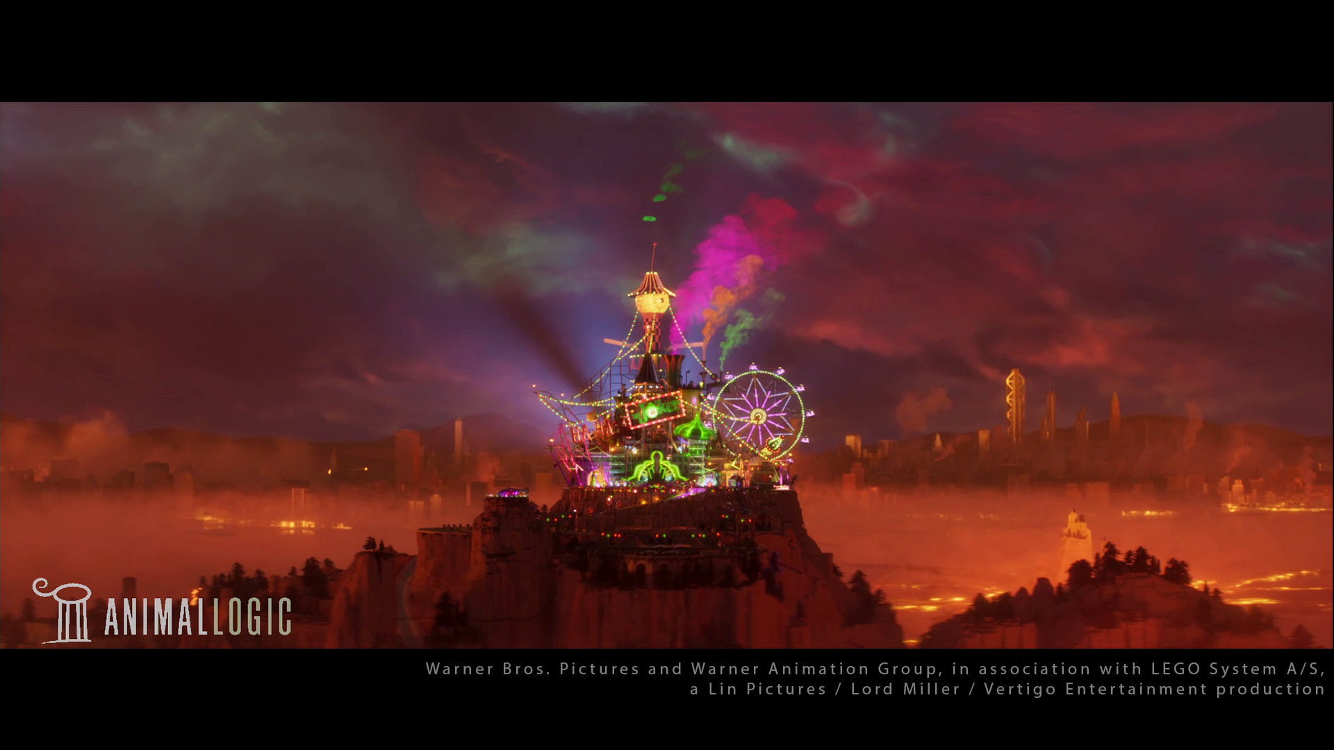
One more example about the green color. In Lego Batman, there is a sequence where the Joker tricks Batman and offers him a deal. Guess what is the dominant color of the sequence ?
再举一个关于绿色的例子。在 《乐高蝙蝠侠》 中,有一个场景是小丑欺骗蝙蝠侠并向他提出交易。猜猜这个场景的主色调是什么?
 ! 《乐高蝙蝠侠》是我在灯光中使用纯色的唯一一部电影。这真是太疯狂了(但从好的方面来说)!")

 : the batcave is under Batman's control. Color helps the viewer to instantly figure out where the action is taking place. Smart ! 蓝色、黄色和红色(另一种三色配色方案):蝙蝠洞在蝙蝠侠的控制之下。颜色可以帮助观众立即弄清楚动作发生的位置。聪明!")
Having Color Schemes per character is a very powerful tool. It can show their personality and their arc through the story. The Batcave in the slide above is the perfect example of having the same location under different influences : the change of color scheme indicates an important story point.
每个角色都有配色方案是一个非常强大的工具。它可以展示他们的个性和故事情节。上面幻灯片中的蝙蝠洞是同一地点受到不同影响的完美例子:配色方案的变化表明了一个重要的故事点。
My personal experience on this movie was different from anything I have ever seen before. For example, we did not use any Color Key. I know this seems insane but this workflow actually makes complete sense. We will come back to that in Chapter 5.
我个人对这部电影的体验与我以前见过的任何电影都不同。 例如,我们没有使用任何 Color Key。我知道这看起来很疯狂,但这种工作流程实际上完全合理。我们将在第 5 章中回顾这一点。
乐高蝙蝠侠夜间序列 Lego Batman night sequence
Here is an other example on Lego Batman : we were launching a sequence set in the woods at night, and Grant Freckelton was showing me some references. He told me :
这是乐高蝙蝠侠 的另一个例子:我们正在制作一个以夜晚的树林为背景的场景,Grant Freckelton向我展示了一些参考资料。他告诉我:
We are going to make a sequence where the key will be warm on the set, neutral on the characters and blue on the volumetric FX.
我们将制作一个序列,其中场景上的色调为暖色,角色上的色调为中性色,体积 FX 上的色调为蓝色。
When I heard this, I can tell you that my heart skipped a beat. What the heck ? How can one make this work ? Different colors for the same key ? I just had finished The Secret Life of Pets where we did not use any Light-Linking and barely no cheat… I was not prepared for this !
当我听到这个消息时,我可以告诉你,我的心跳漏了一拍。这是什么鬼?怎么才能让它工作?同一个键有不同的颜色?我刚刚完成了*《爱宠大机密》* ,我们没有使用任何光链接,几乎没有作弊……我对此毫无准备!
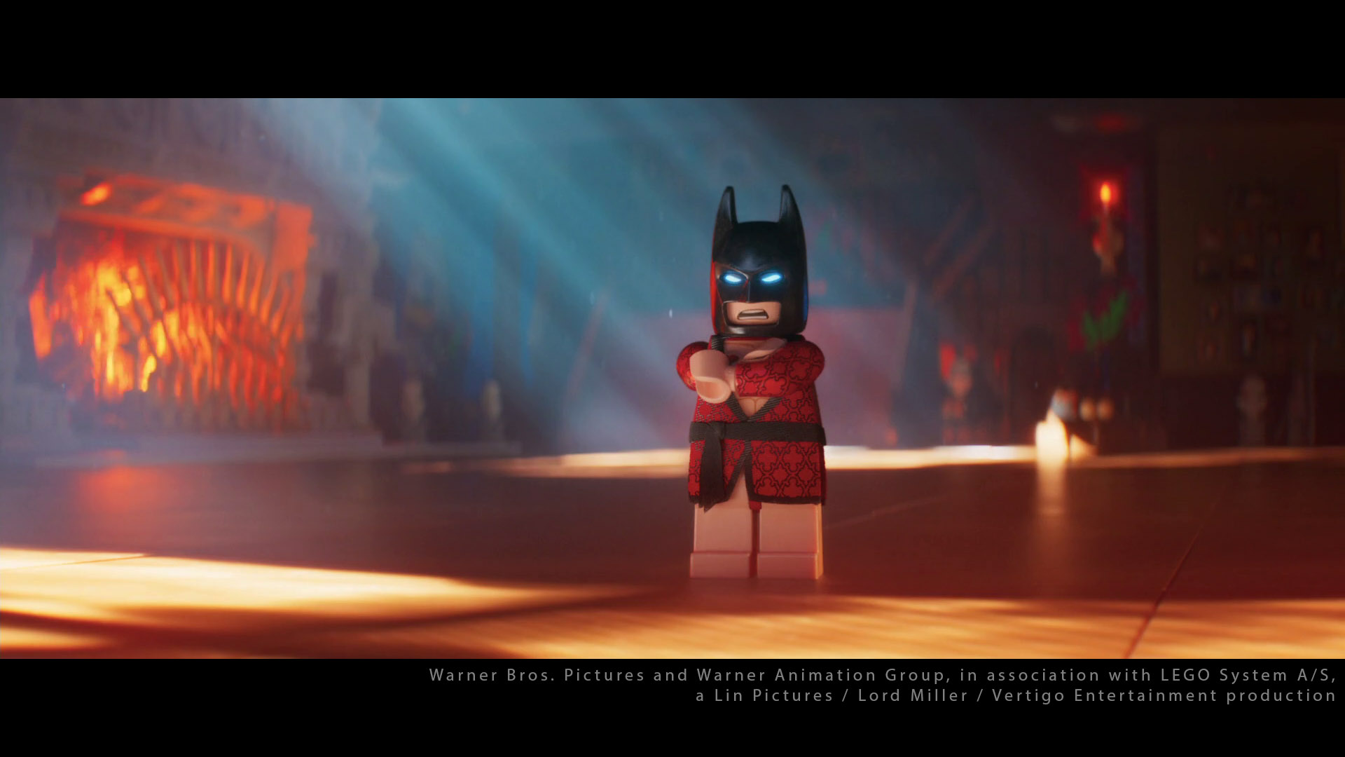
Use of color On Lego Batman was very original and pretty much insane. It is the only movie where I used these (almost) pure colors : R : 1 / G : 0.01 / B : 0.01. It took me time to accept it as it was so different to what I am used to.
《乐高蝙蝠侠》 的色彩运用非常新颖,甚至可以说是疯狂。这是我唯一一部使用这些(几乎)纯色的电影:R : 1 / G : 0.01 / B : 0.01。 我花了很长时间才接受它,因为它与我习惯的完全不同。
I actually avoid to put 0 in CG, this quite a dangerous value as it completely removes the information. 0 in CG is considered an optimization value.
我实际上避免在 CG 中放置 0,这是一个非常危险的值,因为它会完全删除信息。CG中的 0 被视为优化值。

After a few days, I realized his choice was just great. The colors work really well together. It is actually a pretty common technique in his work :different colors for geometry and volumetric give depth and readability.
几天后,我意识到他的选择很棒。颜色搭配得很好。这实际上是他作品中一种相当常见的技巧:几何和体积的不同颜色赋予了深度和可读性。
Something important to notice is that we used neutral lights on the characters for the skin tones. A blue light on a Lego figure (or a minion) does not look good ! Damn green !
需要注意的是,我们在人物皮肤上使用了中性光。 乐高人物(或小黄人)上的蓝光看起来不太好看!该死的绿色!
如何训练你的龙 How to train your dragon
I haven’t worked on this movie but I would like to use this example from Dave Walvoord. Do not hesitate to check his talk from Siggraph 2019. It is a very interesting read ! I think the color principle he is describing below is simple but very clear and efficient.
我没有参与过这部电影的制作,但我想使用 Dave Walvoord 的这个例子。不要犹豫,看看他在 Siggraph 2019 上的演讲。这是一篇非常有趣的文章!我认为他下面描述的色彩原理很简单,但非常清晰和有效。


Very interesting how the color is linked to the story.
颜色和故事的联系非常有趣。
Interesting comment about color in Lighting Design for Stylized Animation : “Using this color theory as a guide for lighting, it means that the Hidden world is lit with mostly neutral lights to allow the local colors to dominate. While in the human world, due to the desaturated local color palette, very saturated lights can be used to give each sequence a distinctive color palette and to enhance its mood.”
关于风格化动画的照明设计中色彩的有趣评论:“使用这种色彩理论作为照明指南,这意味着隐藏的世界主要用中性光照亮,以使当地色彩占主导地位。而在人类世界中,由于局部调色板不饱和,可以使用非常饱和的灯光为每个序列赋予独特的调色板并增强其氛围。”
I guess on Lego we used saturated lights on already saturated bricks !
我想在乐高积木上我们在已经饱和的积木上使用了饱和灯光!
I will use Dave Walvoord’s talk several times in my book as a point of a comparison. Stay tuned !
我将在我的书中多次引用Dave Walvoord 的演讲作为比较点。敬请关注!
颜色和灯光 Color and lights
It is difficult to come with some advice on color but here is my two cents. When you light, try not to have overlapping colors since they will just cancel each other.
很难给出关于颜色的建议,但我有两点看法。当你打光时,尽量不要让颜色重叠,因为它们会相互抵消。
For example if you light a character, try to have one main hue for the left lights and an other hue for the right ones. Otherwise your render will just blend these colors (additive process) and get all muddy.
例如,如果您要照亮一个角色,请尝试为左侧灯光设置一个主色调,为右侧灯光设置另一个色调。否则,您的渲染只会混合这些颜色(添加过程)并变得混乱。


Let’s now have a look at a clear example from Dragon where lights do not cancel each other and their temperature blend perfectly.
现在让我们看一下Dragon的一个清晰的例子,其中灯光不会相互抵消并且它们的温度完美地融合。


Another great example of naturalistic look, enhanced by dramatic lights.
自然主义外观的另一个很好的例子,通过戏剧性的灯光增强。
I am bit overlapping with Chapter 8 about Shot Lighting. The idea is to show that different directions of lights call generally for different colors. This concept is also valid for Set Lighting by the way.
我与第 8 章关于镜头照明的内容有些重叠。这个想法是为了说明不同方向的灯光通常需要不同的颜色。顺便说一下,这个概念也适用于场景照明。
The choice of colors and intensity in your lights is one of your most important task. We generally have a reference to guide us. You should try to avoid the 0 value at all costs. It will remove completely the channel and if you want to tweak your lights later in Nuke, you won’t have any information. Otherwise you could try to render in spectral. Here is an example using a scan by Lee Perry Smith :
选择灯光的颜色和强度是您最重要的任务之一。我们通常有一个参考来指导我们。您应该尽量避免使用 0 值。它将完全删除通道,如果您以后想在 Nuke 中调整灯光,您将没有任何信息。否则,您可以尝试在光谱中渲染。以下是使用 Lee Perry Smith 的扫描的示例:


In a way it makes sense : 0 is forbidden in the albedo and it should be in our lights as well. Try to avoid it at all costs !
从某种意义上说,这是有道理的:反照率中禁止使用 0,在我们的灯光中也应该禁止使用 0。尽量不惜一切代价避免这种情况!
概念和颜色键 Concept and Color Keys
It may seem trivial but this is one of the key point of my book/website. Should we apply the same colors and values between a 2D and a 3D image ? What difference is there between the two mediums ? Do we have to match perfectly a color key in CG ?
这看起来可能微不足道,但这却是我这本书/网站的关键点之一。我们是否应该在 2D 和 3D 图像之间应用相同的颜色和值?这两种媒介之间有什么区别?我们是否必须完美匹配 CG 中的色键?
I completely agree with Dave Walvoord on this topic.
我完全同意**Dave Walvoord**在这个问题上的观点。
From Lighting Design for Stylized Animation : “First, we use color keys as a guide, not a destination. […] We try not to take our color keys too literally. We want to be open to happy accidents and the process of discovery as we move into 3D.” So true !
摘自《风格化动画的灯光设计》:“首先,我们使用色键作为指南,而不是目的地。[…] 我们尽量不要把色键看得太字面化。我们希望在进入 3D 时对意外惊喜和发现过程持开放态度。” 真是这样!


I guess they did not want to match the Color Key because it is a totally different medium. And even if we share some visual principles with 2D and live-action, CG in PBR also has its own rules. The color key above looks great in 2D, but I guess in 3D, there was a lack of details in the grass, shadows were harsh on the faces and they needed more patterns to make the render pleasant.
我猜他们不想匹配 Color Key,因为这是一种完全不同的媒介。即使我们与 2D 和实景共享一些视觉原则,PBR 中的 CG 也有自己的规则。上面的 Color Key 在 2D 中看起来很棒,但我猜在 3D 中,草地上缺乏细节,脸上的阴影很刺眼,他们需要更多的图案来使渲染令人愉悦。
颜色和介质 Color and medium
In my experience matching a 2D color key actually depends on many factors : the relation between the art department and lighting, the director of the movie, the schedule… Some supervisors like to stick to references, some don’t care… It really depends.
根据我的经验,匹配 2D 色键实际上取决于许多因素:艺术部门和灯光之间的关系、电影导演、日程安排……有些主管喜欢坚持参考,有些则不在乎……这真的取决于情况。


I’ll now use a the short film Competition as an example where the color and the medium were deeply connected. I’ll focus on the first minute. Let’s have a look :
现在我将以短片《竞赛》 为例,其中色彩和媒介有着深刻的联系。我将重点介绍第一分钟。让我们来看看:
Adapting the color keys to CG was a bit of headache in this short film. The CG artists tried to match as close as they could but something did not quite fit. I personally think it was mainly due to the change of medium. Here is my explanation :
在这个短片中,将色键适配到 CG 上有点令人头疼。CG 艺术家们试图尽可能地匹配,但有些地方不太合适。我个人认为这主要是由于媒介的变化。以下是我的解释:
 of this sequence and it was looking great. 检查一下墙:这是个斜坡。我看到了这个序列的色键(2D),它看起来很棒。")


Here is the key to CG : we need details. And guess what ? Details are expensive. Once again if you are a surfacing artist, do not hesitate to check the PBR guide from Substance. It is a great read on how to add colors and details to a material.
这是 CG 的关键:我们需要细节。你猜怎么着?细节很昂贵。再次强调,如果你是一名表面艺术家,请不要犹豫,查看Substance 的 PBR 指南。这是一本关于如何为材质添加颜色和细节的好书。
I’ll finish with this quote from a great CG supervisor : each step of the pipeline should be an improvement from the previous step. Layout should be an improvement from storyboard and the same applies for lighting and color keys.
最后,我想引用一位伟大的 CG 主管的一句话:流程的每一步都应该比前一步有所改进。布局应该比故事板有所改进,灯光和色键也一样。
2D 遗产 The 2D legacy
What happened on most movies I have worked on ? The director used to be an animation supervisor and the art director is an illustrator with a 2D background. This may cause some issues when reviewing lighting shots.
我参与制作的大多数电影都发生了什么?导演曾经是动画总监,艺术总监是具有 2D 背景的插画师。这可能会在审查灯光镜头时造成一些问题。
From Kristof Serrand’s conference : “Many people asks me when I am going to direct a feature film ? That’s a very weird question. It would be like asking Gérard Depardieu when he’s going to direct a movie.”
摘自 Kristof Serrand 的发布会:“很多人问我什么时候会执导一部故事片?这是一个非常奇怪的问题。这就像问杰拉尔·德帕迪约什么时候会执导一部电影一样。”
I have sometimes heard comments on PBR movies such as “Can you remove the Global Illumination ? ” or “Can you make the shadows brighter without changing the rest ? “.
我有时会听到对 PBR 电影的评论,例如“您可以删除全局照明吗? ”或“您可以在不改变其余部分的情况下使阴影更亮吗? ”。
There is very often a cultural shock between 2D and 3D and the best solution I know is this one : have a proper Director of Photography (DP) or Lighting Supervisor who is PBR-friendly. Let’s have a look at these photos by Sabine Weiss and concepts by Alberto Mielgo.
2D 和 3D 之间经常存在文化冲击,我知道的最佳解决方案是:聘请一位对 PBR 友好的摄影指导 (DP) 或灯光总监。 让我们来看看Sabine Weiss拍摄的这些照片和Alberto Mielgo的概念。
 See the policeman? Great silhouette! But in CG, it would look weird or fake. We would need to add some details on him or a fill. 萨宾·韦斯 (Sabine Weiss) 拍摄的精彩照片(纽约地铁 1955 年)看到警察了吗?很棒的轮廓!但在 CG 中,它看起来很奇怪或很假。我们需要在他身上添加一些细节或填充。")
 but there is no impact on him. Works as a photo but would not in CG. 萨宾·韦斯的另一张精彩摄影作品。在 CG 中,前景人物身上的阳光会消失。他本应已经在阳光下(从他的影子就可以看出),但对他没有影响。作为照片效果不错,但在 CG 中则不行。")
 on the right? It works perfectly in 2D but it would need some details in CG. 我喜欢 Alberto Mielgo 为《哈利·波特》设计的这个概念。天空中的绿色闪电是一种微妙而奇妙的点缀。看到右边的轮廓(灯柱和树)了吗?它在 2D 中效果完美,但在 CG 中需要一些细节。")

Let me be crystal clear here. I am not saying that 2D is lacking details if you compare to 3D. I am saying that 2D can afford some minimalism (a simple ramp or a brush stroke) that 3D (PBR cartoon) cannot. You may see this in Lou Romano’s work for example. But it does not make one medium better than the other.
让我在这里说清楚。我并不是说与 3D 相比,2D 缺乏细节。我是说 2D 可以提供一些极简主义(简单的坡道或笔触),而 3D(PBR 卡通)则无法提供。例如,您可以在Lou Romano 的作品中看到这一点。但这并不意味着一种媒介比另一种媒介更好。
On a famous movie produced in Canada, the art director would keep asking for gradients everywhere. Can I have a gradient from the head to the feet ? And one from the foreground to the background ? And one from the left side of the character to the right ?
在一部加拿大制作的著名电影中,艺术总监一直要求到处都要有渐变。我能从头到脚做一个渐变吗?从前景到背景做一个渐变吗?从角色的左侧到右侧做一个渐变吗?
I let you imagine how the light rigs would look after this kind of comments.
我让你想象一下,在这样的评论之后,灯光设备会是什么样子。
乐高蝙蝠侠体验 Lego Batman experience
It seems to me there was an interesting solution on Lego Batman for the division of roles :
在我看来,乐高蝙蝠侠对角色划分有一个有趣的解决方案:
- Chris McKay is the director of Lego Batman, taking care of many tasks such as layout, animation, dialogues, editing and storytelling.
- 克里斯·麦凯担任《乐高蝙蝠侠》的导演,负责布局、动画、对话、剪辑和故事叙述等多项工作。
- Grant Freckelton is the Production Designer of Lego Batman taking care of modeling, surfacing, lighting, visual effects and DI.
- 格兰特·弗雷克尔顿 (Grant Freckelton) 是乐高蝙蝠侠的制作设计师,负责建模、表面处理、灯光、视觉效果和 DI。
I personally think this division of labors was really efficient. Each “director” was responsible for what he knew best.
我个人觉得这种分工还是挺有效率的,每个“主管”只负责自己最擅长的事情。
What does this mean concretely ? Chris McKay was not present during lighting dailies. Grant and Craig Welsh were running the show in lighting since they are really good at it. And once a week, they would show the approved shots to Chris. The worst retake I ever had from him was : “There is an important line of dialogue by the end of the shot. Can you make Barbara’s face a bit brighter ? “
这具体是什么意思 ?克里斯·麦凯 在每日灯光工作中并不在场。 格兰特和克雷格·韦尔什负责灯光工作,因为他们在这方面非常擅长。每周一次,他们会向克里斯展示批准的镜头。他给我看过的最差的重拍是:“镜头结束时有一句重要的台词。你能把芭芭拉的脸弄亮一点吗? ”
Grant, our production designer, who would work mainly in Photoshop, actually knew about Global Illumination and our render engine : Glimpse. That’s very rare. I asked him if he was trained. I love his answer.
我们的制作设计师Grant主要使用 Photoshop 工作,但他实际上了解全局照明和我们的渲染引擎:Glimpse。这非常罕见。我问他是否受过培训。我喜欢他的回答。
Just enough to understand the various passes that come out of rendering and the basic principles of shading and lighting. […] Physically based renderers like Glimpse and Vray are much easier to get good results from than many legacy rendering techniques… which means they’re easier for non-technically mind artists to grasp.
足以理解渲染产生的各种过程以及阴影和照明的基本原理。[…] 与许多传统渲染技术相比,基于物理的渲染器(如Glimpse和 Vray)更容易获得良好的效果……这意味着非技术型艺术家更容易掌握它们。
You can check Max Liani’s blog here.
您可以在此处查看 Max Liani 的博客。
So it looks like that PBR will not only benefit CG artists but also Art Directors. With a bit of training (it does not have to be complex) any person with a 2D background should be able to make wonders.
因此,看起来 PBR 不仅对 CG 艺术家有益,对艺术总监也同样有益。只要经过一点培训(不必太复杂),任何具有 2D 背景的人都应该能够创造奇迹。
But we do not want the other way around either. If your supervisor is only technical, good luck to you. It is all about finding a good balance between artistic and technical brains.
但我们也不希望情况反过来。如果你的主管只是技术人员,祝你好运。关键在于在艺术和技术头脑之间找到一个良好的平衡。
两个大脑 Two brains
I don’t know if Grant and Craig realize it but they actually solved a BIG issue in animation studios nowadays. On the surface to be a lighter in the VFX industry or in animation studio looks similar. We put lights and render images. But there is one big difference : the culture within the studio. In VFX, lighting TDs are used to match a plate. They talk T-Stop, camera settings and HDR verification.
我不知道 Grant 和 Craig 是否意识到了这一点,但他们确实解决了如今动画工作室的一个大问题。 从表面上看,在 VFX 行业和动画工作室当灯光师看起来差不多。我们打灯并渲染图像。但有一个很大的区别:工作室内部的文化。在 VFX 中,灯光 TD 用于匹配底片。他们谈论 T-Stop、相机设置和 HDR 验证。
In animation, we rely on the same principles but we bend the rules. We don’t break them. We bend them. There’s no need to match a plate because we get a concept as an inspiration. It is a more creative process. For Computer Graphics, two cultures have been developed : one mostly artistic and one mostly scientific.
在动画中,我们依赖相同的原则,但我们改变规则。我们不会破坏它们。我们改变它们。 没有必要匹配一个板块,因为我们会得到一个概念作为灵感。这是一个更具创造性的过程。对于计算机图形学,已经发展了 两种文化:一种主要是艺术性的,一种主要是科学性的。
Sharon Calahan : On the other hand, computer generated animation has a more stylized, illustrative quality, with its roots more in hand-drawn animation than live-action cinema.
Sharon Calahan :另一方面,计算机生成的动画具有更加风格化和说明性的特质,其根源更多地在于手绘动画而不是真人电影。
Let me give you an example : I arrived at Framestore right after *Despereaux. A bunch of tools had been developed for this animation movie to help artists on several tasks such as stereo. When the animation branch shut down, developers asked VFX supervisors if they were interested by any of these tools. They replied : “We do not use of this stuff in VFX. We are not interested.* ” Six months later, Framestore was working on Avatar and the same guy had to redo all his stereo tools. Waste of time and money.
举个例子:我在*《Despereaux》* 之后就加入了 Framestore 。这部动画电影开发了一系列工具来帮助艺术家完成立体制作等多项任务。当动画部门关闭时,开发人员询问 VFX 主管是否对这些工具感兴趣。他们回答说:“我们在 VFX 中不使用这些东西。我们不感兴趣。 ” 六个月后,Framestore 正在制作*《阿凡达》* ,同一个人不得不重做他所有的立体工具。浪费时间和金钱。
艺术家还是技师? Artist or Technician ?
Nowadays, thanks to path tracing, these two methods are slowly blending. But it is still an issue in many studios. On one side we have artists who talk about colors, composition, shapes and design. On the other side, we have CG supervisors who talk about Specular, Roughness, Light-Linking and Displacement bound. We need these two worlds to communicate and share because they both have to learn from each other.
如今,由于路径追踪,这两种方法正在慢慢融合。但这仍然是许多工作室面临的一个问题。 一方面,艺术家们谈论色彩、构图、形状和设计。另一方面,CG 主管们谈论镜面反射、粗糙度、光链接和位移边界。我们需要这两个世界进行交流和分享,因为他们都必须相互学习。
I once asked a colleague in London : are we artists or technicians ? I still remember his answer : a little bit of both.
我曾经问过一位伦敦的同事:我们是艺术家还是技术人员?我还记得他的回答:两者都有一点。
The word artisan is a good job description.
“工匠” 这个词是一个很好的职业描述。
The BIG issue we are facing today is about Color Keys. How do we translate a 2D image painted in Photoshop into a PBR 3D medium ? It may sound basic or stupid but believe me, it is a very common issue. How do we succeed in making these two worlds work hand-in-hand ? A VFX supervisor once told me : “We need art directors who are PBR friendly. ” And he is a 100% right. This is why Animal’s way is the best solution I have ever seen. It uses the best of both worlds.
我们今天面临的大问题是关于颜色键。我们如何将 Photoshop 中绘制的 2D 图像转换为 PBR 3D 介质? 这听起来可能很基础或愚蠢,但相信我,这是一个非常常见的问题。我们如何成功地让这两个世界携手合作?一位视觉特效主管曾经告诉我:“我们需要对 PBR 友好的艺术总监。 ”他 100% 正确。这就是为什么 Animal 的方式是我见过的最佳解决方案。它充分利用了两个世界的优点。
I have quite enjoyed the Lego Batman workflow. So I’ll often mention it.
我非常喜欢乐高蝙蝠侠的工作流程。所以我经常提到它。
格兰特的话 A word from Grant
I also asked Grant about his views on color : “Do you have any process to choose the color schemes ? Is it based on the script, your “guts” or just references you like ? ” His answer is pretty astounding.
我还问了格兰特他对色彩的看法:“你选择配色方案有什么流程吗?是基于剧本,你的‘直觉’,还是只是你喜欢的参考? ”他的回答相当惊人。
I wish I had a process ! This is a complicated one because it changes depending on each director. It is a mixture of doing a color script in some situations and guts in the other. It’s also a matter of trying to balance aesthetics (making it look cool) with storytelling (making choices that support the process of conveying information and provoking and emotional response). Some directors are happy with a steady onslaught of ‘cool’…. others are all about clarity or naturalism or whatever. This could be a whole discussion about colour theory… but as someone who never learnt colour theory formally I can say guts can account for a lot of it too. I’m still learning about how to use colour !
我希望我有一个流程!这是一个复杂的流程,因为它会根据每个导演的不同而变化。在某些情况下,它是彩色剧本的混合,而在其他情况下,它需要勇气。这也是试图平衡美学(让它看起来很酷)和讲故事(做出支持传达信息和激发情感反应的选择)的问题。有些导演喜欢稳定的“酷”冲击……其他人则喜欢清晰度或自然主义或其他什么。这可能是关于色彩理论的整个讨论……但作为一个从未正式学习过色彩理论的人,我可以说勇气也可以解释很多。我还在学习如何使用颜色!
I love his honesty. “Still learning”. That’s just awesome !
我喜欢他的诚实。“仍在学习”。太棒了!
心理意象 The mental image
It took me a while to connect the dots on this one but let me explain. It seems to me that the fundamental difference between the 2D guys and the CG guys is about exposure. This is at the core of all our issues in feature animation. And more interestingly this issue can actually be summed up in one image. Pretty cool, right ?
我花了一段时间才把这些点联系起来,但让我解释一下。在我看来,2D 人员和 CG 人员之间的根本区别在于曝光。这是我们所有动画长片问题的核心 。更有趣的是,这个问题实际上可以用一张图片来概括。很酷,对吧?
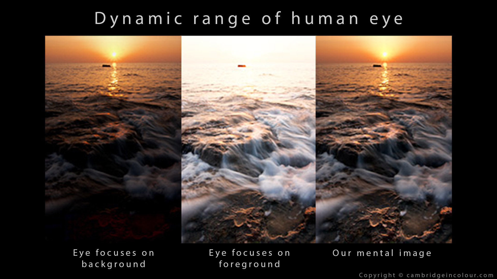
I asked a great 2D art director and an amazing lighting supervisor the following question : What should we try to reproduce in CG ? The camera or the eye ? They both gave me a different answer :
我问过一位出色的 2D 艺术总监和一位出色的灯光主管以下问题:我们应该在 CG 中重现什么?相机还是眼睛? 他们都给了我不同的答案:
- The art director replied : the eye.
- 艺术总监回答说:眼睛。
- The lighting supervisor replied : the camera.
- 灯光师回答:摄像机。
Generally a director with a 2D background will aim at our mental image (right image), when a supervisor with a live-action experience will go for the camera exposure (left and center images). The only solution I know is to make a choice. Which vision should we embrace ?
通常,具有 2D 背景的导演会瞄准我们的心理形象(右图),而具有实景拍摄经验的监督会选择摄像机曝光(左图和中间图)。我知道的唯一解决方案是做出选择。我们应该接受哪种愿景?
Beautiful frame. A bright object between two characters ties them together.
漂亮的框架。两个角色之间的明亮物体将他们联系在一起。
From Dave Walvoord : Traditionally, animated films are made as viewed from the eye of a painter because of the 2D origins of animation. The Dragon franchise uses the view from the camera.
**Dave Walvoord**表示 :传统上,动画电影是按照画家的视角制作的,因为动画起源于二维。《龙》系列电影采用了摄像机视角。
They did a bold choice on Dragon.
他们在“龙”上做出了大胆的选择。
Most of the movies I have worked on had a mental image photography. I personally call this style filled-saturated (débouché-saturé) so it does not scare the children. The shot below from The secret life of pets (Director : Chris Renaud, Art Director : Colin Stimpson) is a perfect example.
我参与制作的大多数电影都有一种心理形象摄影。我个人称这种风格为 “填充饱和” (débouché-saturé ),这样就不会吓到孩子。下面这张来自《爱宠大机密》 (导演:Chris Renaud,艺术总监:Colin Stimpson )的镜头就是一个完美的例子。
With a photographic exposure, the sky would be blown-out.
通过摄影曝光,天空将会被吹散。
结论 Conclusion
I have tried to express my view on color as a lighting artist. While a detailed overview of color is beyond the scope of this document, there are many articles which introduce color theory in wonderful detail :
我试图表达我作为一名灯光艺术家对色彩的看法。虽然对色彩的详细概述超出了本文的范围,但有许多文章非常详细地介绍了色彩理论:
- Wassily Kandinsky and his color theory.
- 瓦西里·康定斯基和他的色彩 理论。
- Goethe and his color theory.
- 歌德和他的色彩理论。
- Eugène Chevreul and a link to his book (in French) about color theory. Otherwise there is a really good paper in English.
- Eugène Chevreul以及他关于色彩理论的书(法语版)的链接。另外,还有一篇非常好的英文论文。
- The psychology of color.
- 色彩心理学。
- Great article from the no film school about color. A very interesting read.
- 来自非电影学院的关于色彩的很棒的文章。读起来非常有趣。
- Color palettes for movies.
- 电影的调色板。
- Movies and their color palettes.
- 电影及其调色板。
- Movie screencaps for references and Animation screencaps as well.
- 电影截图可供参考,动画截图也是如此。
- Film Grab and Film Colors.
- 胶片抓取和胶片色彩。
- An incredible website for references : shotdeck.
- 一个令人难以置信的参考网站:shotdeck。
- The colors of motion.
- 运动的色彩。
- Glossaire des couleurs (in French).
- Glossaire des couleurs(法语)。
- Color Theory on Youtube.
- Youtube 上的色彩理论。
- Studiobinder on color grading.
- Studiobinder 负责色彩分级。
- Some great artists : Simon Stalenhag, Alberto Mielgo, Alexandre Jacob, Daniele Tosti, Ryan Church, Aurelien Predal, Rémi Salmon, Péah, Craig Mullins, John Sweeney, Axel Sauerwald, Colorsponge, Kevin Whitfield, Avner Geller, Artur Szymczak.
- 一些伟大的艺术家:Simon Stalenhag、Alberto Mielgo、Alexandre Jacob、Daniele Tosti、Ryan Church、Aurelien Predal、Rémi Salmon、Péah、Craig Mullins、John Sweeney、Axel Sauerwald、Colorsponge、Kevin Whitfield、Avner Geller、Artur Szymczak。
- I also would like to mention the work from Zeno Pilgrims. Big fan !
- 我还想提一下Zeno Pilgrims的作品。超级粉丝!
- Some concept art from Spider-verse.
- 来自《蜘蛛侠:平行宇宙》的一些概念艺术 。
- Some concept art from Scoob.
- Scoob的一些概念艺术。
- Coolors Image Picker helps you create beautiful palettes from your photos.
- Coolors 图像选择器可帮助您从照片中创建漂亮的调色板。
- Overly descriptive color palettes.
- 过于描述性的调色板。
- The three colour primaries rule is wrong.
- 三色原色规则是错误的。
-
- 介绍 Introduction
- 颜色术语 Color Terminology
- 色轮 Color Wheel
- 开尔文温度表 Kelvin Temperature Chart
- 配色方案与和谐 Color Schemes and Harmonies
- 色彩心理学 Color Psychology
- 色彩与情感 Color and Emotions
- 坏人综合症 Bad Guy Syndrome
- 生产实例 Production Examples
- 颜色和灯光 Color and lights
- 概念和颜色键 Concept and Color Keys
- 颜色和介质 Color and medium
- 2D 遗产 The 2D legacy
- 乐高蝙蝠侠体验 Lego Batman experience
- 格兰特的话 A word from Grant
- 心理意象 The mental image
- 结论 Conclusion
 粤公网安备44060602002818